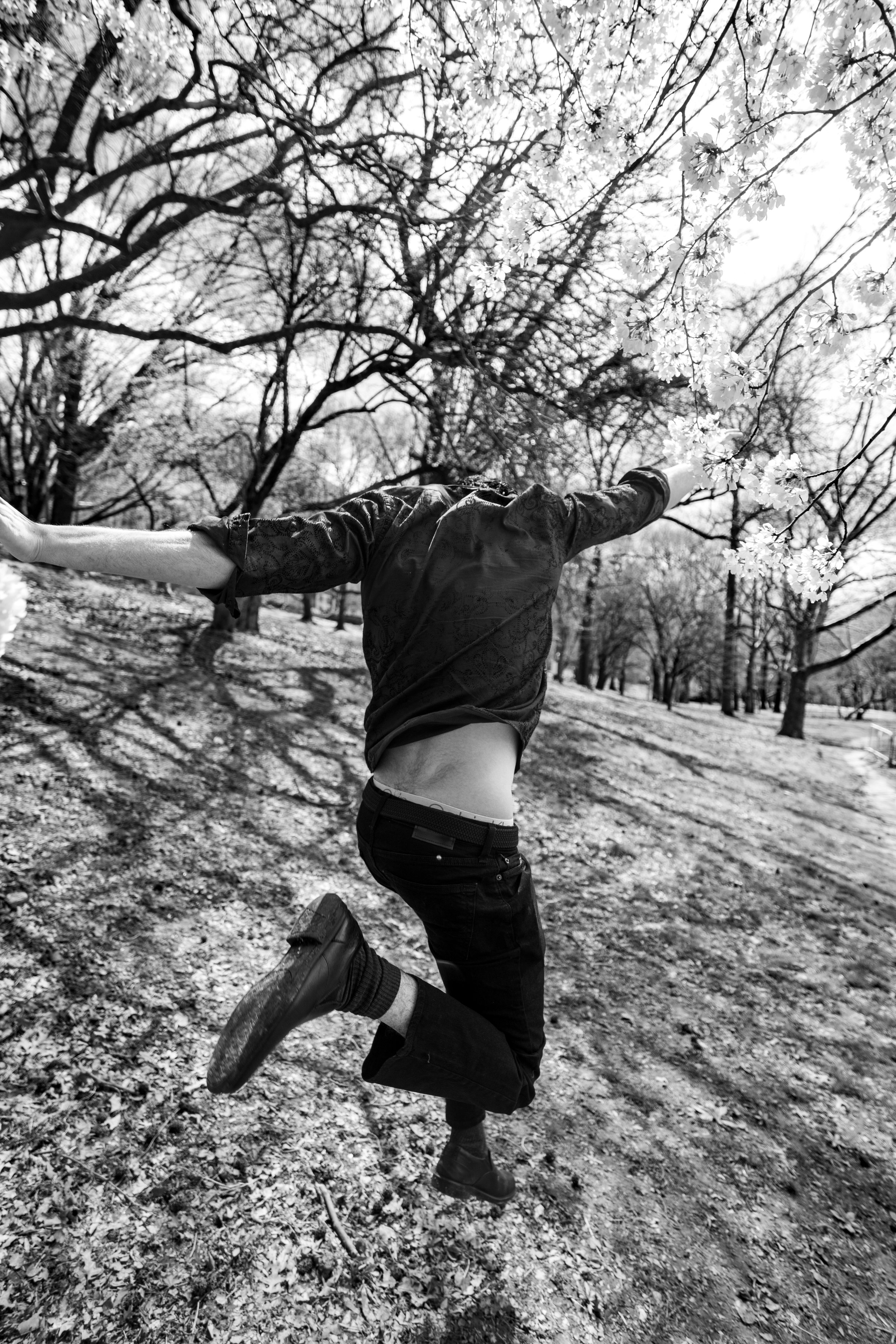
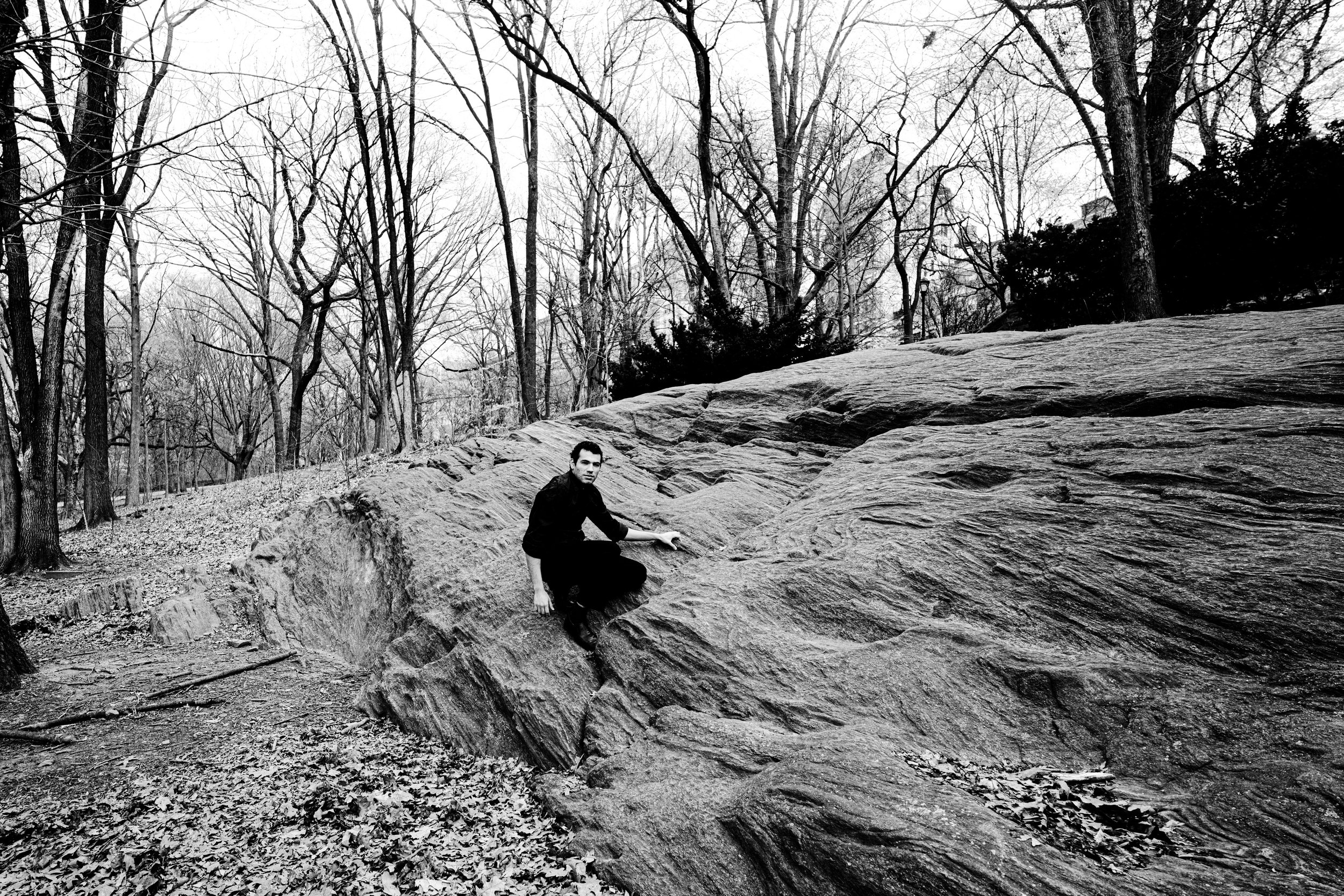
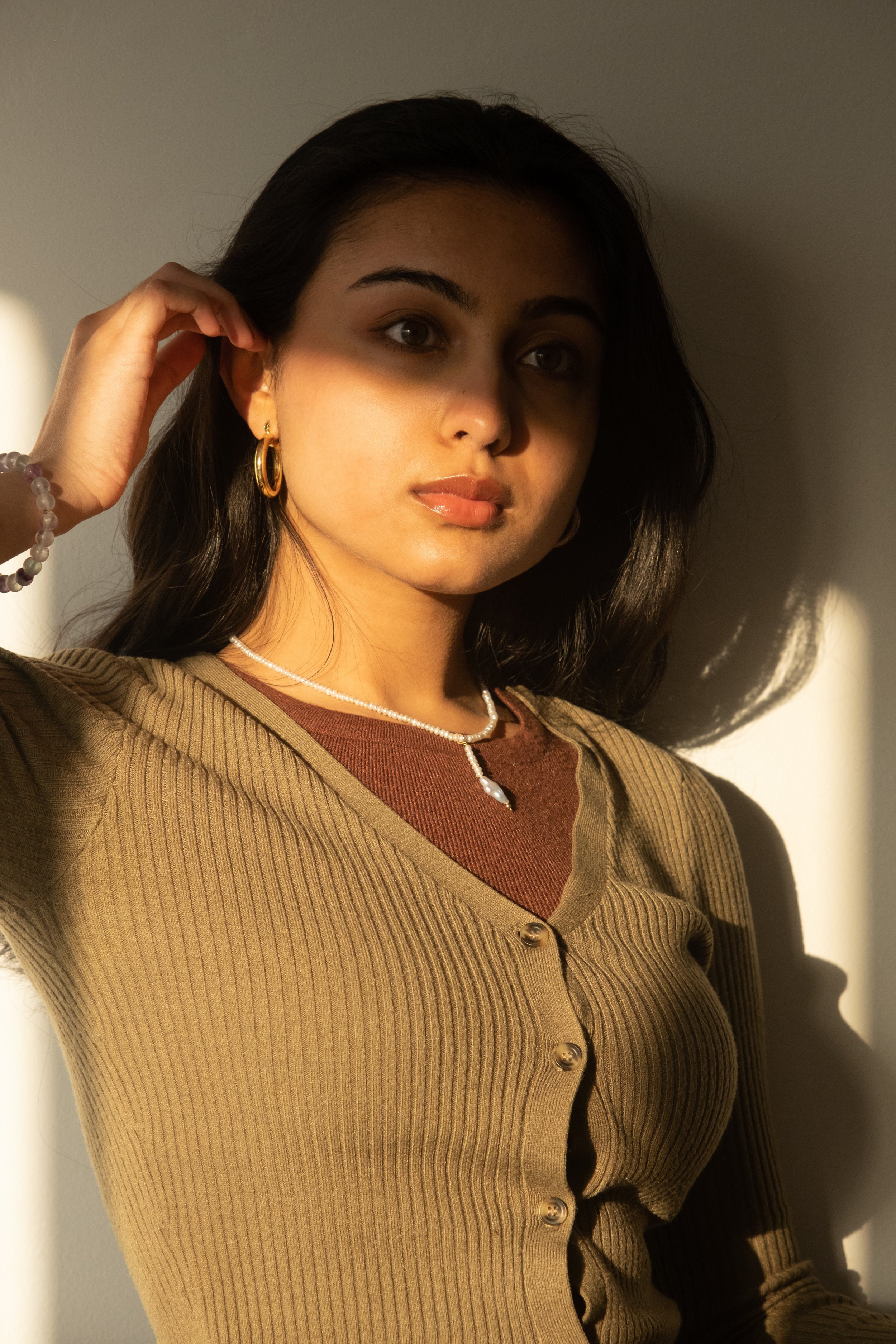
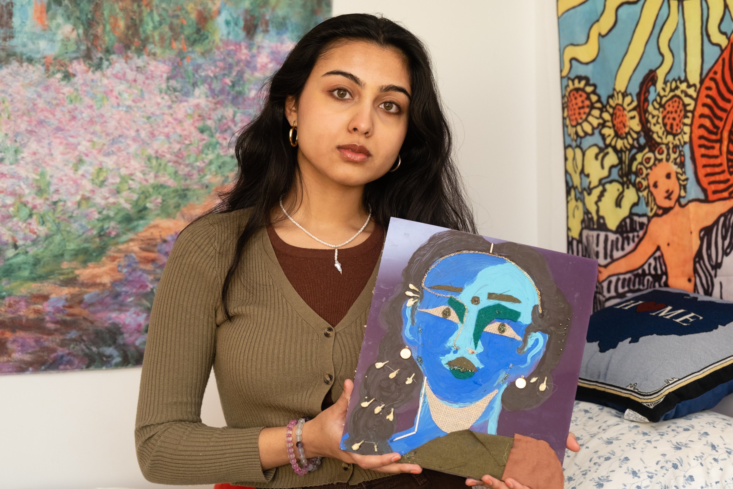
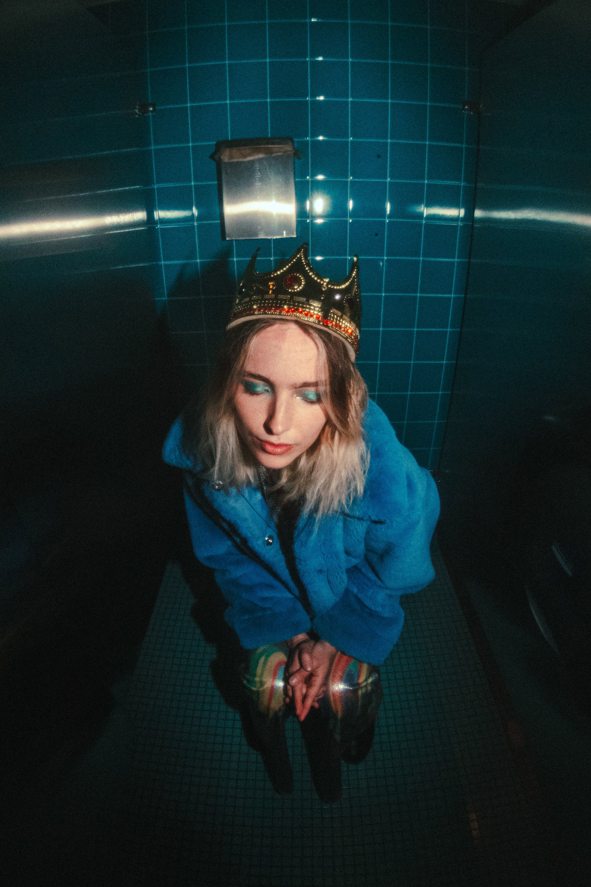
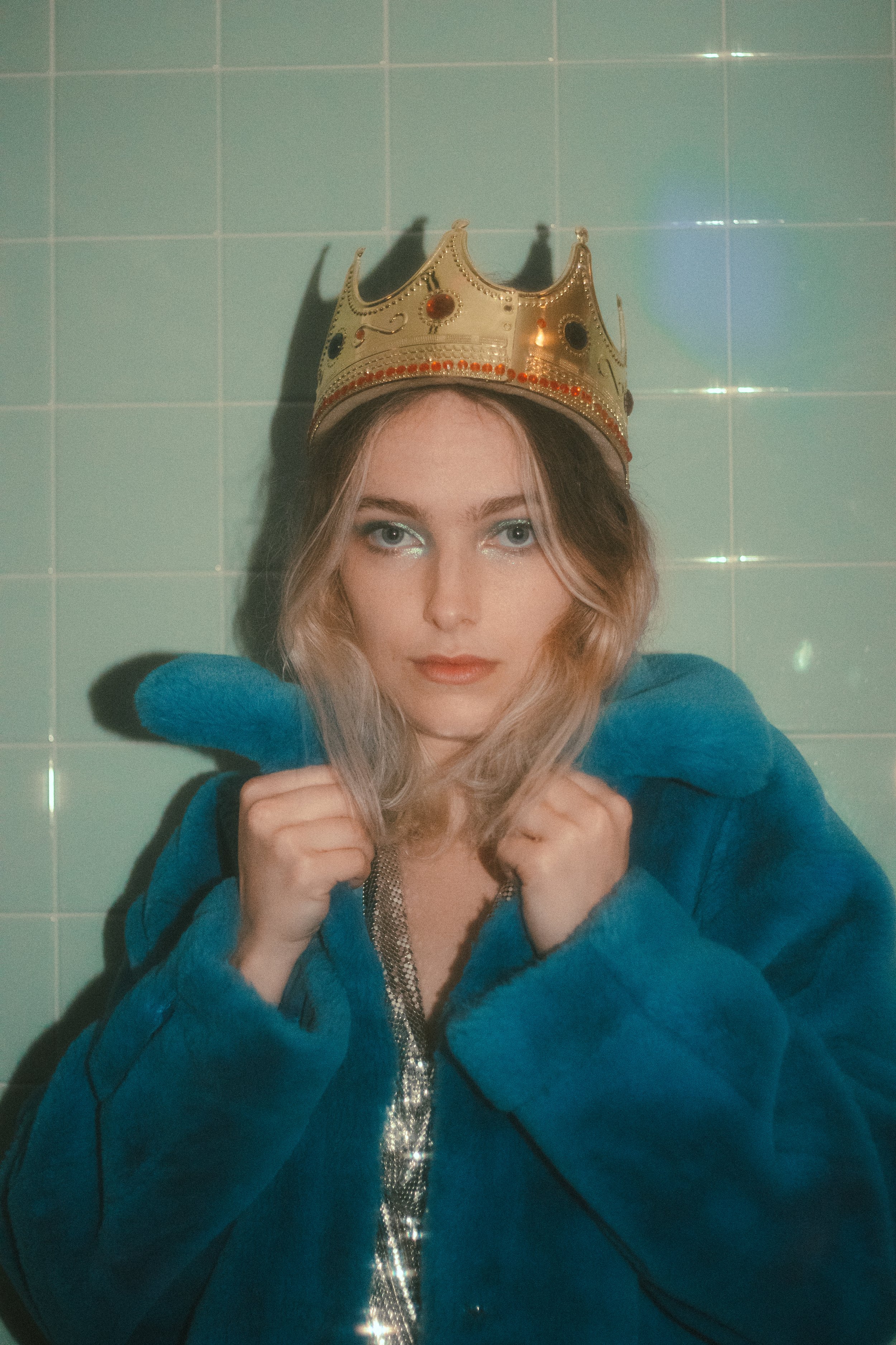
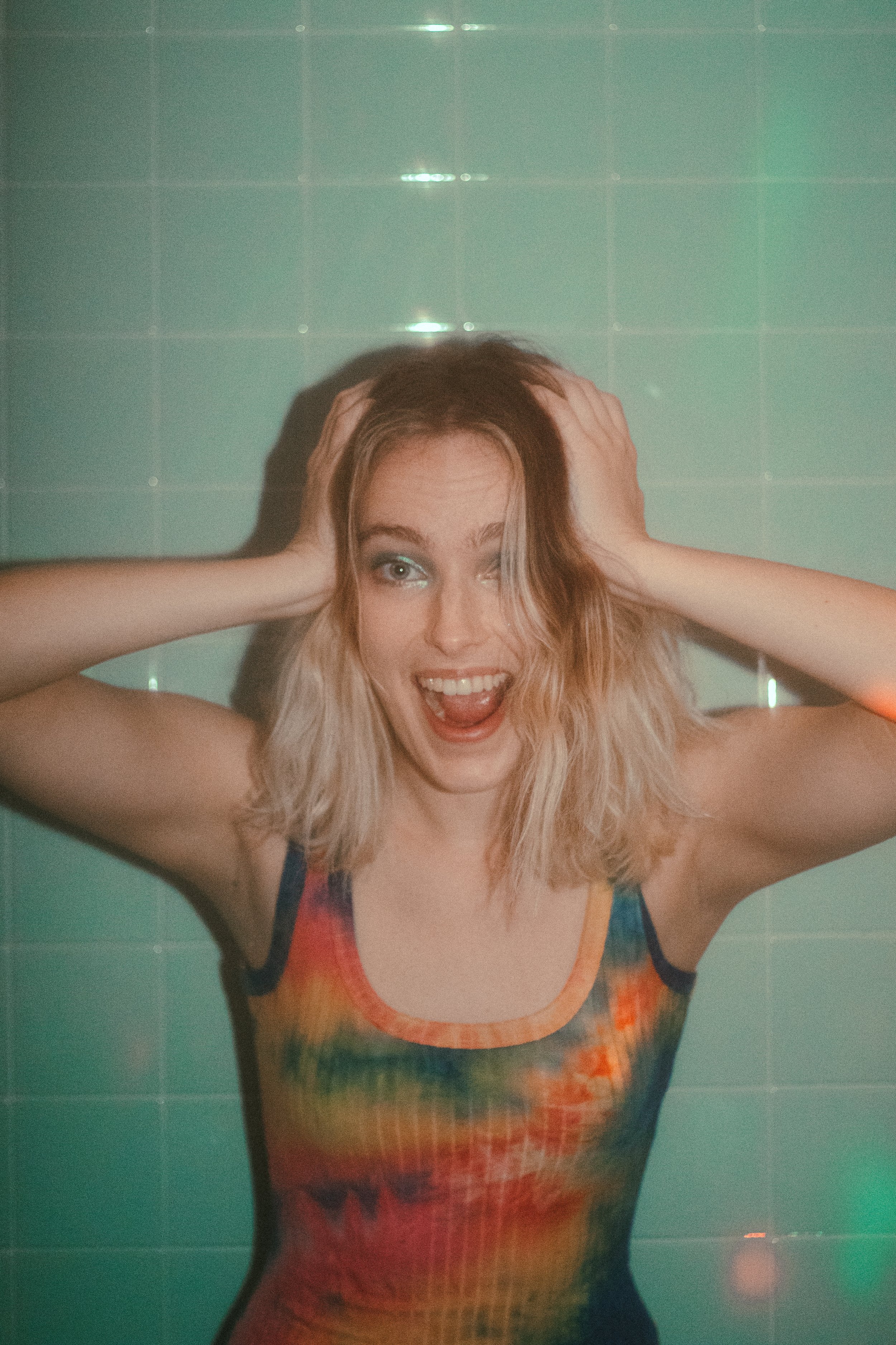
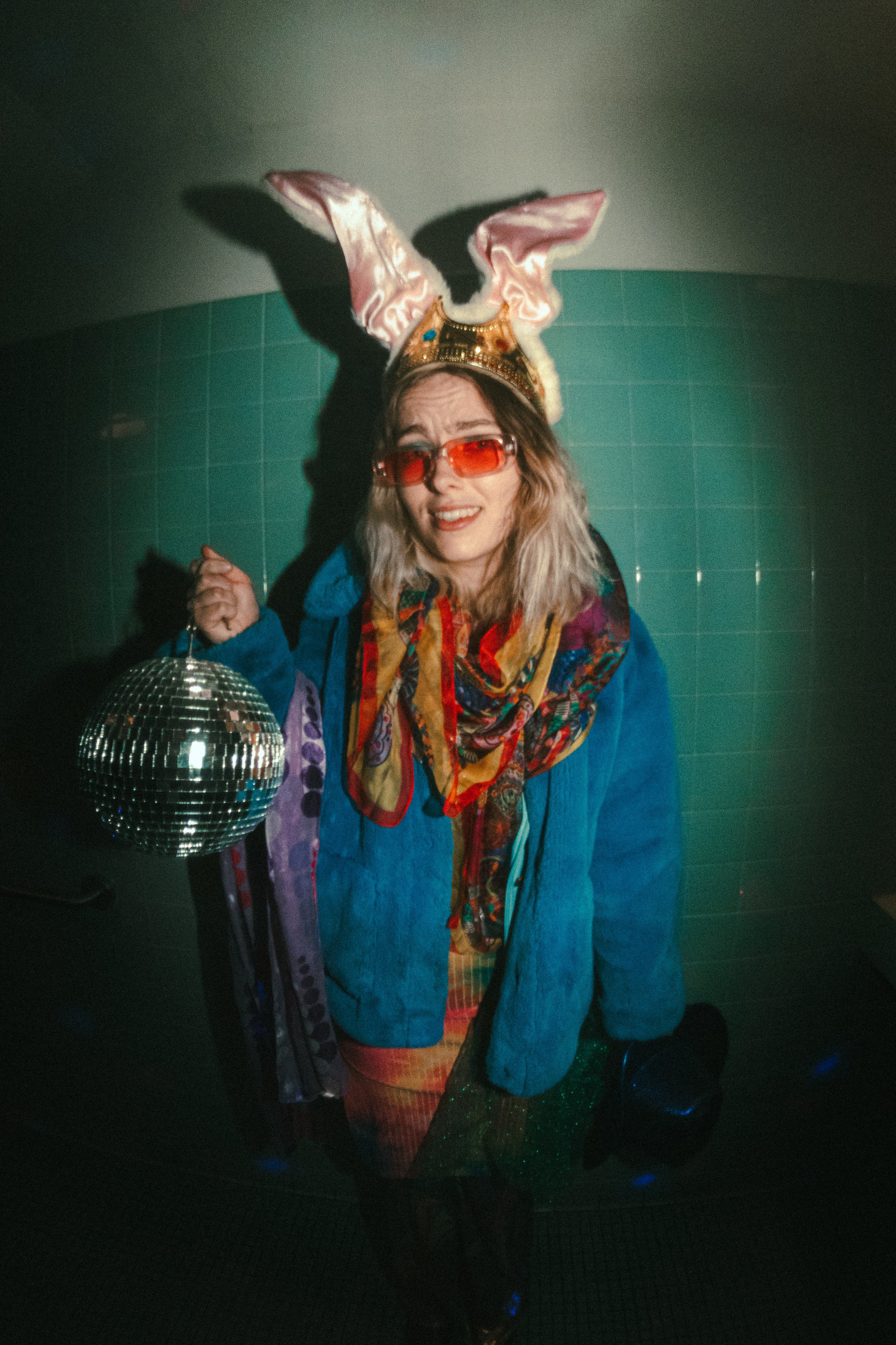
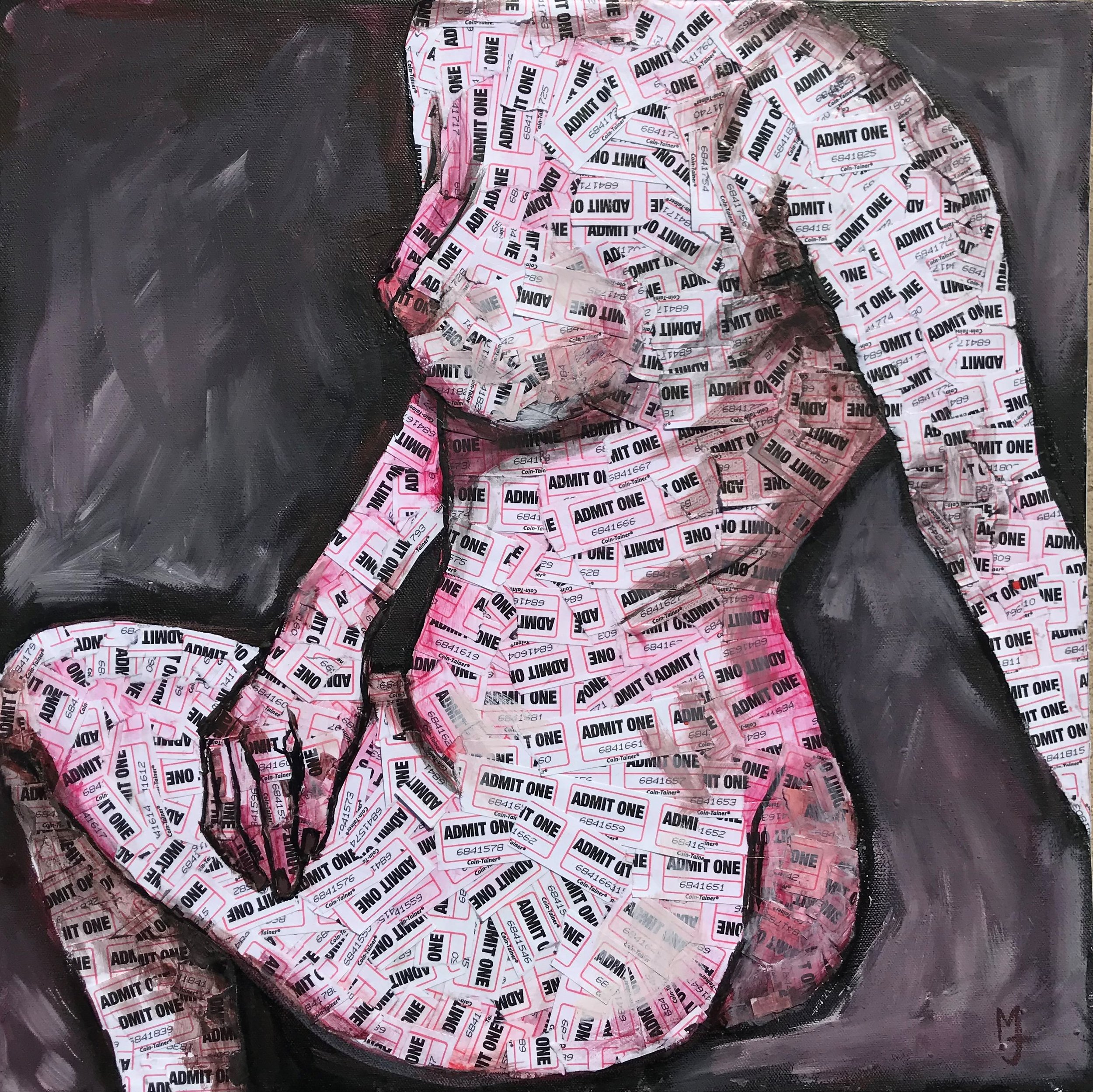
Sophie Paquette

Feature by Alex Avgust

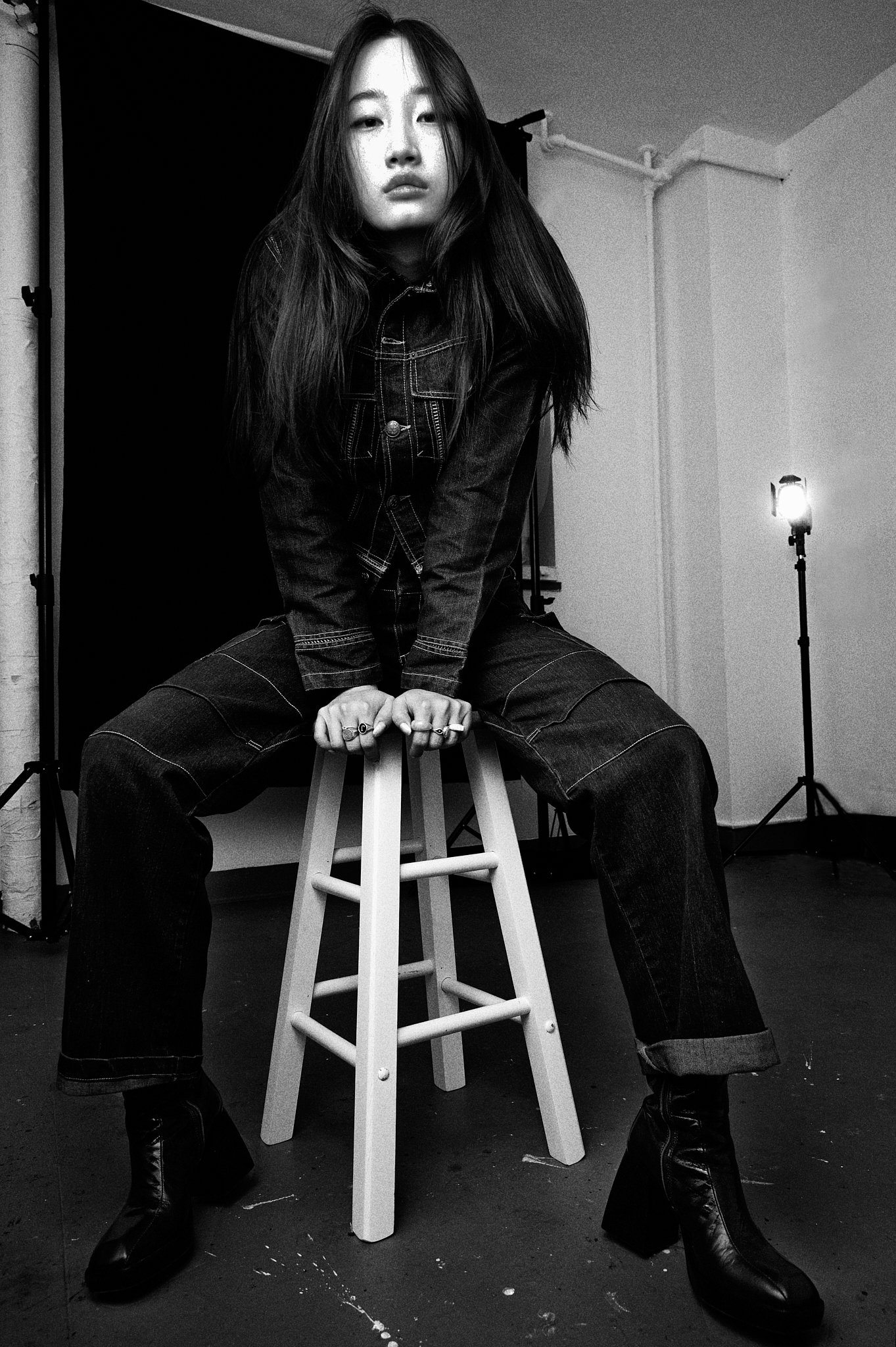
Photos by Caroline Cavalier

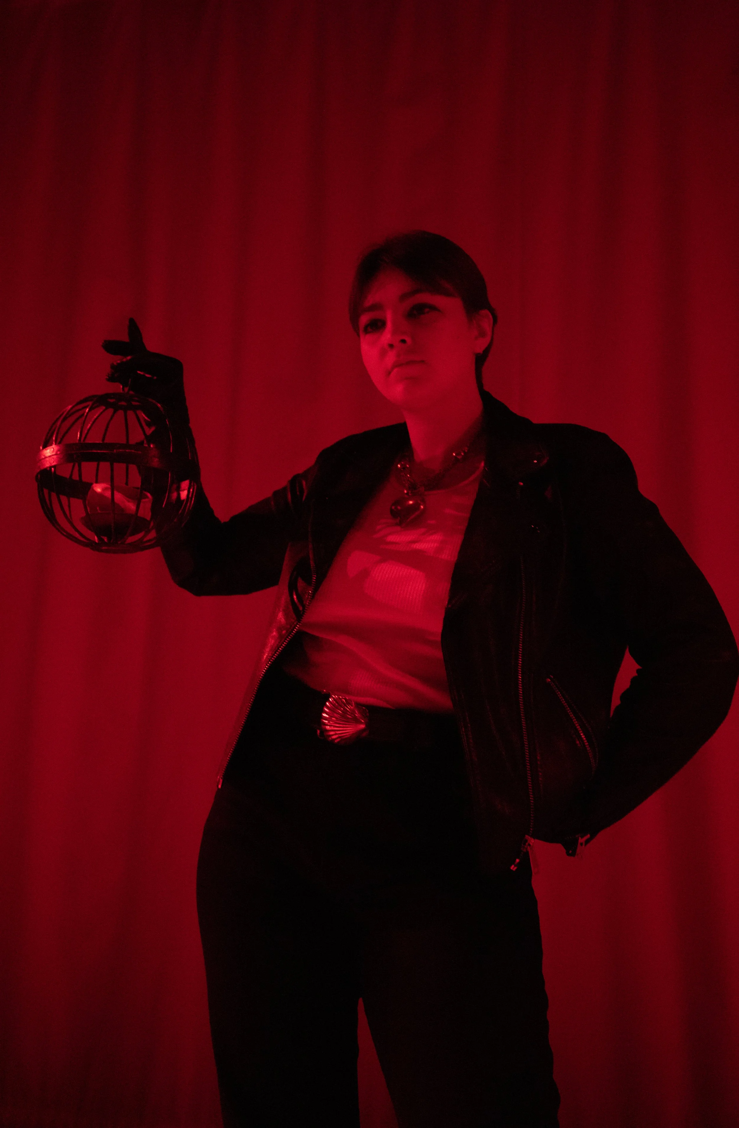
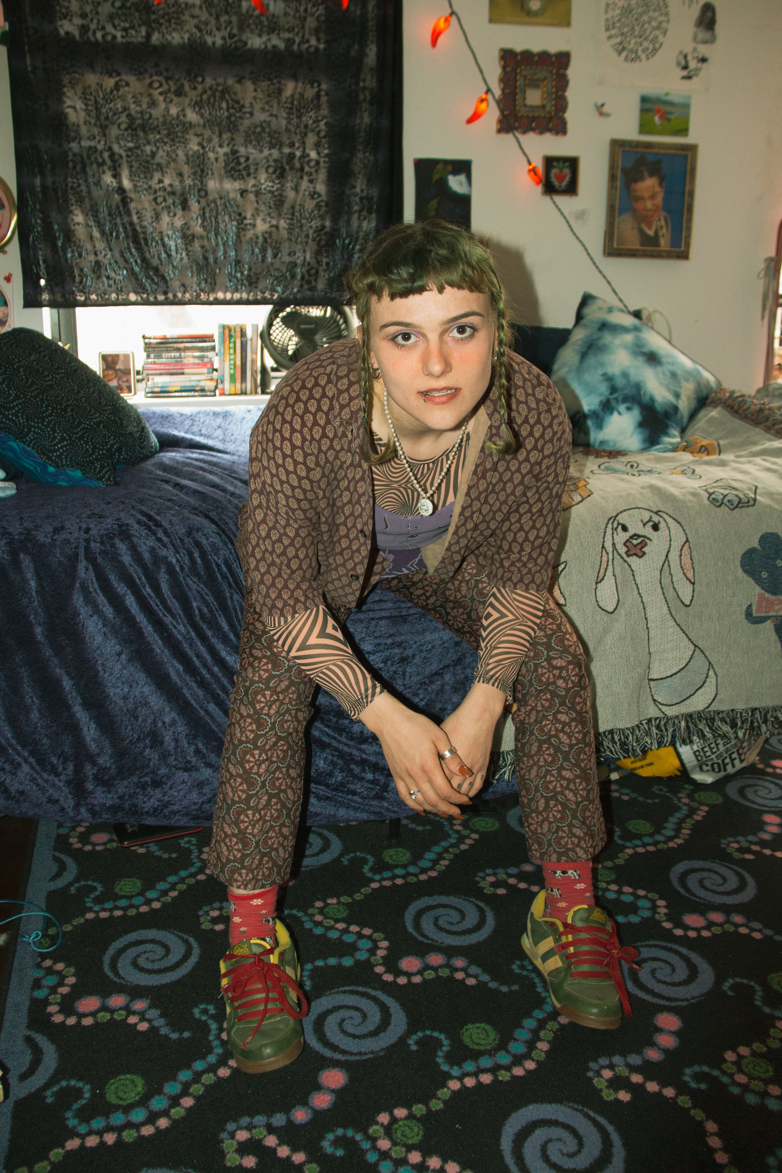
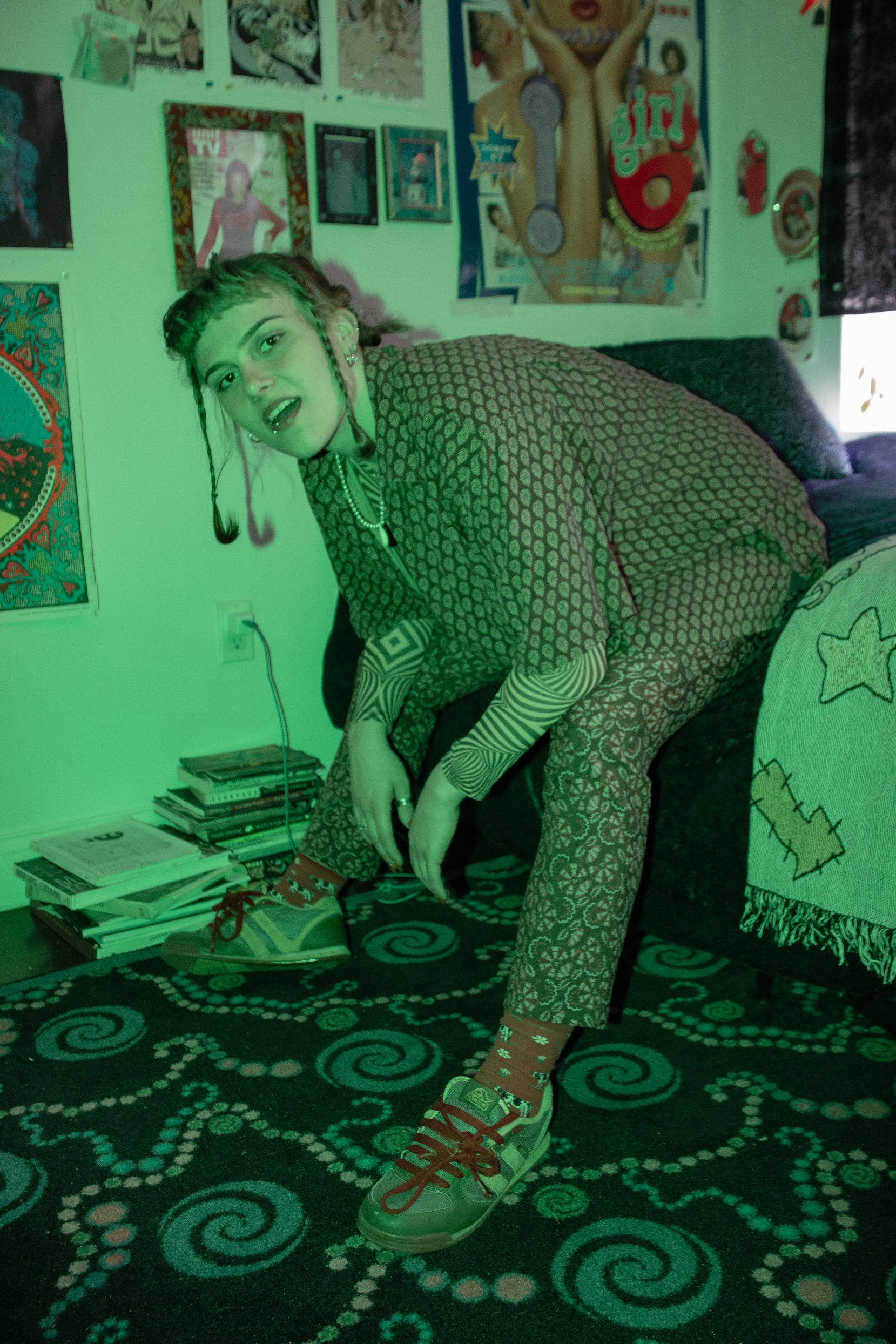
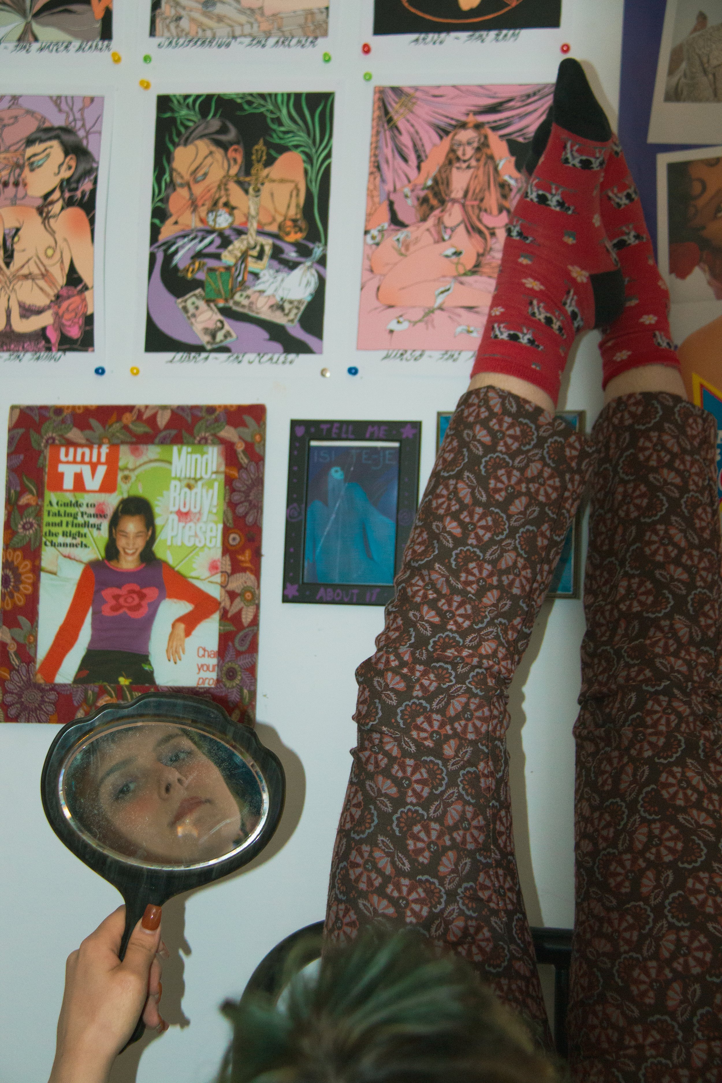
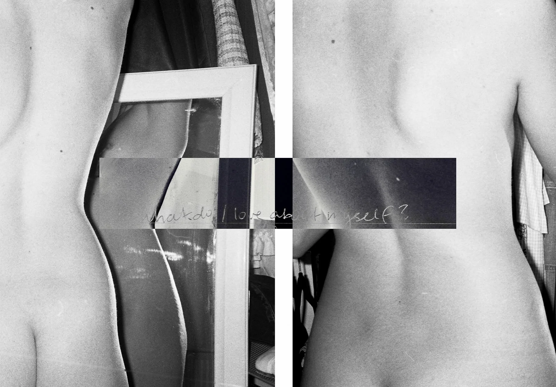
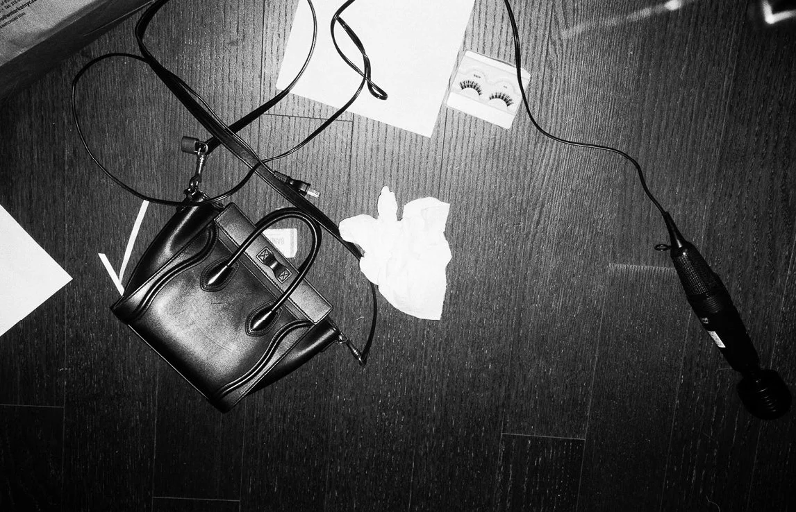
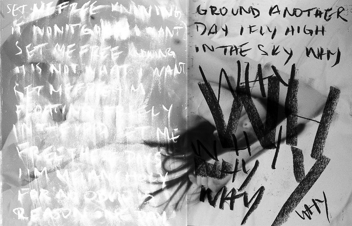
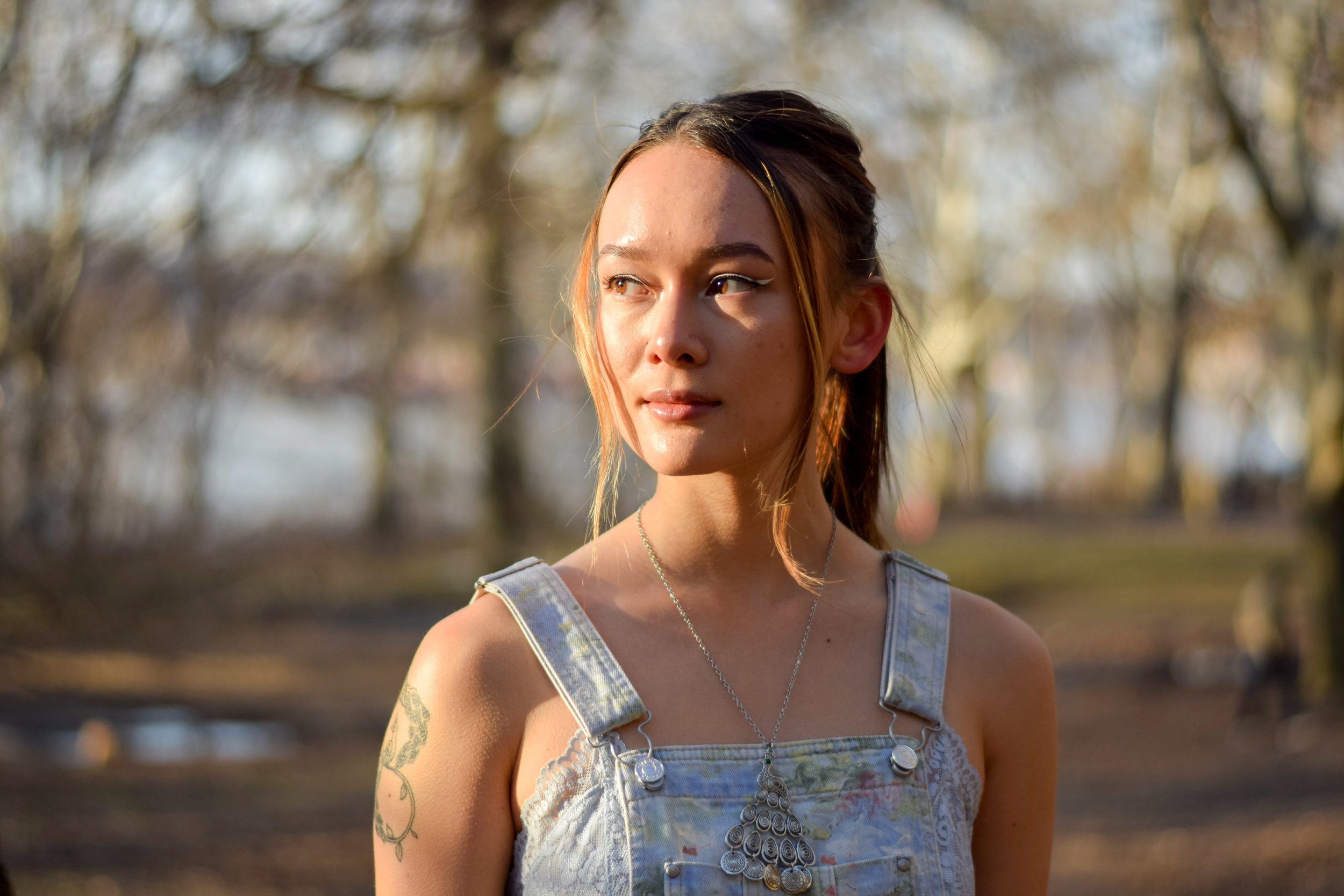
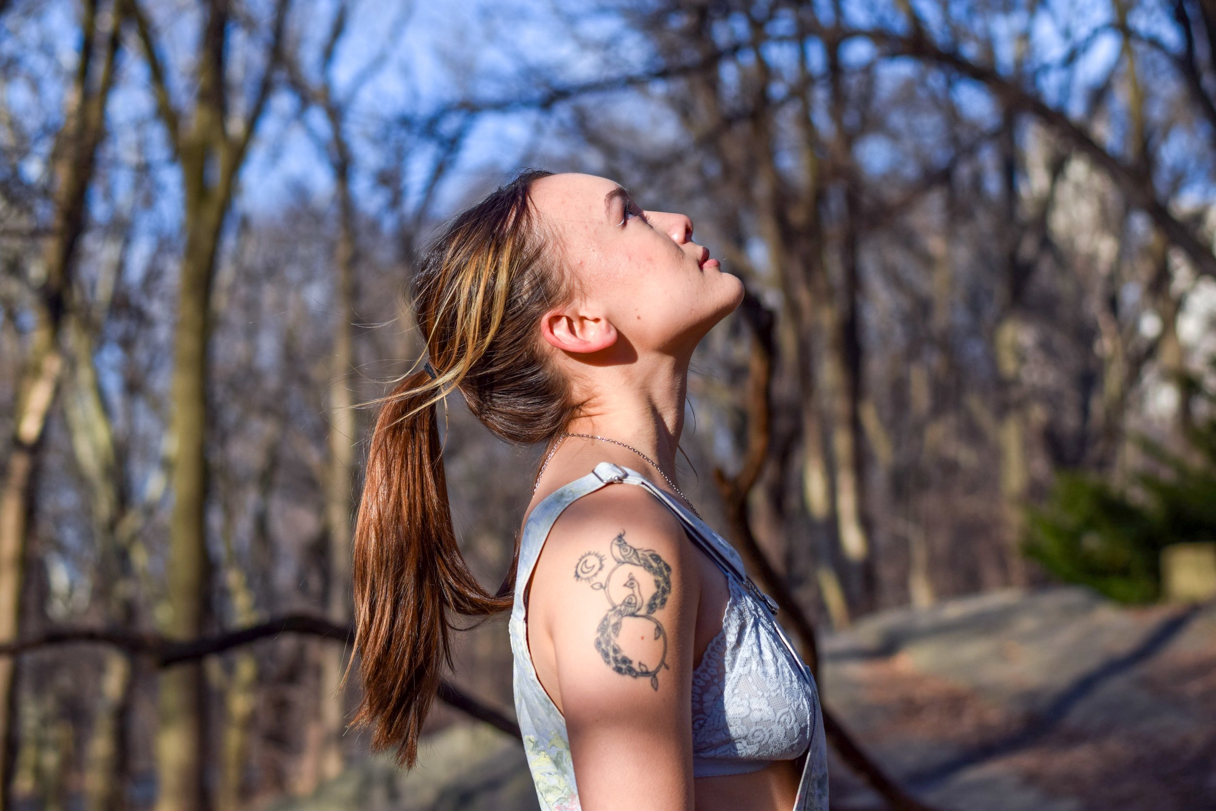
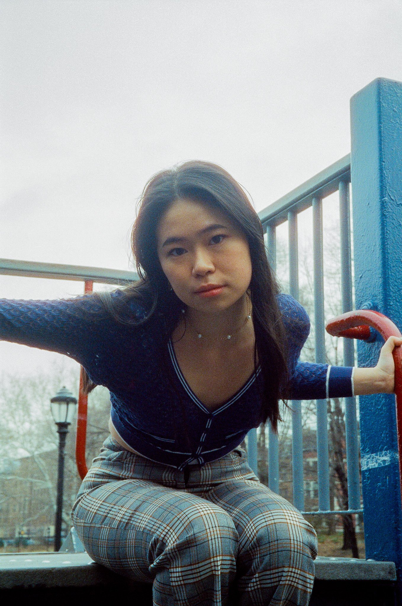
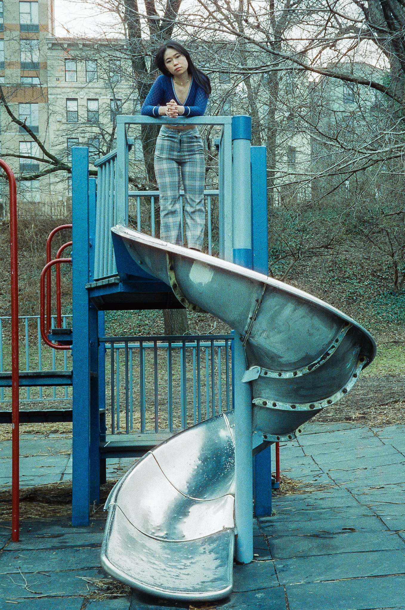
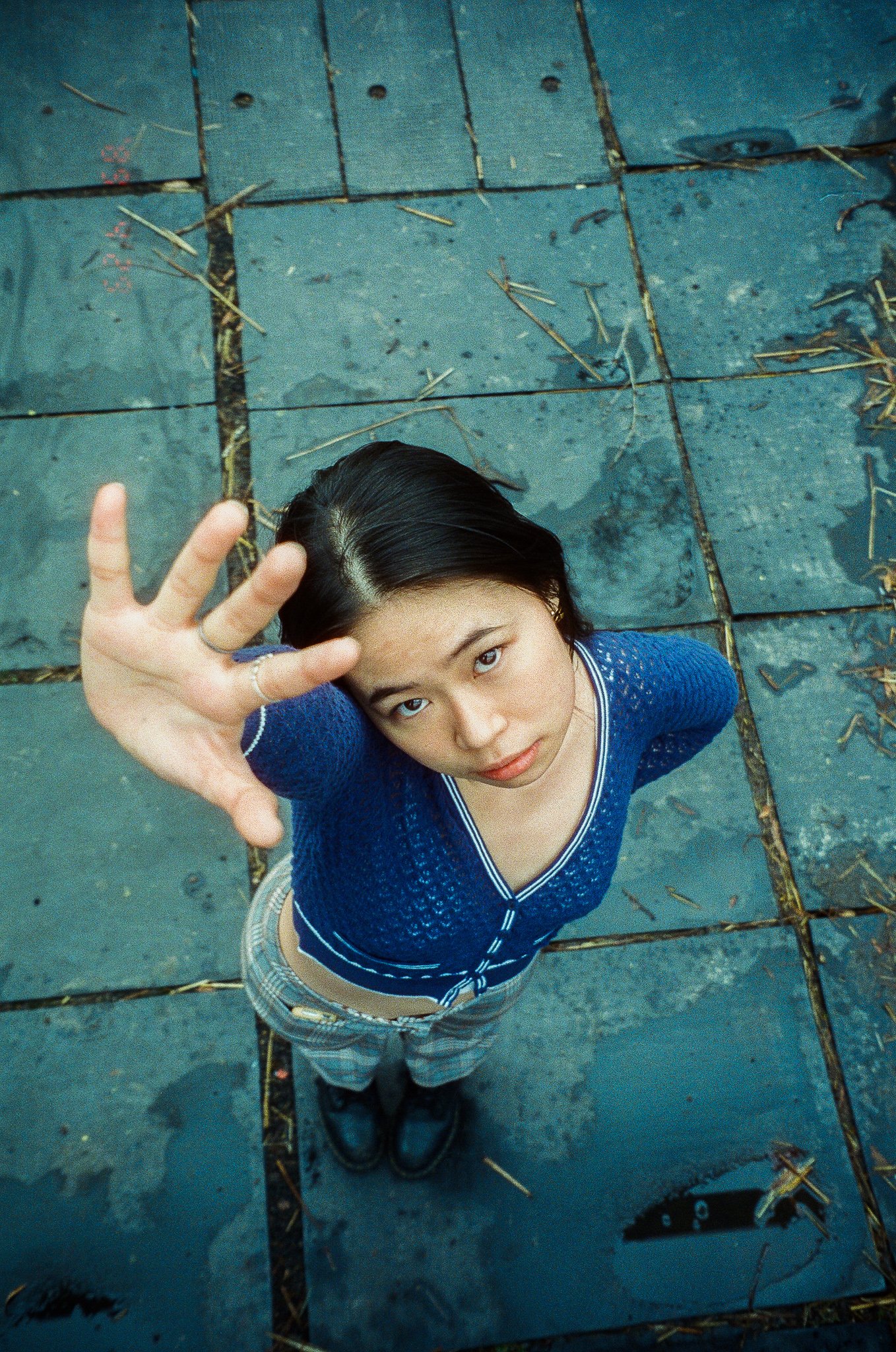
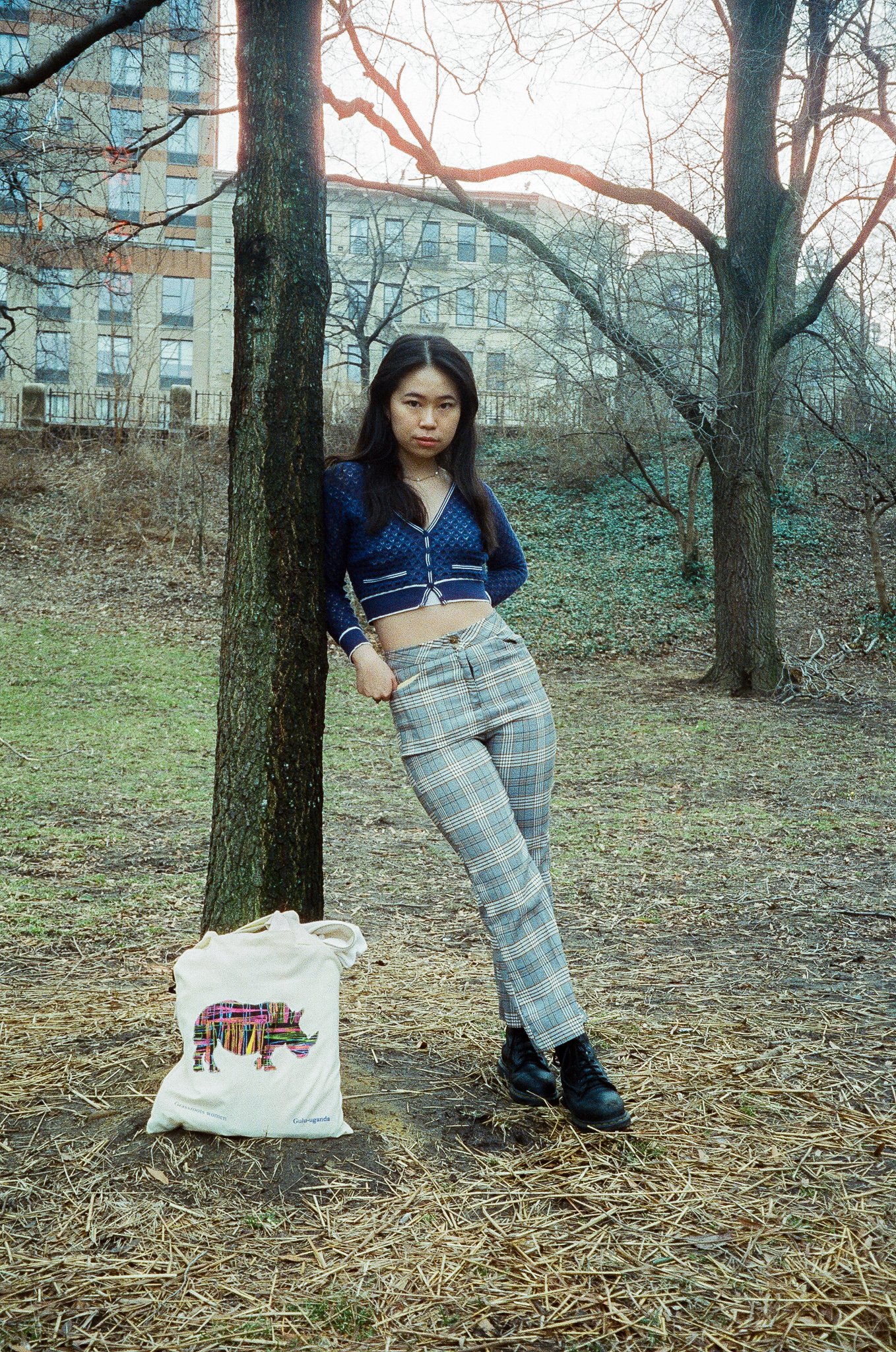
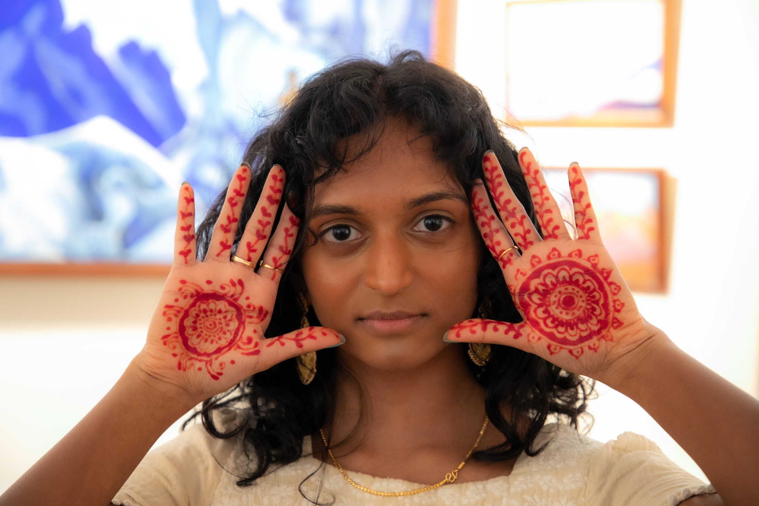
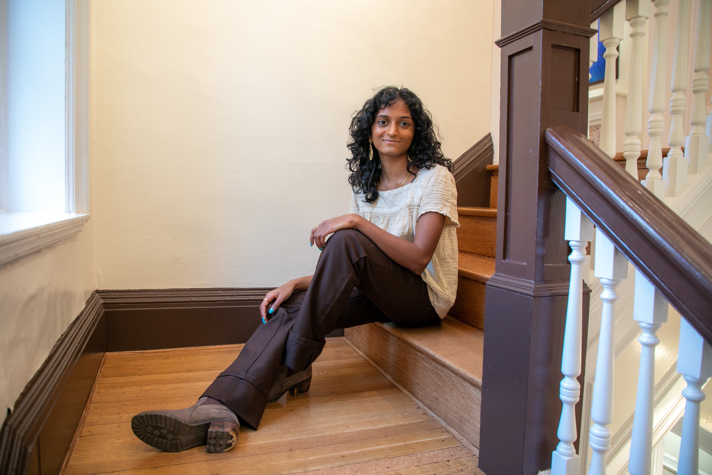
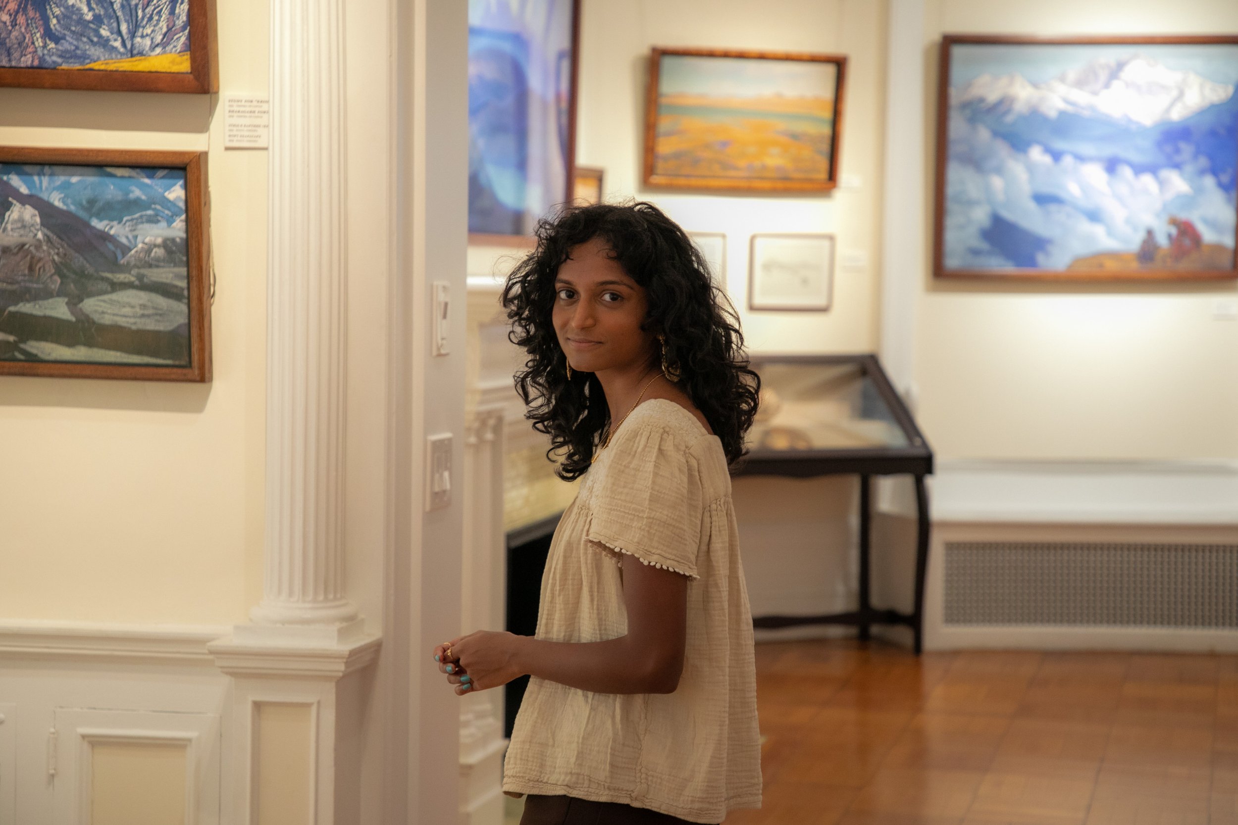
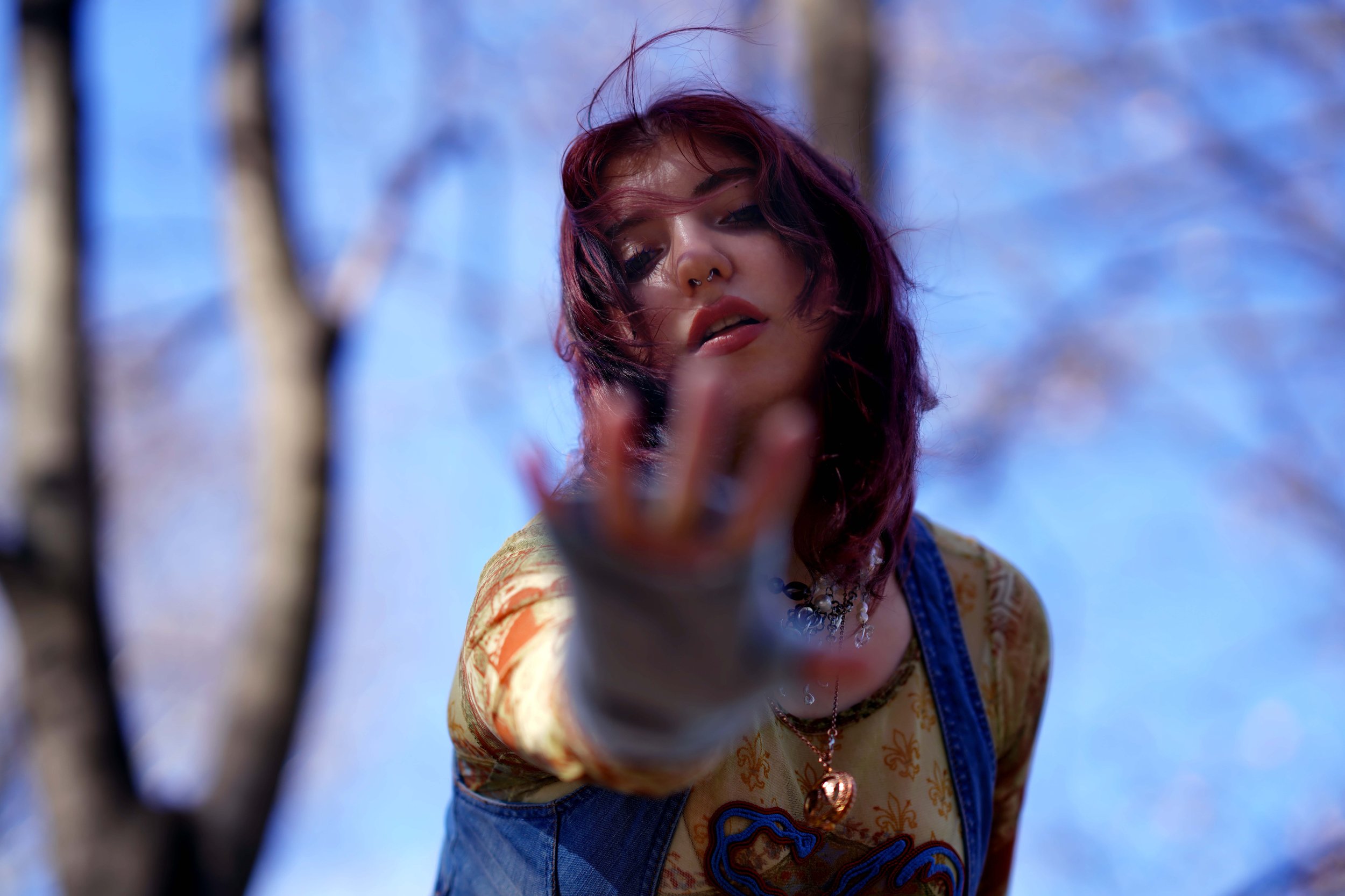
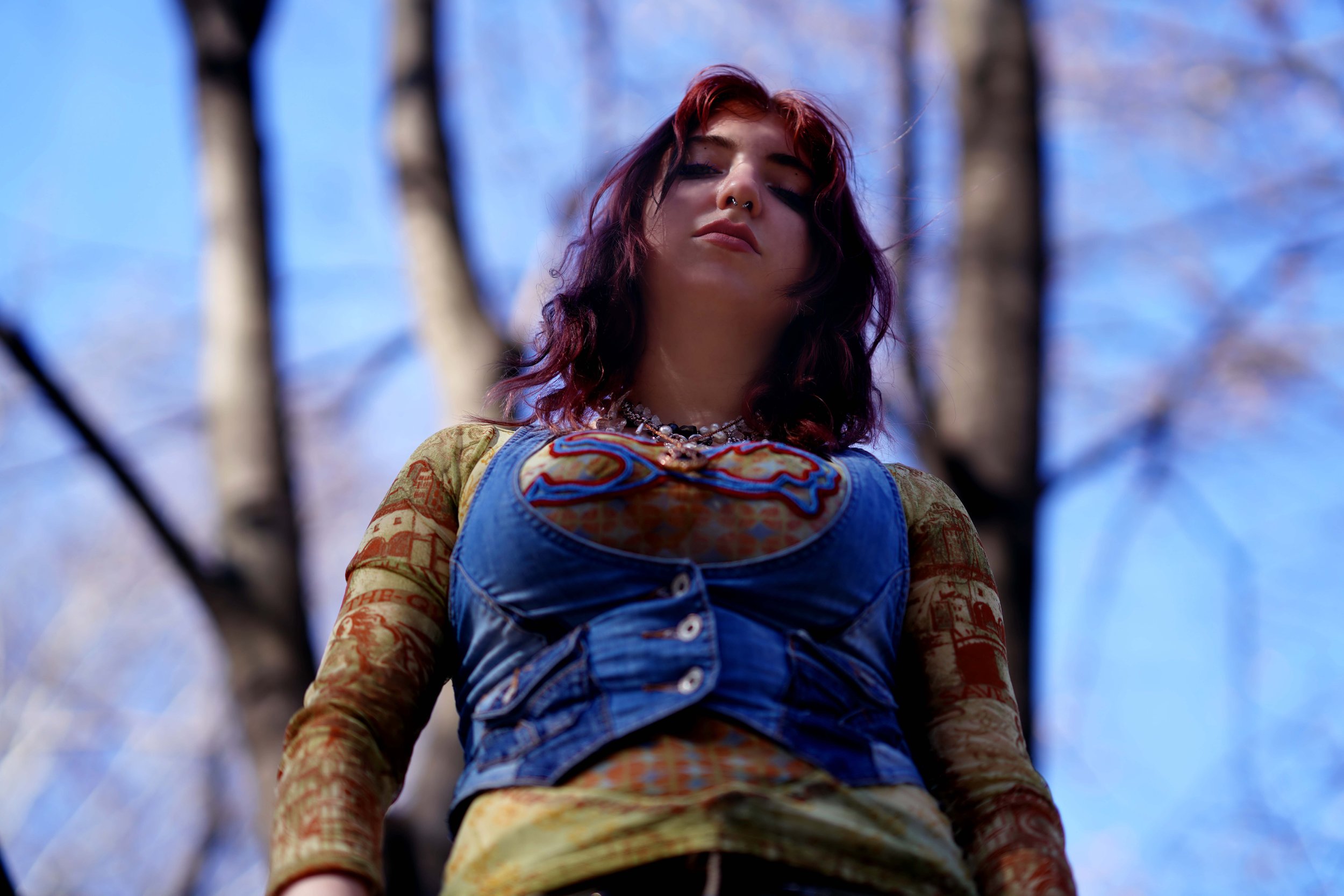
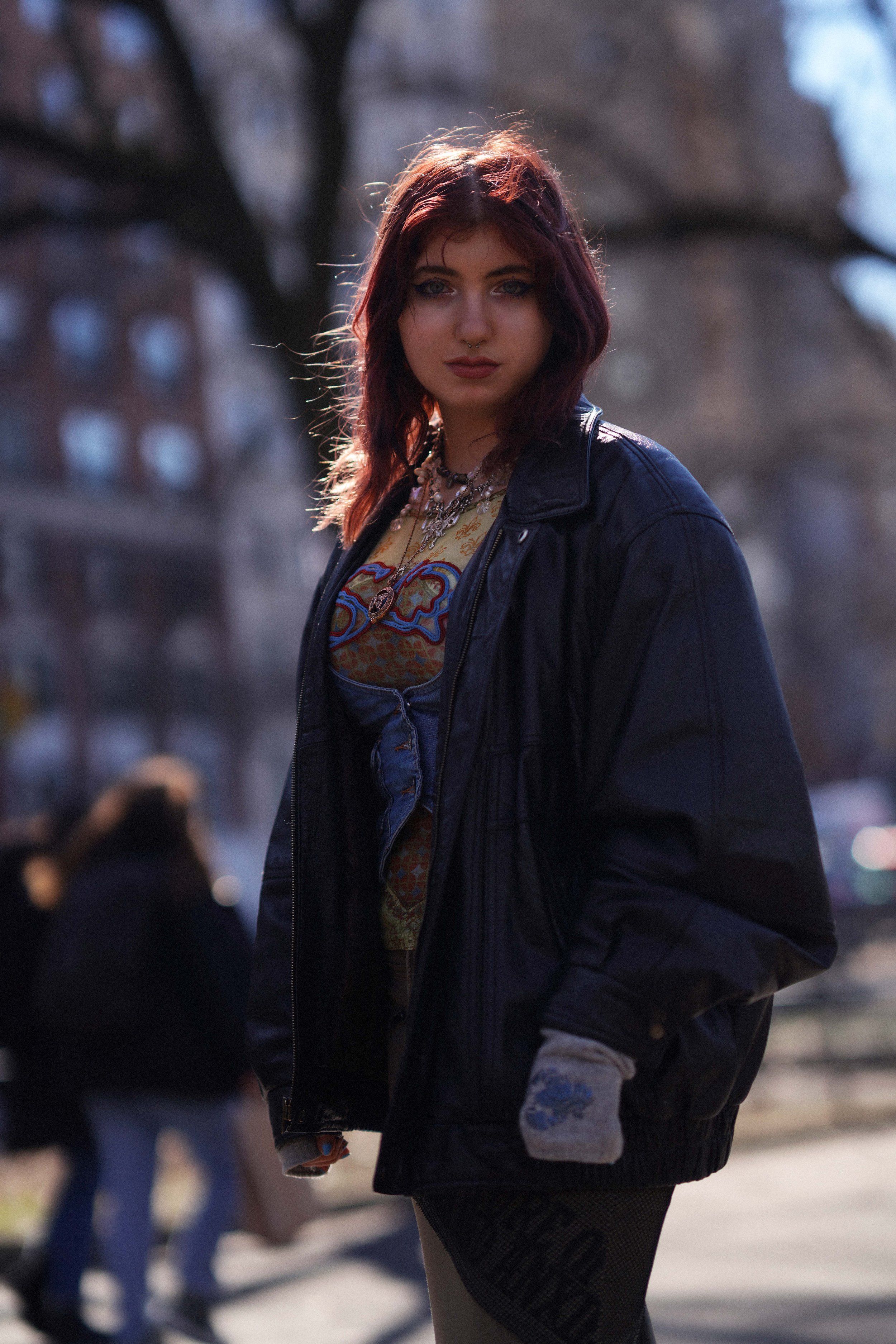
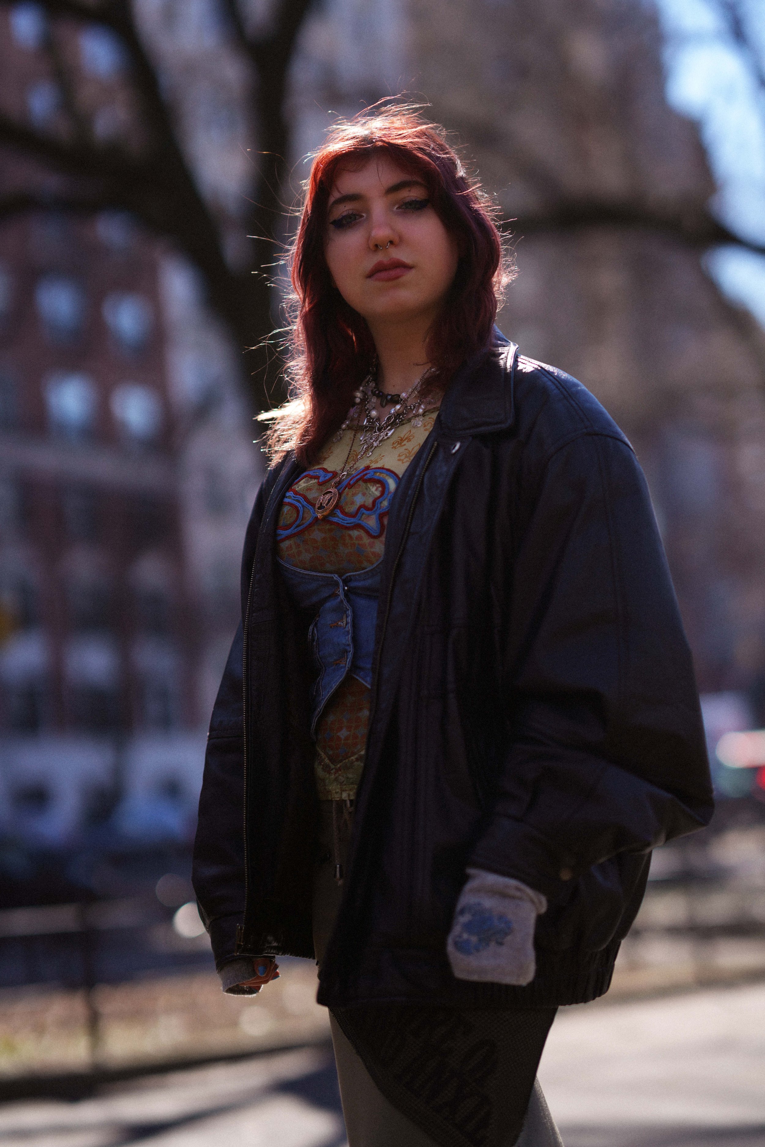
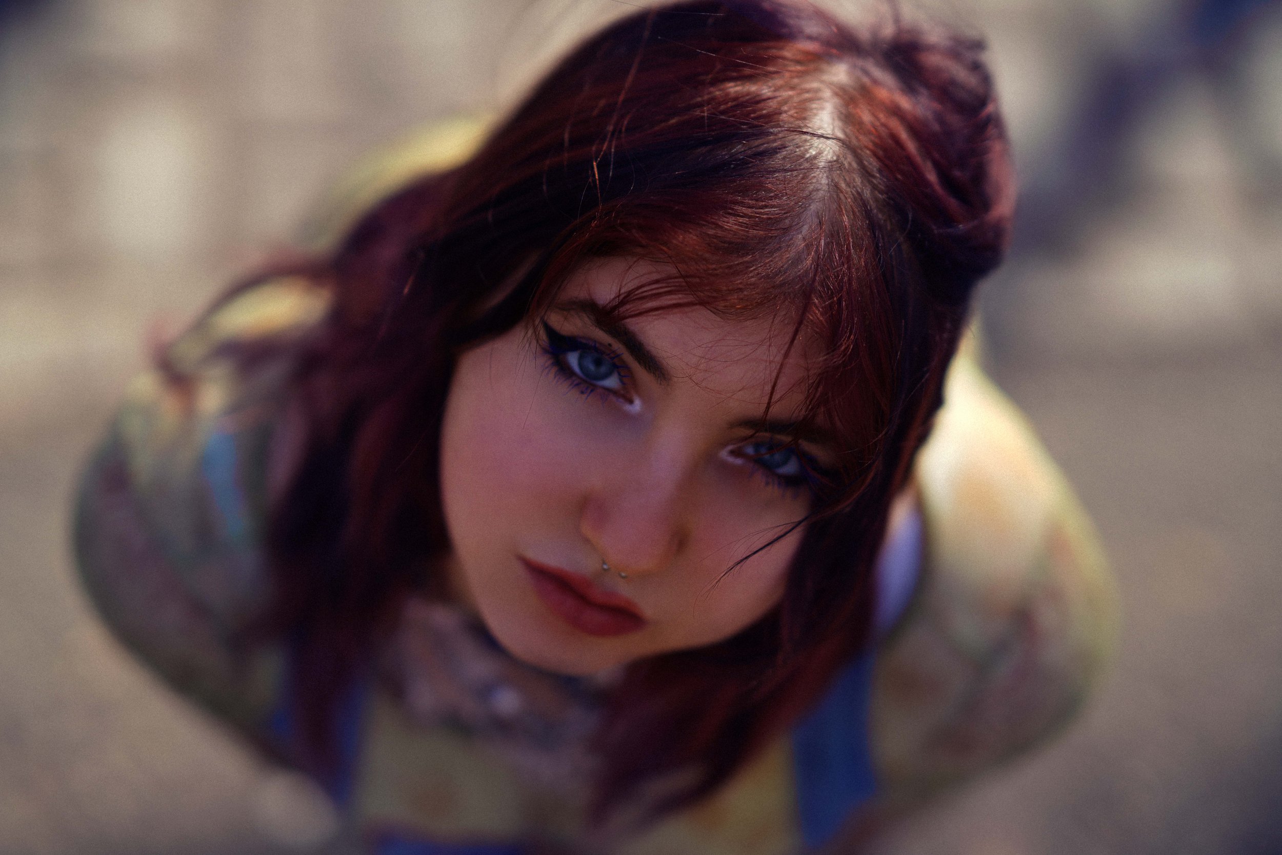
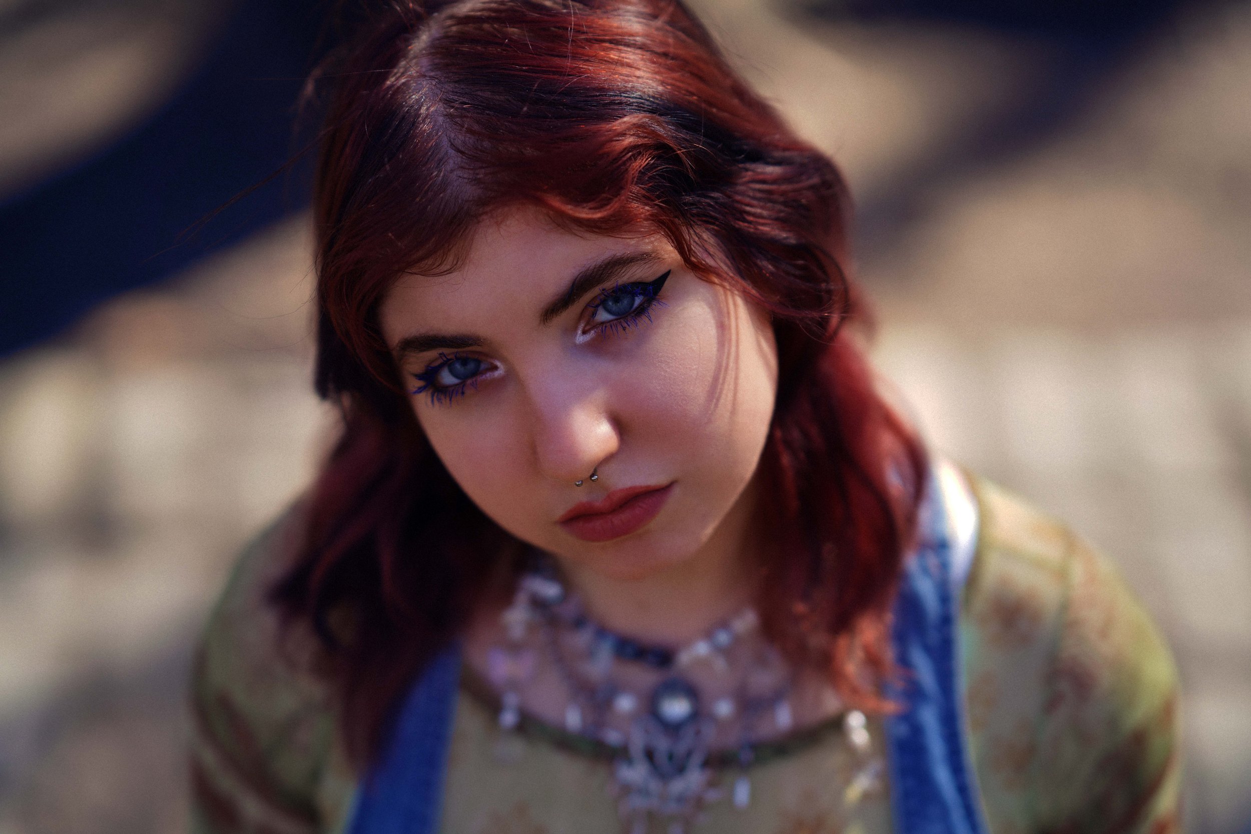
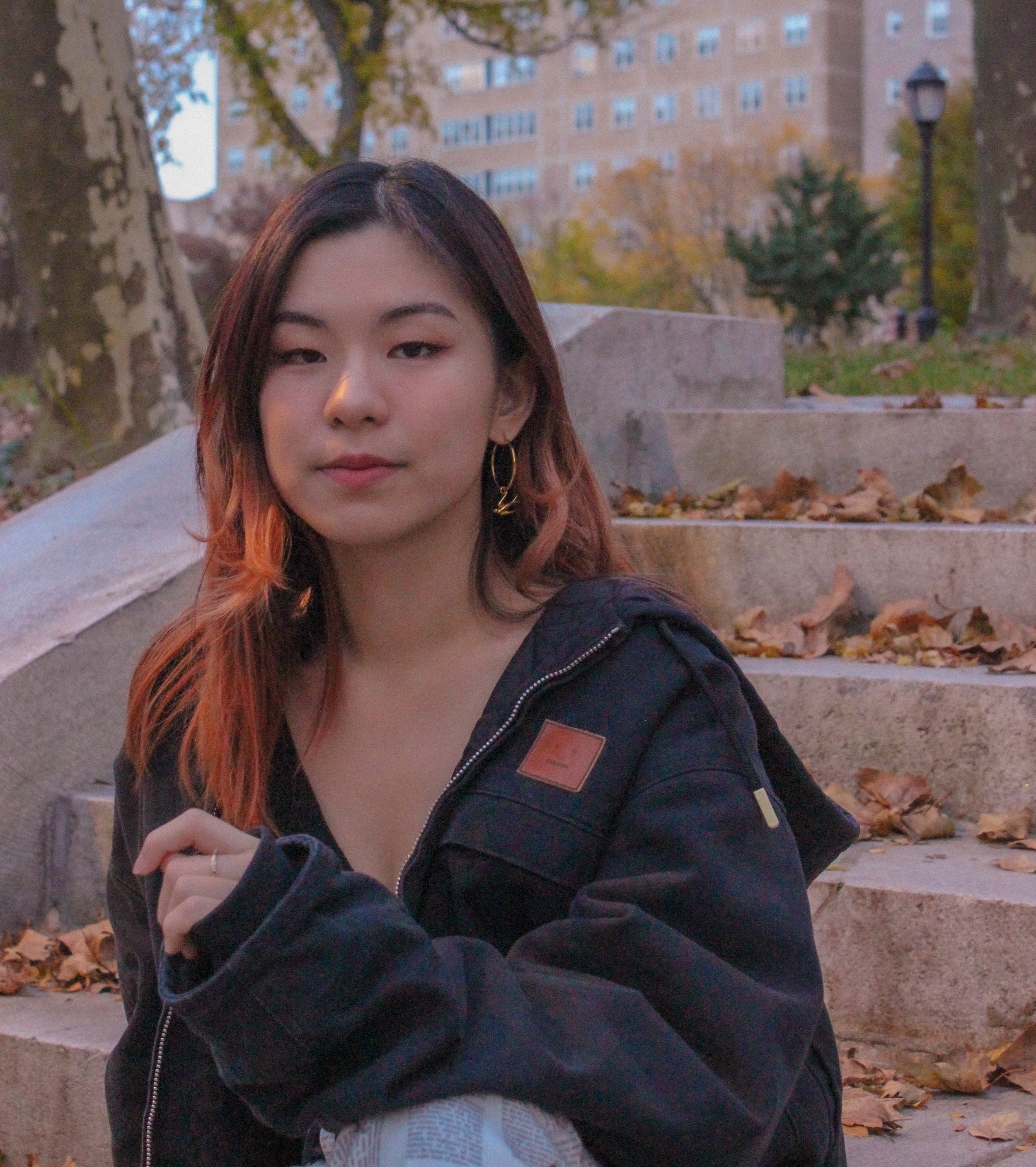
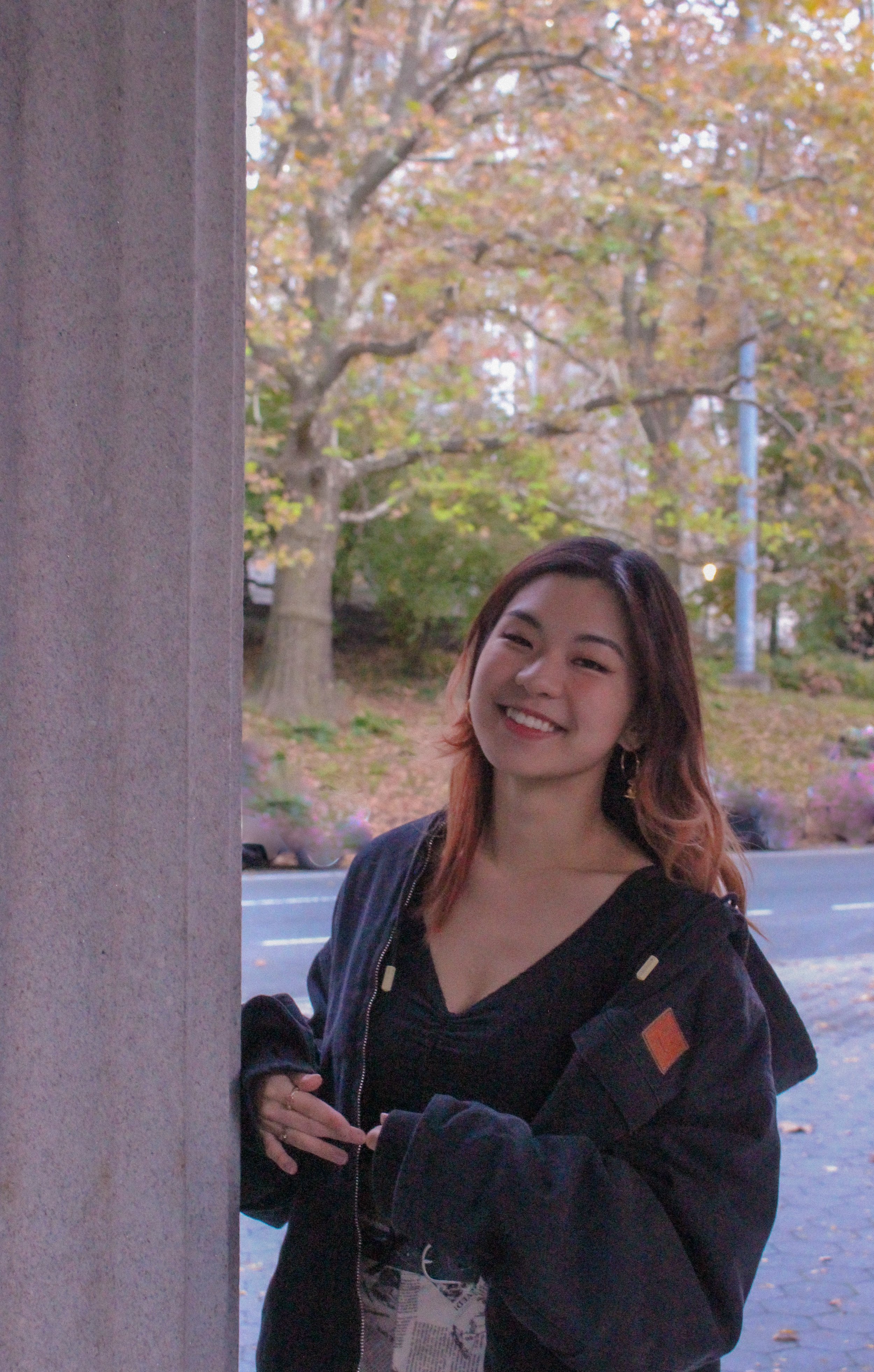
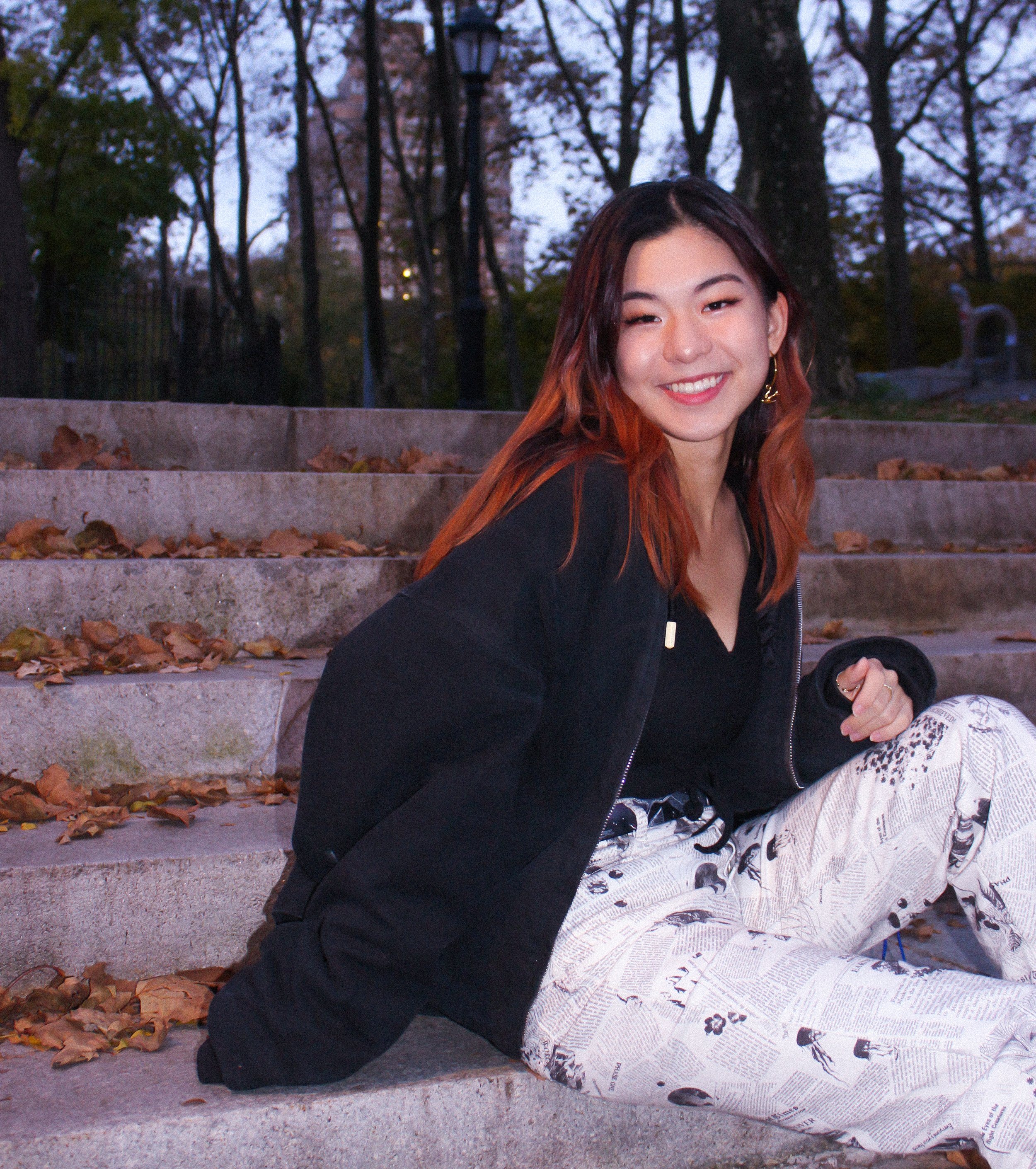
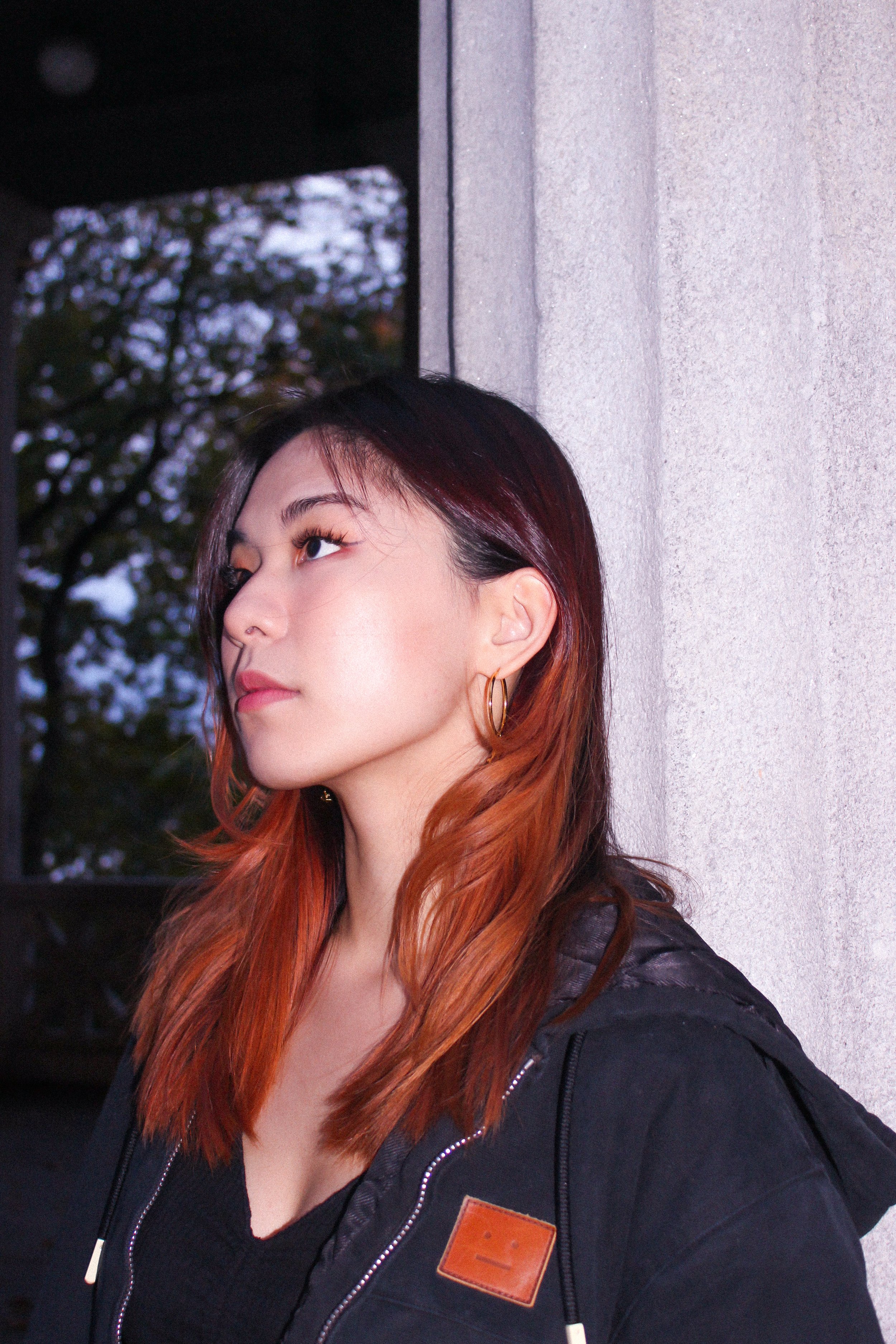
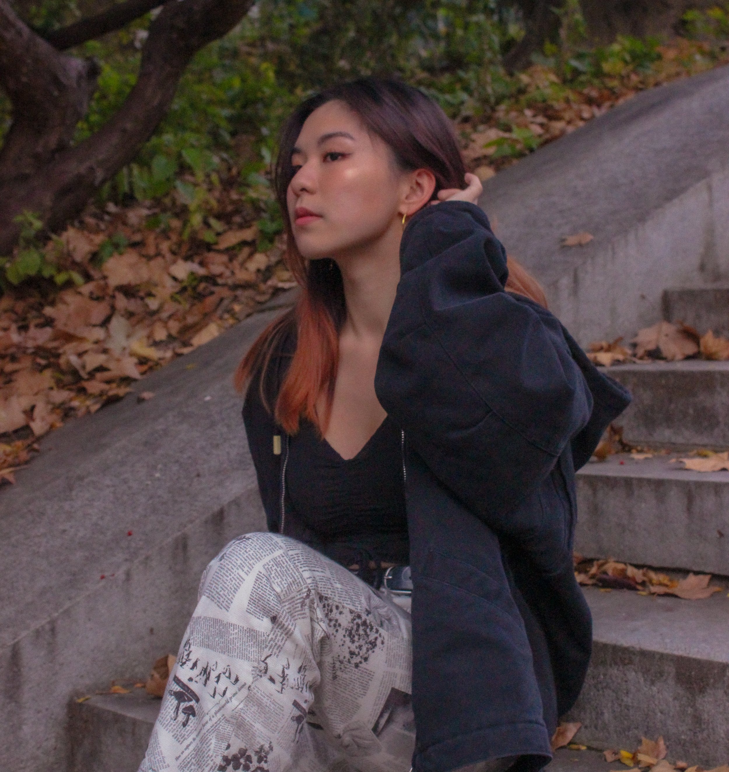
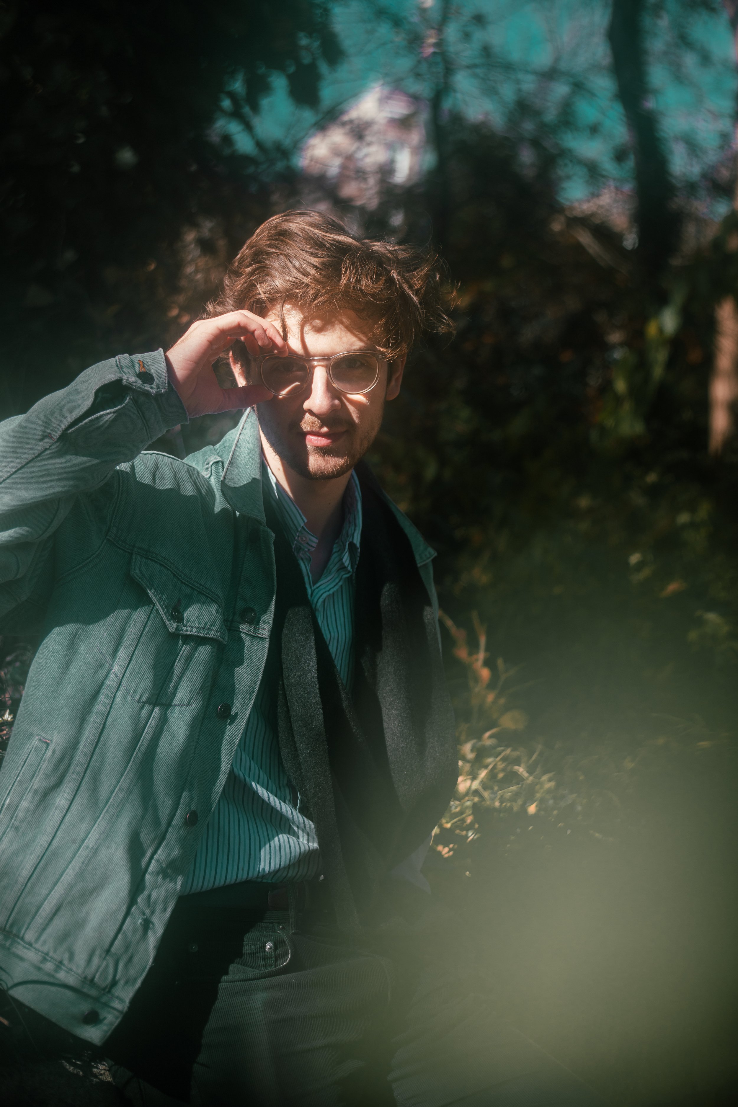
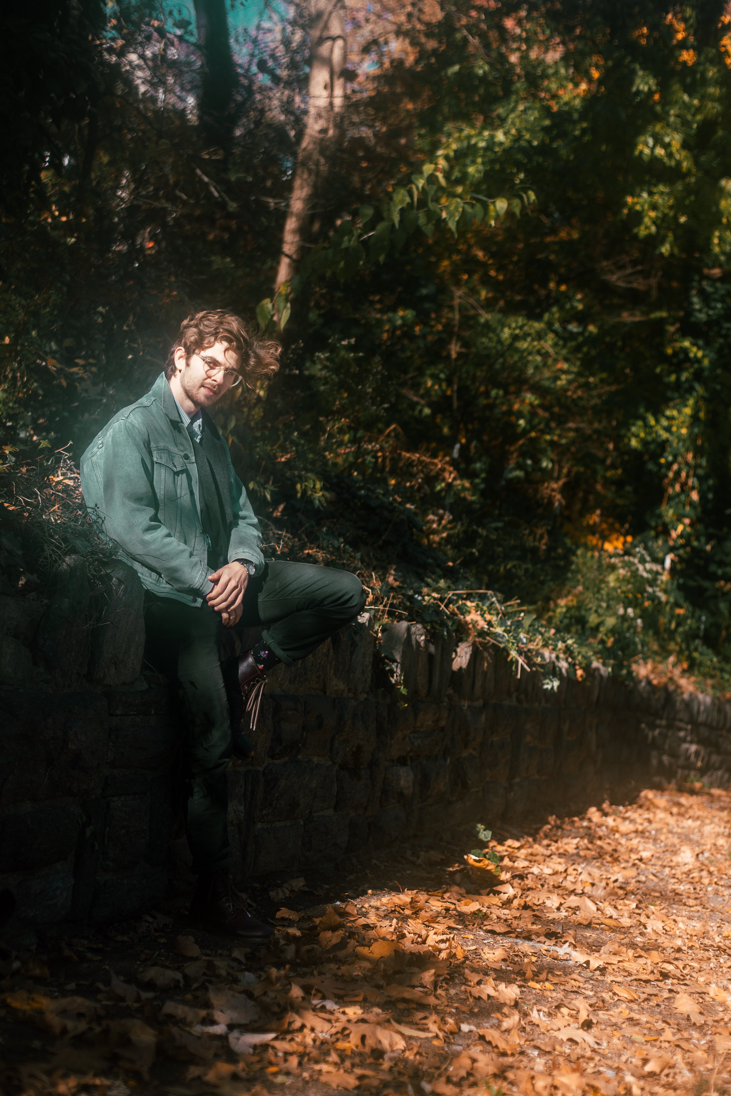
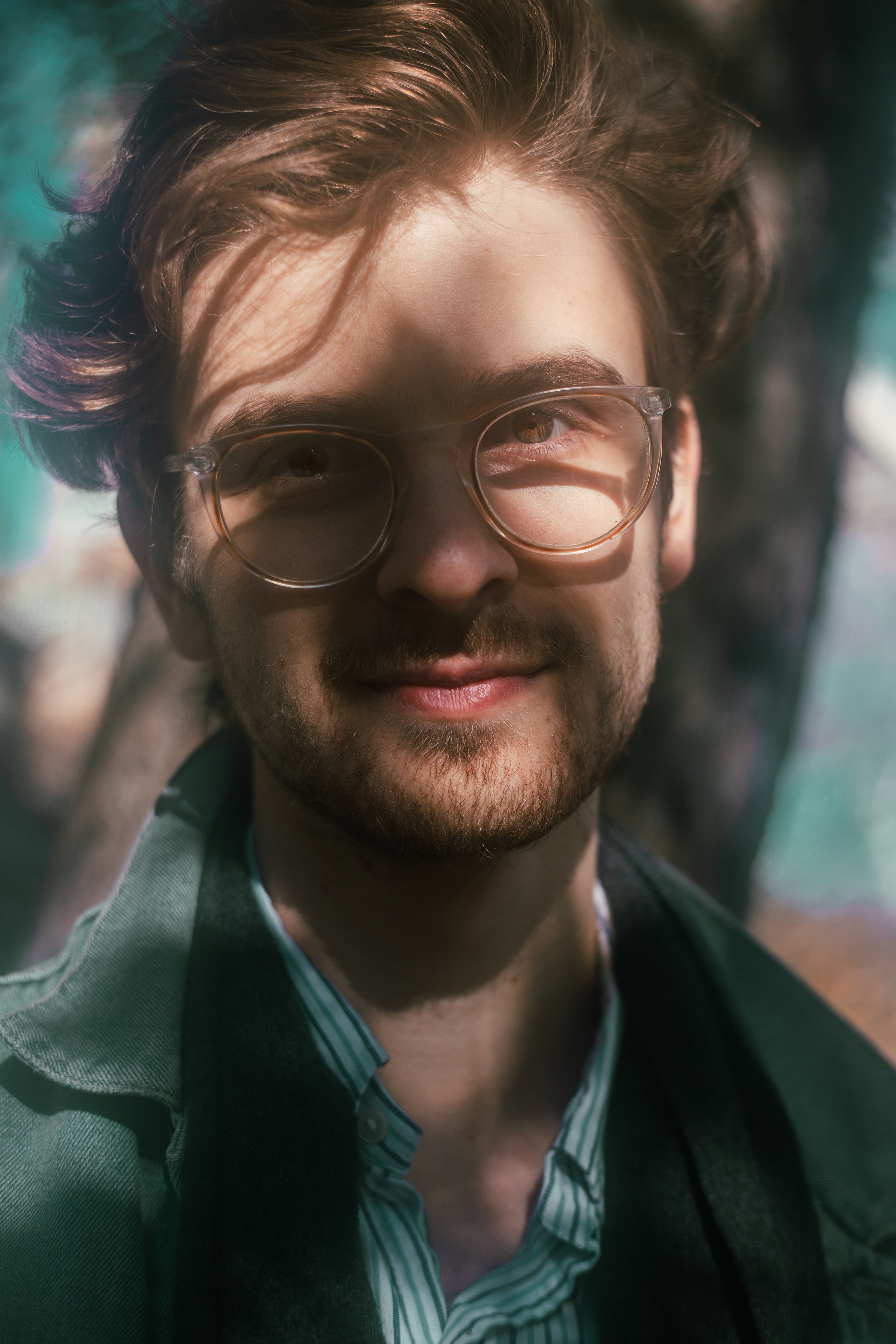
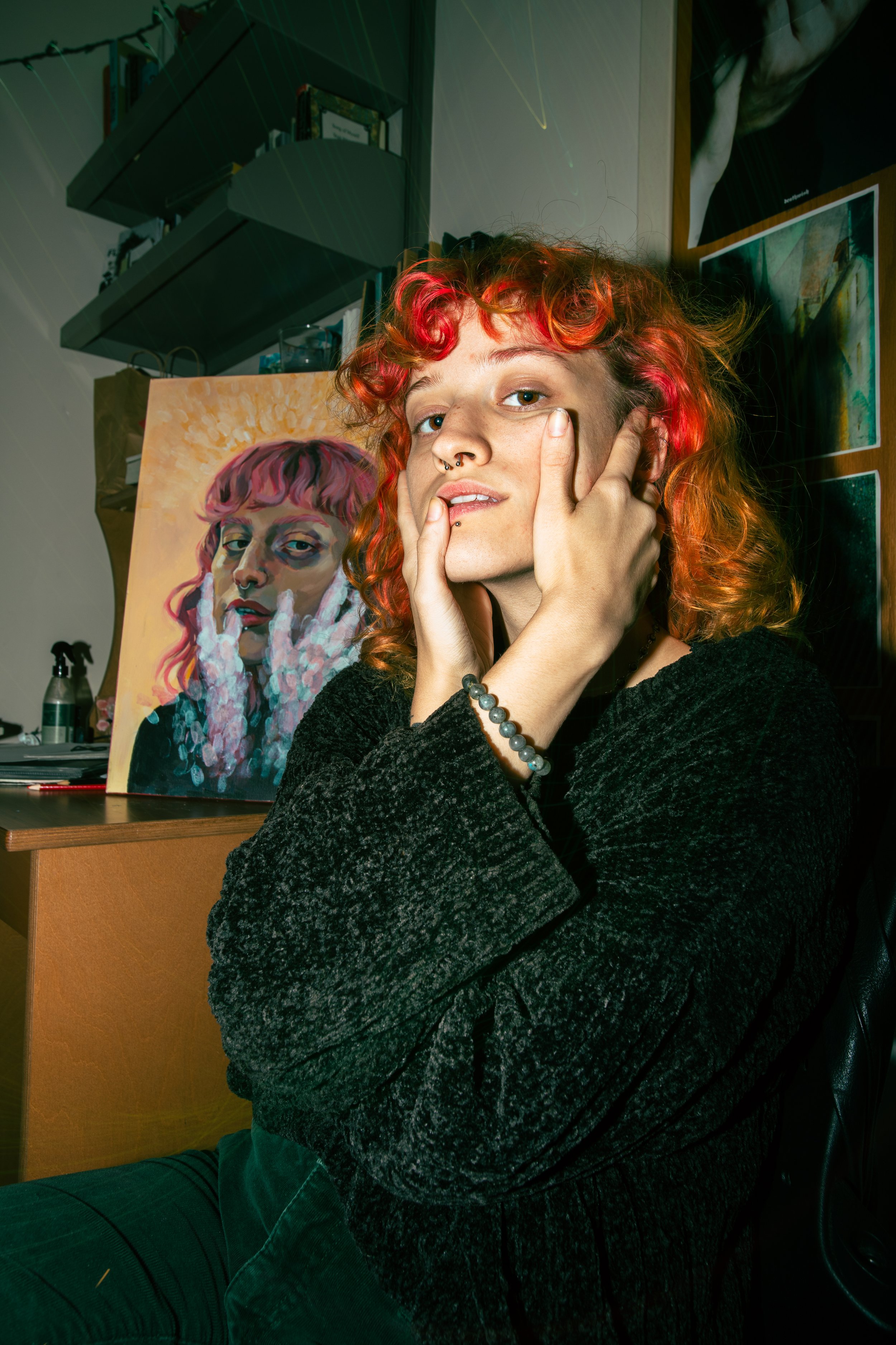
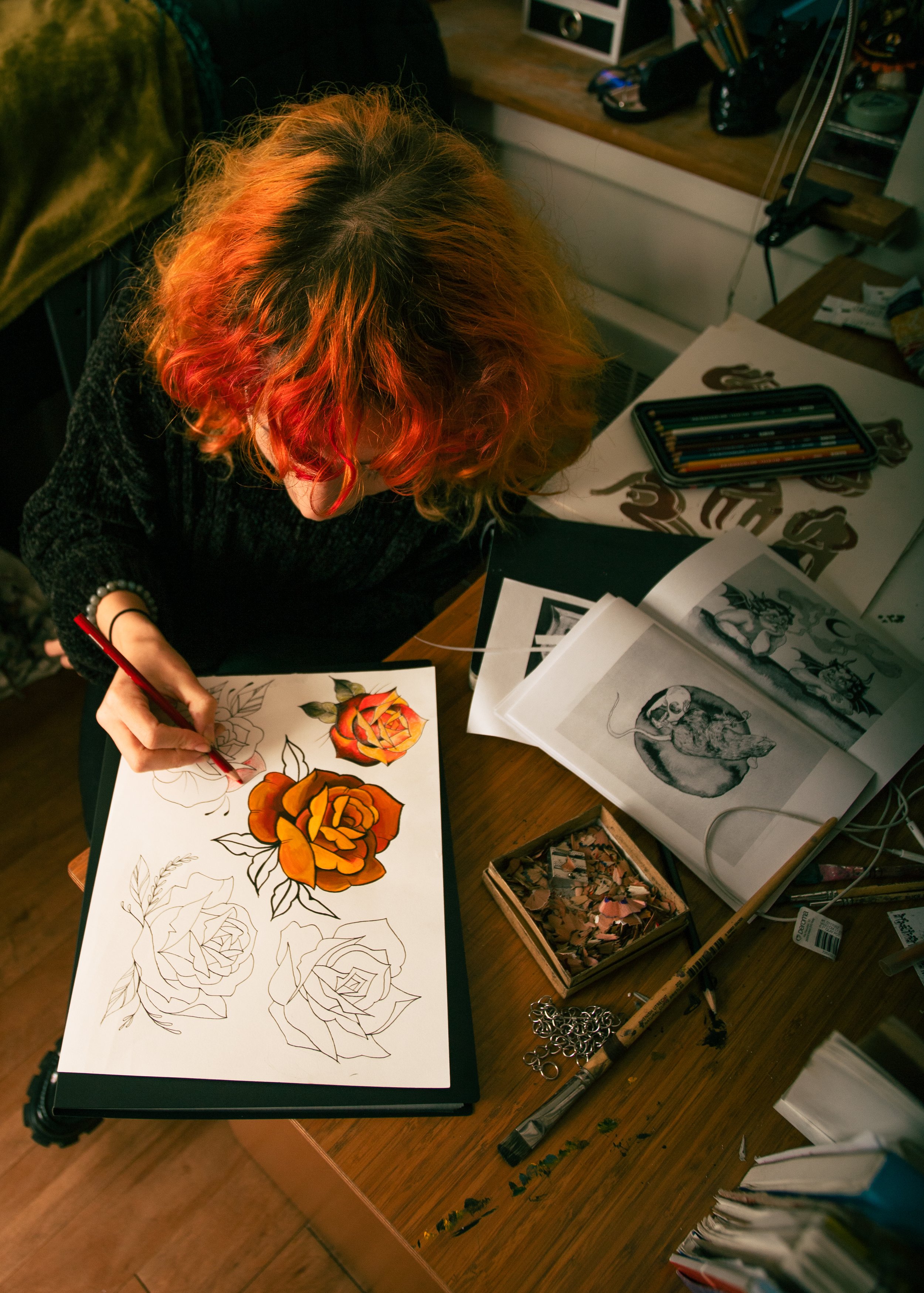
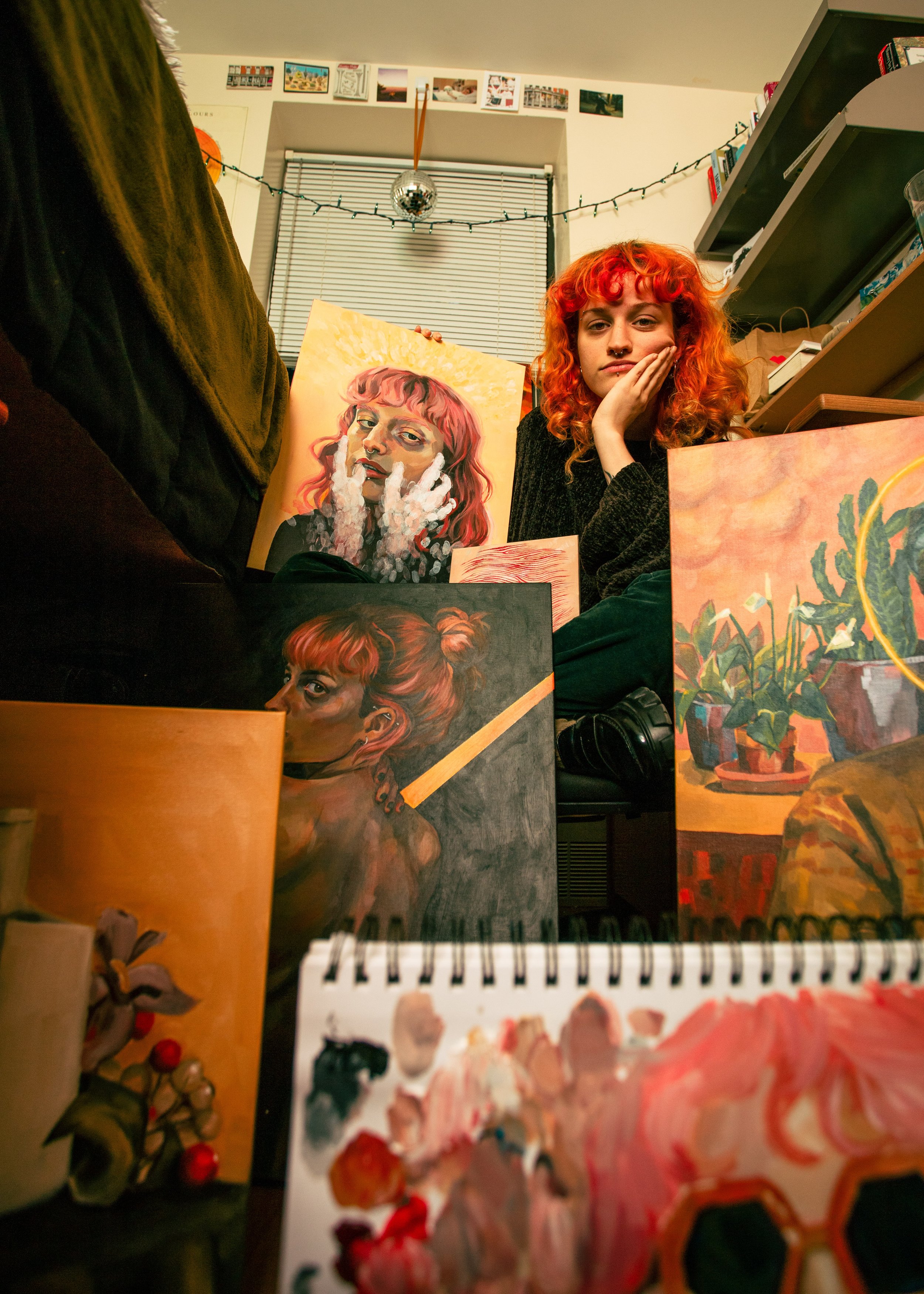
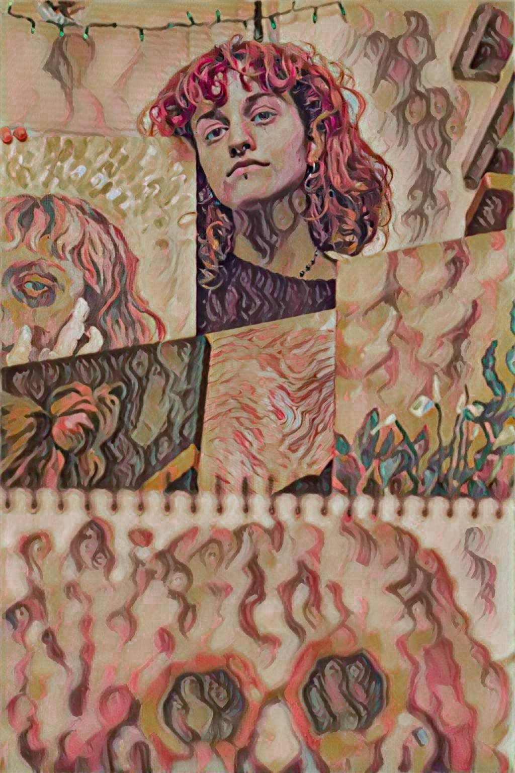
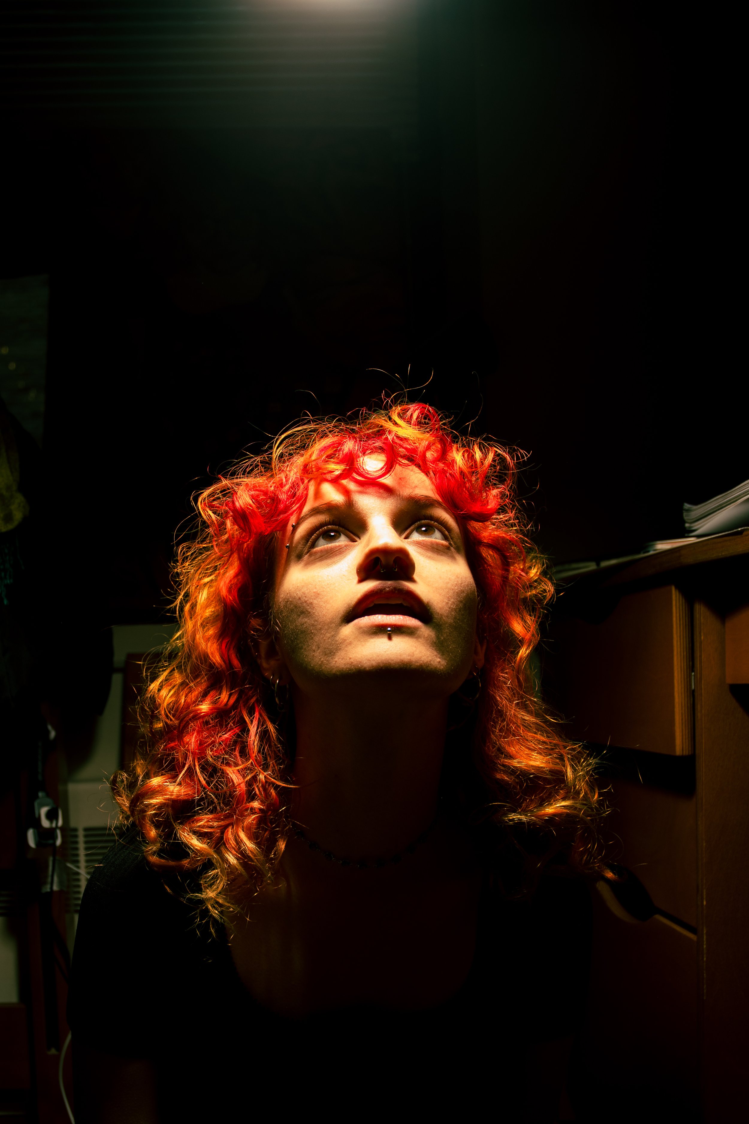
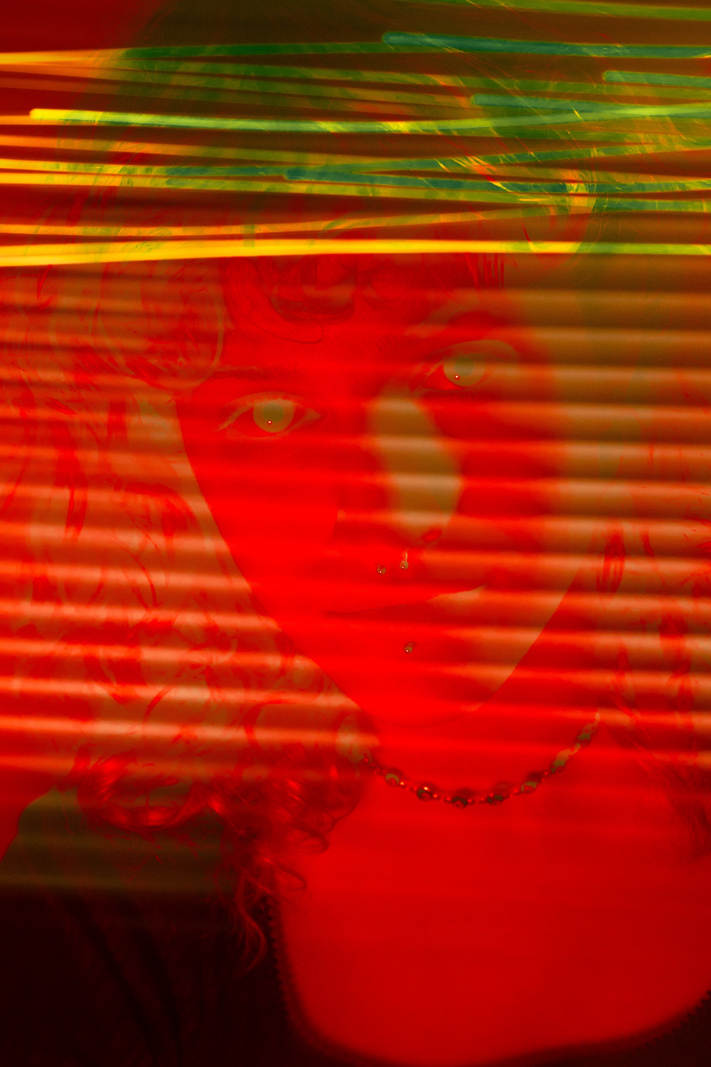
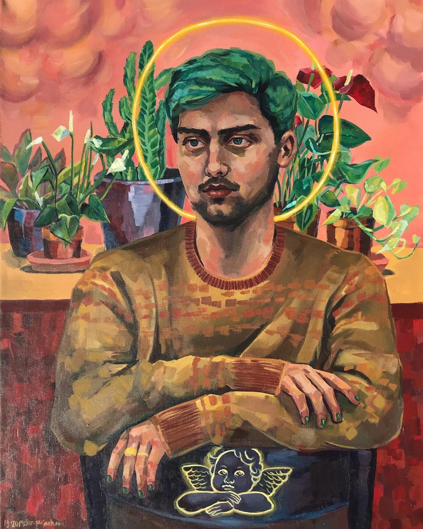
Sophie Paquette is a filmmaker, writer and student artist in residence at the Barnard movement lab. Her work explores the themes of embodiment, chance and fortune through its playful aesthetics and depictions of radical intimacy. 

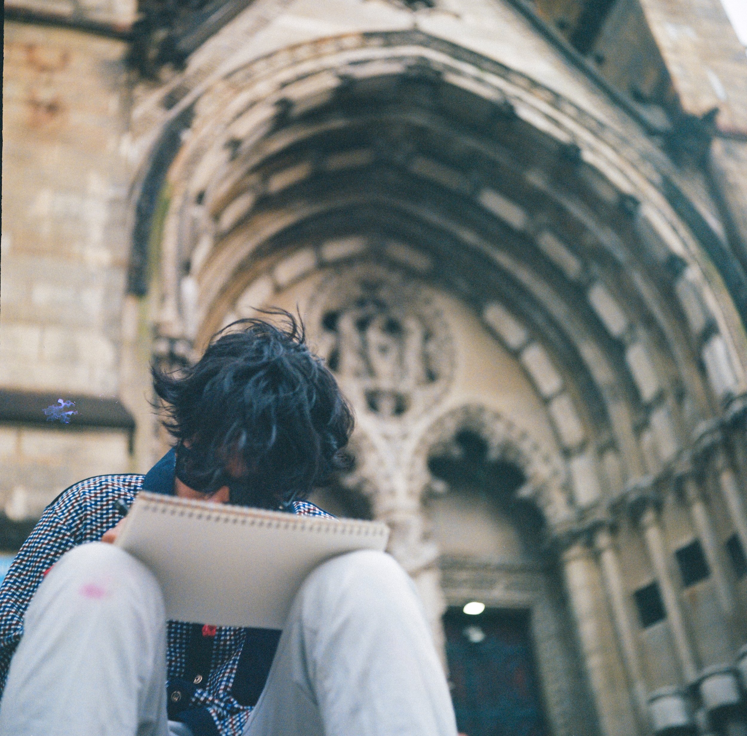
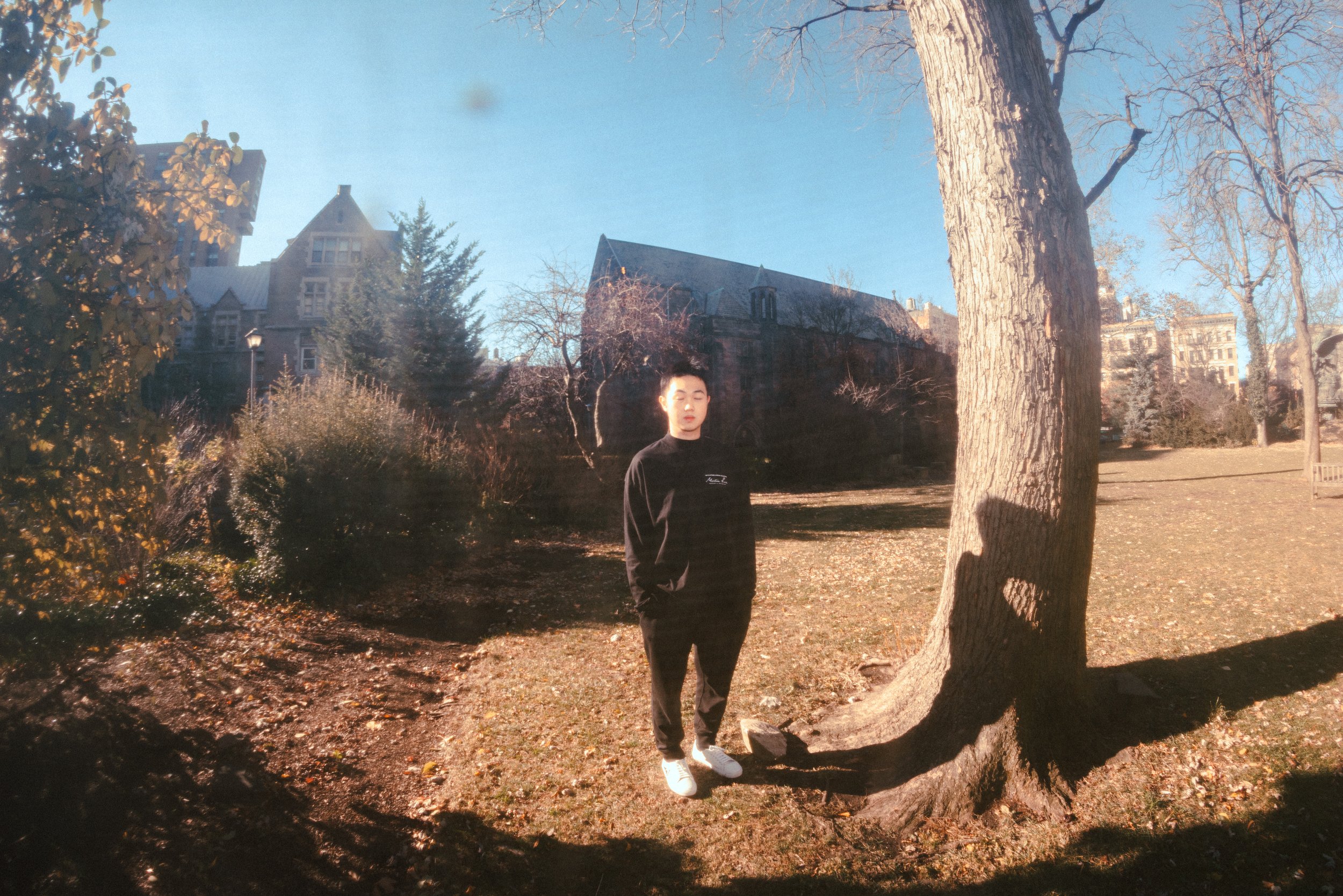
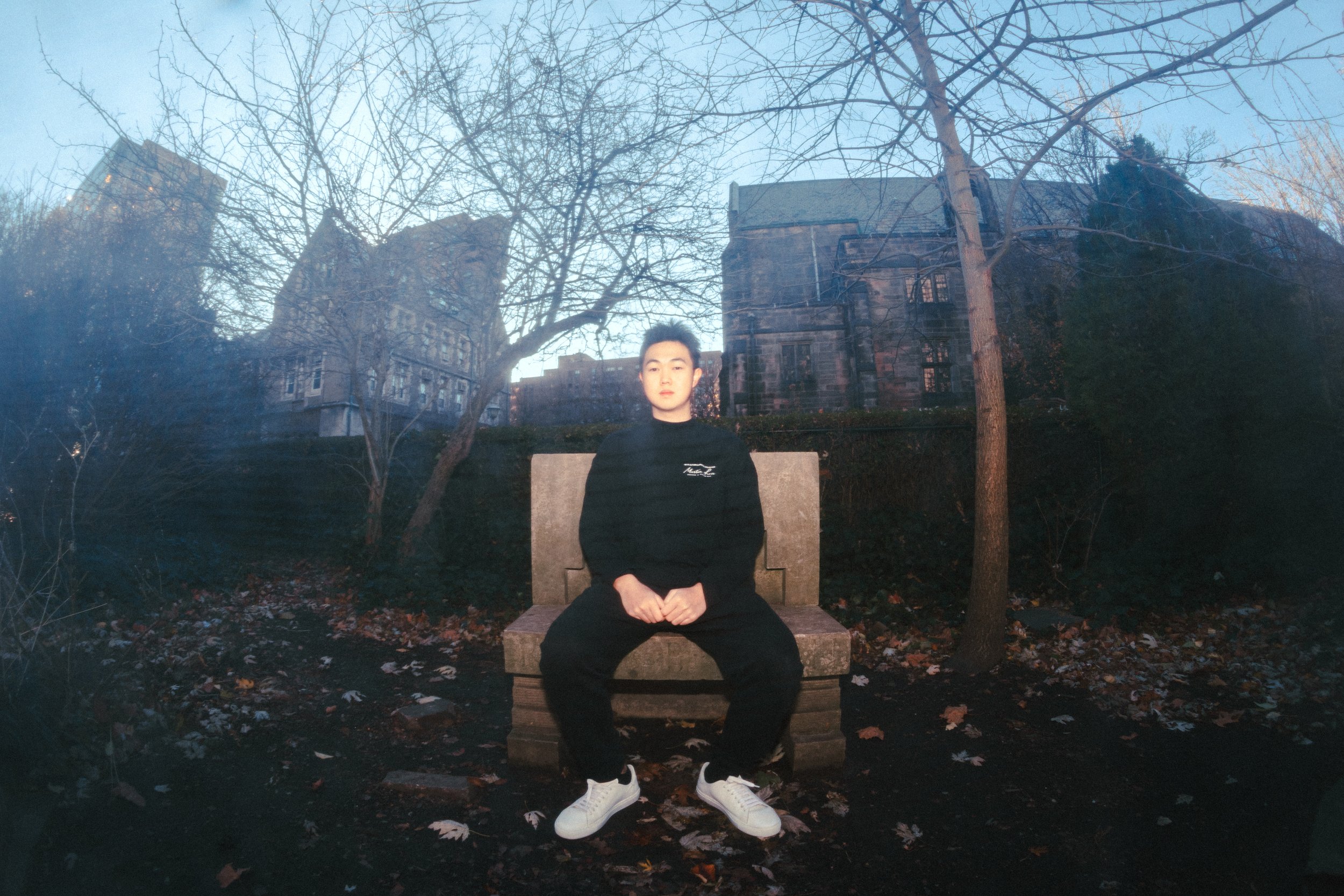
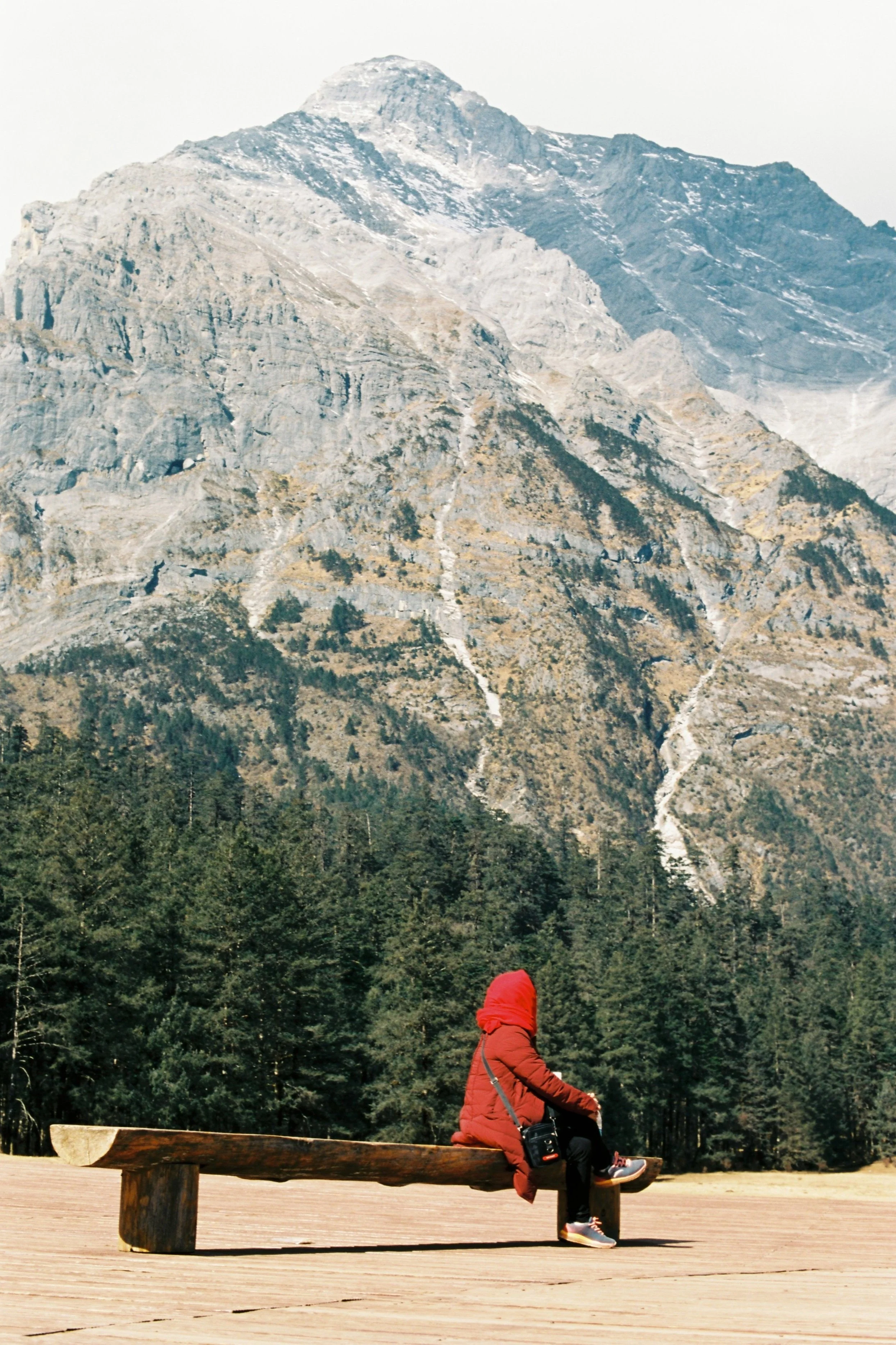
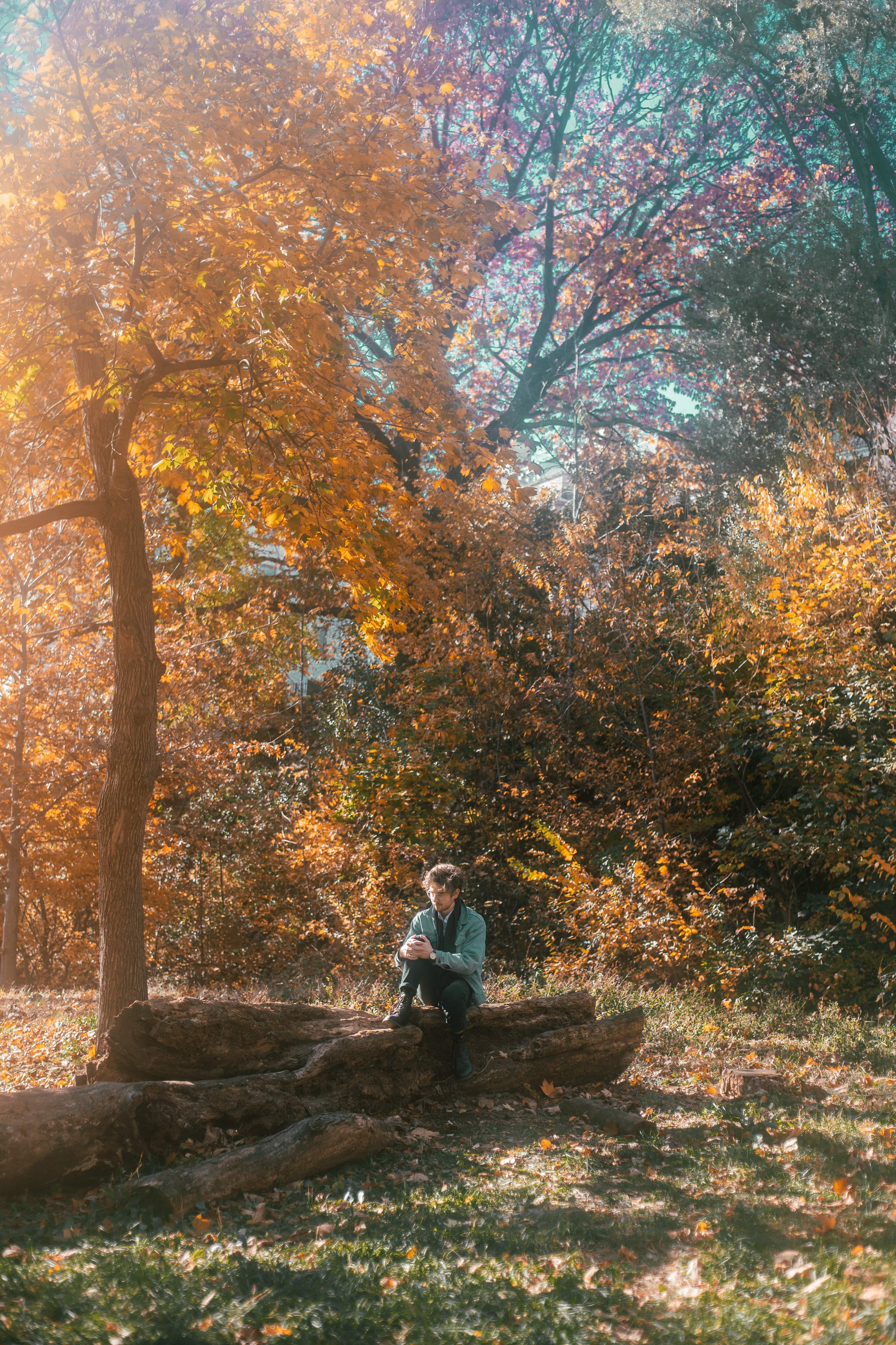
I met student filmmaker Sophie Paquette after her weekly roller-skate session in Riverside Park. As we looked for a bench––ultimately settling for the one featured in her short film: runaway––she told me she began her creative journey as a writer. The transition of her work into video format was a conscious choice, a way of rendering her process more physical: “I think I got a little antsy doing just page-based stuff. A lot of my writing was body focused, dealing with space and shape. My work was about bodily experiences, so I felt like the body needed to be physically engaged in the process of making it as well. With film, you can get your hands on a camera, you can move actual bodies in space.”

Runaway

As Sophie’s work developed, the themes it explored became deeply connected with the format it was presented in: for her, content, form and process all overlap, they are all a part of the same story. Her thematic interest shifted from dealing with themes of physicality to exploring ritual, chance and intuition—all of which she finds to be intimately connected with the way the medium of film connects with its audience. “The way we view film is very intuitive. It comes from this understanding of what it means to see things in sequence, what it means to connect a sound to an image to an amount of time.” 

While her work has a naturalistic, quotidian aesthetic, its playfully whimsical nature makes it difficult to place within the realms of reality. “All of my work exists in this weird space. I want there to be a sense of naturalism without it being necessarily realistic. There is a weird amount of coincidence and chance. That’s what I find exciting about film, finding these strange moments of fortune or chance that usually get overshadowed in real life. It’s this little magical spark.” For Sophie, a sense of magic is inherent to the multi-modal nature of film: the various elements of production come together to capture a specific moment in time in a way that cannot be replicated: “Even if I am making something realistic and narrative I still want it to have that charm of intuition and chance.” 

Out of Order

While she is comfortable with the idea of suspended reality in her work, Sophie greatly values emotional authenticity. She wants her work to feel impactful, coming from a place of real emotional experience. She doesn’t mind her work being interpreted as autobiographical, considering this just another component of presenting work to an audience: “It’s kind of funny. I performed the reading of this poem in high-school, the poem was from the perspective of a mother and one of my teachers came up to me after to ask me if I had a child. I think people want to find autobiographical meaning to performance. And that honestly doesn’t bother me.” Even if a piece isn’t explicitly about her experience, Sophie still feels like she leaves her own stamp on it through the process of making. “I do think it’s about me because I was there the whole time it was being made,” she explains. Sophie finds that her experience and her environment deeply influence her as a maker: by making the work herself, she necessarily leaves her it with own touch, regardless of subject matter. 

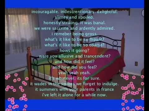
Look How I Like

Still, Sophie prefers to maintain an ambivalence in her work, and allow her audience to connect with it on their own terms: “A lot of autobiography just comes through. Writing creative fiction has kind of primed me for writing about myself.. I hope to make stuff that’s specific to me, but also has an amount of ambiguity so people can access it in their own way. ” She does not wish to limit the interpretive capacity of her viewers. While we can see her work as telling her own story, we can also find ourselves in it and discover our own meaning. As in all other realms of her work, Sophie likes to play with the degree to which her work is personal. “There is freedom in playing with what feels true to me but is not necessarily a personal experience, and how it can still occupy a character or a narrative space,” she says.

Recently, Sophie has started incorporating herself as the subject of her work. “When I was in high school, I was petrified of photos of myself. They made me feel horrible, and literally filled my body with dread and anxiety. But recently, I’ve gotten more comfortable with filming myself—part of it came from filming myself roller skating as progress documentation.” As a student artist in residence at the Barnard Movement Lab, a lot of her work started focusing on the movement of her own body and its potential for expression and exploration. She says/reflects, “I am much more confident moving in front of a camera now. Every single week, I go to the movement lab and usually end up filming myself.” 

She prefers to work in an intimate setting, mostly filming her friends and choosing familiar locations. Even when working on bigger projects, Sophie still prefers to have her friends involved. “I’ve been so lucky, my friends have been so gracious with their time and talents. That’s another reason why my work is so important to me, it represents the moment I realized how appreciative I am of the amount of support I have.” She is also aesthetically drawn to low-budget video work, finding it more physical and authentic: “I like when you can feel the hand that made it. You can feel the material elements of the shooting. There is no polished non-human sheen to it. The final product has an index of its own making.” Immersing herself in the intimate environment of the work’s production as well as leaning into the physicality of the process itself, Sophie finds each of her pieces to be uniquely aesthetically marked by their own making.

Self Care

Many of her videos feature depictions of radical intimacy, explored through multifaceted and often playful lenses. “I love pee scenes in movies. That’s basically what I structured the entire out of order short film around, having someone pee while holding hands. I think it’s just so complicated, it’s not sexual but it’s still so physically intimate. It’s also this thing we all do. It surpasses romance, it’s its own exalted experience.”

She finds inspiration for her process in John Cassavetes’ work, especially the manner in which he described his approach. “He talks about shooting with friends and non-actors, a lot of his first films are blurry and break a lot of filmic conventions. I was really drawn to this idea that even if you don’t have the best gear or technical prowess, if you care enough about the story, you can make something that feels electric.” She describes the insecurity she initially felt: “I didn’t know what I was doing. I’d never done it before. I didn’t have the same gear everyone had.” Applying Cassavetes’ approach helped her not only to overcome doubt but also to see the unique opportunities only accessible in intimate, small-scale productions.

House: a Sonnet: a Palinode

Sophie imagines her work being accessed in a close-knit setting. She tells me about a video installation she recently saw at the Whitney, featuring a My Barbarian retrospective, including the materials used for and in their videos such as masks and puppets as well as a large comfortable couch for viewers to enjoy the work from. More than just being comfortable, Sophie appreciates a viewing space that pays attention to the body: “I hate having to ignore the body to receive artwork. I don’t want to stand still to look at a painting, I always want to touch something and get really close.” She also appreciates the inclusion of material artifacts, as she sees their presence as grounding the final product in the physicality of its production. She sees her work being displayed in a similar fashion, allowing people to get comfortable and interact with it for long periods of time. 

Currently, Sophie is learning to do tricks in her purple roller-skates, listening to Mitski and reading Crying in H-Mart by Michelle Zauner. You can find more of Sophie’s work at: https://www.whereissophiepaquette.com
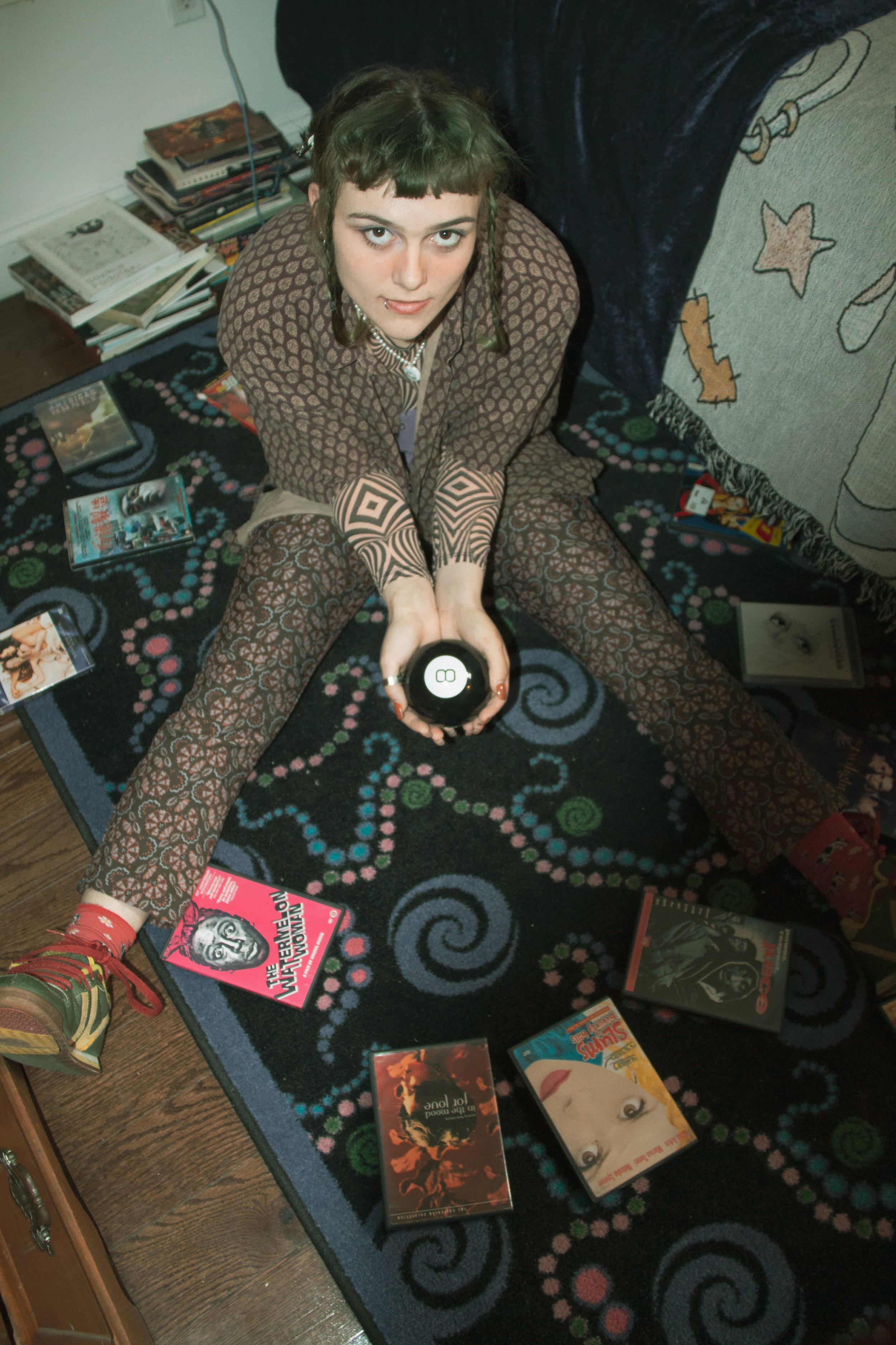
Carlos Ochoa

Feature by Cathleen Luo

Photos by Gabi Levy

Carlos Ochoa, a senior in Columbia College studying Architecture and Visual Arts, talks about the inspirations for his Goya-esque oil paintings that comment on modern issues of gender and social media. Using thick strokes of earth-tone paint, Carlos captures themes of consumption, alienation, and masculinity on his canvases. 

Carlos paints his self-portrait with furrowed eyebrows, rendering himself in moody browns and golden ochres of the classical Zorn palette. If it’s not a painting of him, then it’s other figures and characters whose anatomies twist in a moment of drama. His paintings are intense, brooding, even nightmarish at times, yet when I met with him to chat at Uris Library, Carlos was thoughtful and vulnerable about his inspirations, digging deep into the darker parts of himself to understand universal issues with body and image.

Vaquero

When I first encountered Carlos’ work on Instagram, I immediately thought of Francisco Goya’s feverish portrayals of humanity’s underbelly. Carlos is flattered by my comparison and goes on to describe how Goya’s art is “reflective horror,” something that can be seen in his own work. 

Inspired by Baldomero Romero Ressendi’s work, Carlos explains: “in very few brush strokes, Ressendi is able to completely capture the psychology of a person.” Lucien Freud is another artist that influences Carlos, though in different ways; while Ressendi paints quickly and messily, Freud puts in painstakingly large amounts of time to psychoanalyze his subjects in his paintings. 

Carlos’ process adopts this subjective approach in both his painting and digital work. Though he believes that his digital and traditional art practices hardly overlap, his approach to painting traditionally and designing characters are the same. He says: “I don't think people are that creative, we're just good at observing, and then synthesizing those observations.” Though he’s inspired by movies and video games for his digital art, the personalities he creates are derived from real people. He pulls inspiration directly from his everyday encounters: “If I meet someone that I'm interested in, I'll draw them. I'll try to think from their perspective; what does this person do? How would they react to certain situations?” He never knows exactly why he is drawn to a subject, but he runs with his interest to create an entire persona out of his observations.

Because he doesn’t always have access to live models, Carlos frequently turns to self-portraiture. Unlike many other student artists, he actually enjoys classic figure painting and drawing, and his skill in accurately rendering bodies is apparent. For his self-portraits, he looks at himself to see the ways the light hits different parts of his arm, chest, or back. He laughs and admits his process might seem a little narcissistic. 

Self-Portrait

For anyone who paints themself enough, reckoning with your own image and how you are perceived comes with the deal. Carlos says that the theme of hypermasculinity often appears in his work since it’s an issue that plagues men who grew up on the Internet. At first glance, his paintings Cake People and Parasocial look like they are feeding into a gender binary that prioritizes the male-gaze, but unpacking the discomfort that arises from engaging with his paintings reveals deeper meditations on the toxicity of hypersexuality in society. He opens up about a problem that he thinks should be talked about more: the amount of pornography that is accessible to people at a young age, and how it distorts people’s perception of gender. He explains: “Even if you're not searching for it, there's so much of it out there. I've known people who’ve been trapped in the warped reality that porn feeds them.” He finds himself still working to shed the damaging ideas about masculinity andtraditional expectations of men to be macho, aggressive, and dominant promoted by meme culture. In portraying these themes of hypermasculinity in his art, he says, “the only way I could do it was with a very literal depiction…. It's not beautiful or cool. It’s not supposed to make you feel good.” 

Cake People

He believes media like the movie The Wolf of Wall Street embodies this issue. The glorification of Jordan Belfort’s life full of money, sex, and drugs was meant to be a cautionary tale about excess but ended up doing the opposite. Everyone wants to be Jordan, the powerful, rich, misogynist. For Carlos, it’s the gluttony and vicious indulgence inherent in hypermasculinity that informs his art the most. He feels a need to warn viewers about its damaging and disturbing effects on people’s psyches.

Parasocial

When asked about how he depicts these themes of excess in his work, he replies cleverly: “Well, I use a lot of paint.” He explains that he’s noticed that there is a lot of consumption happening in his work, whether it’s people eating food, or sometimes, even each other. Figures look like they’re hungry: “We’re surrounded with so much stuff, and we always want more.” In this way, excess takes on many meanings, excess food, sex, and media in his other projects.

In order to portray this craving, he draws a metaphor to his own addiction to sugar, a playful yet sickening example of lust. He recounts: “When I first got to Columbia, I realized that you can take a fucking cake for yourself from John Jay, so I would just eat an entire cake for dinner. It's obviously not good for you, but I found myself wanting more.” This sort of pursuit of excess pleasure, followed by nausea and disgust, is a cycle that Carlos is intrigued by as a part of human nature. One way he alludes to his love for confectionaries in his art is by using thick strokes of paint because it “almost feels like food; it looks almost tasty. When I'm painting, sometimes it feels like I’m putting icing on a canvas instead of a cake.”

Lujuria

Carlos admits that his experience painting Lujuria (which translates to “Lust” in Spanish), Cake People and Parasocial, were not pleasant experiences, but he felt like had to say something about a problem that he was so aware of. 

“I’m disturbed by how normalized [addiction to porn is]. It's almost weird to not watch it. And I'm not saying it’s bad thing; it's just the sheer amount that we have, how easy it is to access, especially for young people, and there are no repercussions or warnings. You could just indulge and indulge and indulge.” 

He says those paintings were a reflection of society and his own experience. The discomfort in viewing his art is meant to warn and prompt reflection on gender and sexuality. 

Excess is evident in many of his paintings, but one that breaks from this aggressive messaging is Siren. During the first week of the pandemic, he went home to his family who just moved away from his hometown in Florida. With the social isolation of the pandemic compounded with living in a completely new neighborhood, Carlos felt unbelievably lonely. The inspiration for this painting came from a sculpted figurine he made that ended up looking like a mermaid, reminding him of Disney’s The Little Mermaid: “She must have felt so lonely when she left the ocean and lost her fish friends. That's her home. I had just moved to Texas with my family and I knew nobody in Texas.” Visually, Siren is a “simple painting with just a figure with waves, a moon, sand, and a few rocks” but for him, it captures how infinite loneliness can feel.

Siren

Staying grounded in reality is a theme that runs through his work, and it’s even evident in the color palette he uses: the traditional Zorn palette. Zorn is a limited color palette of 4 colors, yellow ochre, ivory black, vermilion (which can be switched out for cadmium red), and titanium white. In other words, the effect of this color scheme makes paintings look “real” and “old” in its use of neutrals. Few artists stick so closely to this palette anymore. To Carlos, these pigments feel “earthy, grounded, and essential. When I paint with other colors, it feels like I'm not really engaging with my world.” 

When he ends up adding other colors outside this palette, it is meant to make a statement about artificiality. The pure reds and blues that can be seen in The Cursed Party and Cake People add an eeriness to the natural and warm environment. For example, in The Cursed Party, the clowns are painted in bright, plasticky red and blue, giving the painting a sickly aura. In Parasocial, the pinks and bright blues are used to highlight the insincerity on social media and the red “Instagram-like” hearts are bright and gory, rather than cute. 


The Cursed Party

When asked about how he developed his style using the Zorn palette and his unique quick brushstrokes, he explains that he did not always paint this way: “I used to draw extremely strictly often from photos in a very formal and rigid style, very realistic, ‘objective.’ Then I had Professor Susanna Coffey who taught me to be aware of your own perceptions of the world and paint that instead.” This advice added the dynamism to his practice that is now recognizable throughout his work.

Skeletons Still Life

Carlos is aware that his paintings stir up strong emotions in people, and he knows his art brings in judgment. In reflecting on how his art might be perceived, he says: “It's scary to think about how people can react to your art. I think, for the most part, I'm pretty normal. I’m definitely not a ‘tortured artist’ but I can see how my art comes off as edgy.” 

One thing that does scare him about reactions to his art is that, though he intends pieces like Cake People, Lujuria, and Parasocial to be a disturbing warning, people might take it the wrong way. In the same way The Wolf of Wall Street failed to warn us away from Belfort’s lavish lifestyle, Carlos is scared that someone might find ​​his paintings appealing or alluring. But at the end of the day, he’s made a piece of art that should stand on its own, and he has little control over how it’s seen. 

Sewer Rats

Beyond painting, Carlos also jumps from hobby to hobby every month: this month it's welding and rock climbing. When I ask him about what he sees himself doing in the future, he says, as a Visual Arts and Architecture senior, he’s hoping to go into illustration or product design again, but he will definitely keep art on the side. “I would love to work at a movie or video game company designing characters or environments, but I would not want to make painting a full-time job.” He’s candid about his reasoning why he doesn’t want to pursue fine art as a career: “I only paint when I don't have time to paint, so basically, I always paint at the worst times possible. Like when you have an essay due tomorrow and you're like, fuck it. I want to paint. That's one of my best work happens, when there’s a rush, desperation, an outlet.”


You can check out Carlos’ work on his Instagram!

Gokul Venkatachalam

Feature by Yao Lin

Photos by Maeve Cunningham

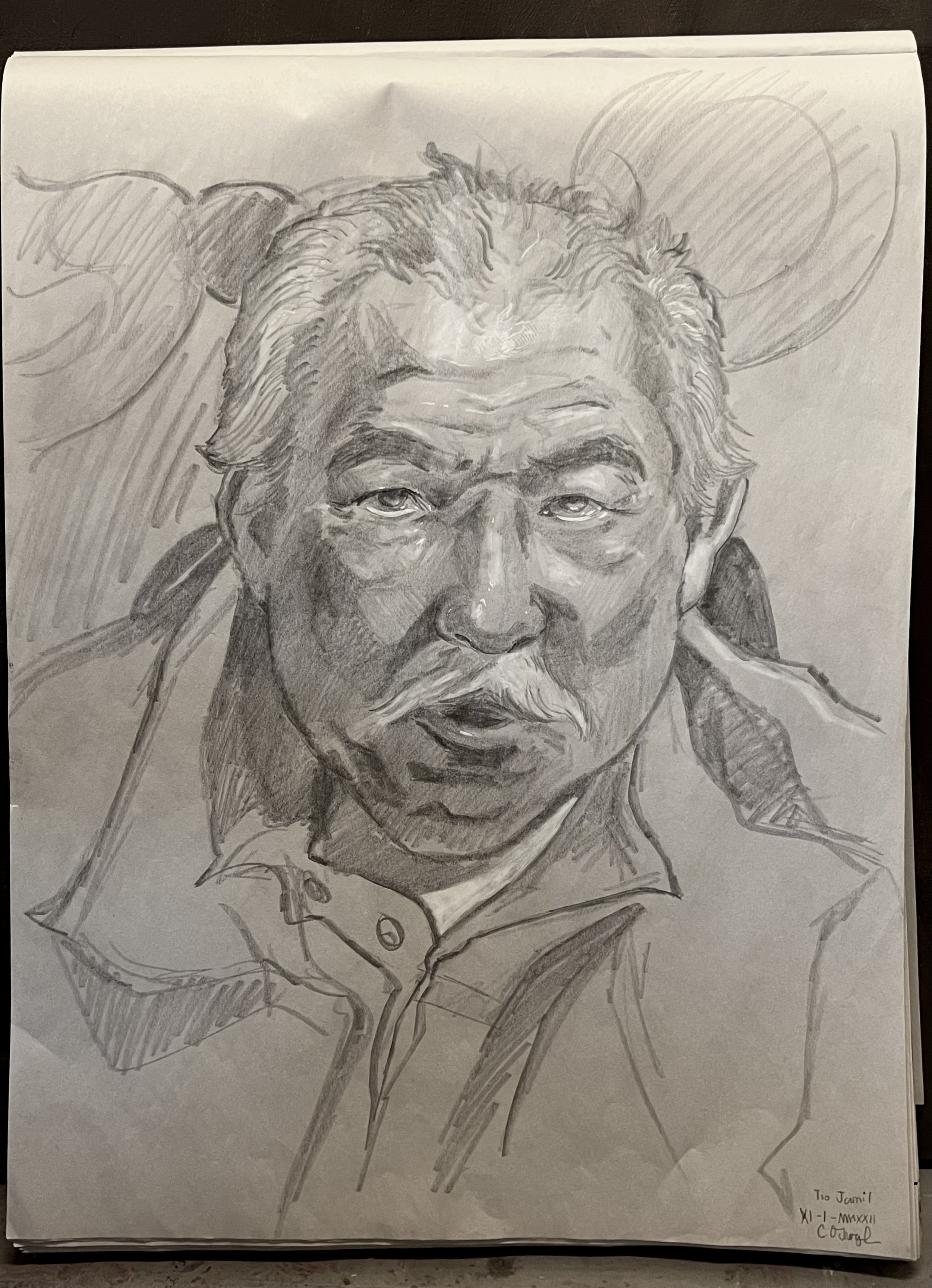
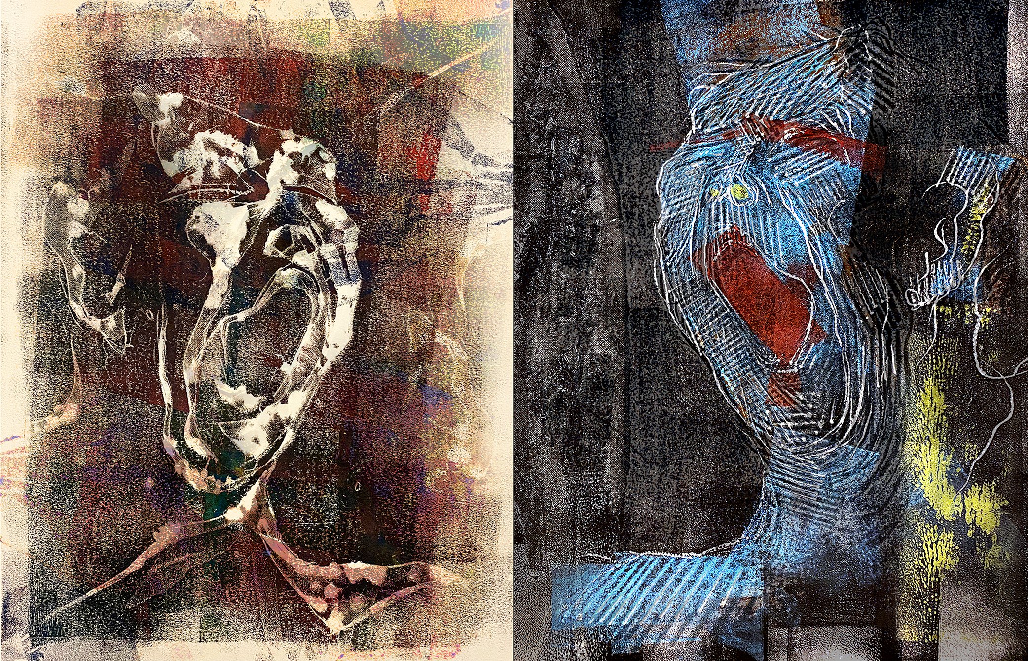
Gokul is a junior in CC majoring in Philosophy. They are a visual artist and a poet. They describe their art as a process of “harnessing and interjecting the forces of chaos onto the page.” Gokul’s art is heavily influenced by Islamic art, abstract art, and electronic and jazz music.

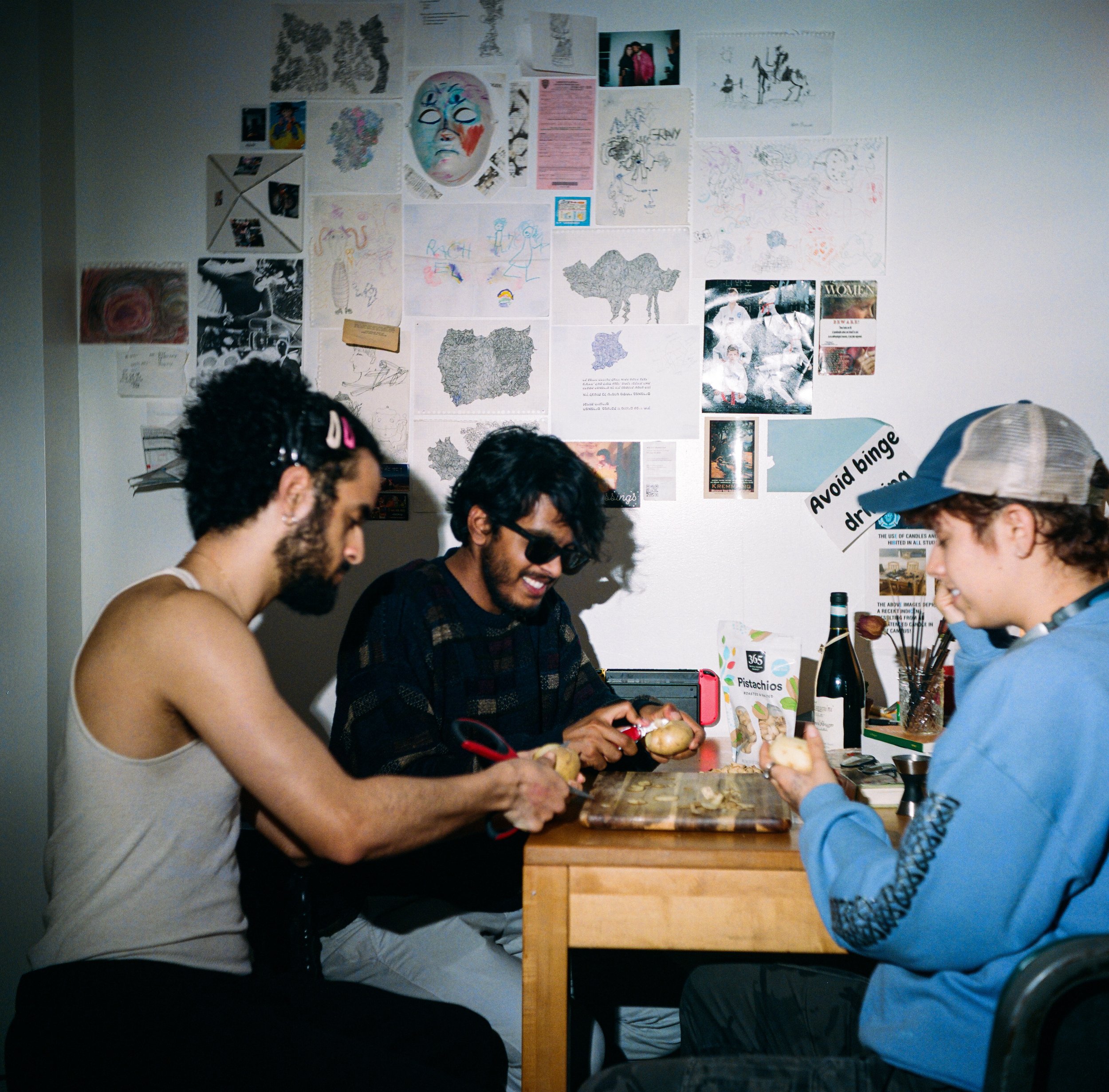
Entering 3R of Potluck House, visitors of the Special Interest Community cannot help but be wonderstruck by a wall full of collages, drawings and nicknacks hanging on the wall. There are photos of friends and family members, posters politely taken from elsewhere for demonstrative sarcastic purposes (an “avoid binge drinking” sign, for instance), and many pieces of drawings on black and white sketchbook papers. These drawings, varied in size and color, are the creation of Gokul Venkatachalam, a Potluck member, a junior in CC majoring in Philosophy, and a good friend of mine.

The decorations on the wall have slowly grown in size since the fall semester. Divided by a dinner table, the left side of the wall gradually became an enormous work of collage that documents the laid-back creative endeavors and daily lives of Potluck. Over spring break, Gokul and I decorated the second half of the wall, consisting of mostly their artworks. What I love the most among these pieces of work is a duo of drawings that I happened to put side by side. There is an accidental asymmetry: while one work is vertical, the other is horizontal. Such asymmetry is connected by their shared theme. Both of them resemble mountains, yet underneath the drawings’ loose representation of mountains, which at first sight seems to be a deluge of geometric shapes, is the core of Gokul’s work: it’s both non-representational and representational, both orderly and chaotic. Gokul’s work is a visual paradox that makes its audience’s gaze and thoughts linger.

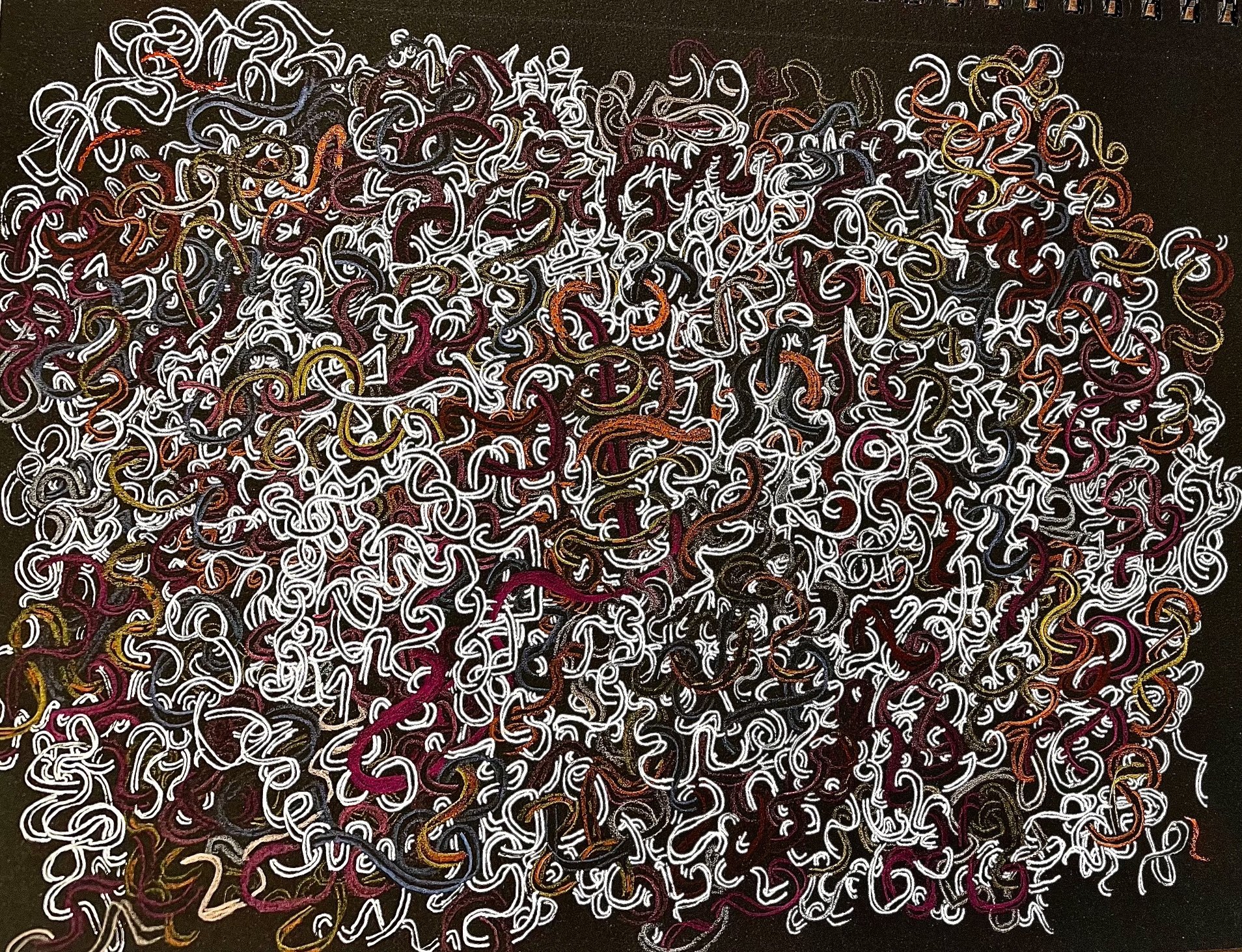
To Gokul, their work to some extent is a vessel through which the stochastic and random makeup of our universe is manifested. Chaos and order are coterminous, and their way of drawing is a method to such paradoxical madness that we see in reality. When one looks at Gokul’s art, one sees unexpectedly realistic representations out of the clusters and compositions of geometric shapes. “It's really interesting that something can resemble something so continuous and compact—very real just out of an assemblage of scribbles or triangles, or tubes and knots,” Gokul says. The random aspects of Gokul’s art are in fact coupled with a lot of intentional choices of form. In their practice, they limit themselves when producing the geometric forms, while always trying to employ negative space and be precise in the types of marks they make. Sometimes, they pursue erratic, even mistaken forms of drawing. For Gokul, these artistic choices represent a very cognitive aspect of art: “This cognitive aspect of art, I think, is often underlooked when people think about art. Being more of a process artist, and being more of a conceptual type of artist forces me to think about my artistic choices in certain types of ways. And I think my philosophical background lends itself to that.”

Although most of Gokul’s earlier works consist of black ink on white paper, Gokul has been experimenting with color recently. While they focus on exploring the textures of things that one might find strange or unsettling in their black and white drawings, vibrant colors enable them to express a wider range of feelings, from joy to morbid horror. Last semester, after seeing an etching with white ink on black canvas at the Met’s Surrealist Exhibition, Gokul started experimenting with white ink as well as metallic pens on black papers. They found themselves creating different effects with this different set of materials. For instance, the white-inked pen is less finer than the black-inked pens, therefore the lines created with it are thicker and fuller, making it possible for Gokul to work faster, try new styles quicker and experiment with their art daily.

Islamic art has been one of the most important inspirations for Gokul. As a freshman, Gokul visited the Met and was dumbfounded to find themselves immersed in a world of Islamic art. ​​Staring up at the Islamic geometry, in various tapestries, textiles, architecture, and even on the ceiling of the exhibition, Gokul discovered in themselves a passion for nonrepresentational geometric art. Gokul also found inspiration in the Abstract Expressionist movement. Jackson Pollock, MC Escher and Paul Klee among others have been big influences on their work. 

Other than visual arts, Gokul also found their passion and inspiration in other art forms: music and poetry. Alice Coltrane was one of the jazz artists Gokul listened to when they first got into drawing—they distinctly remembered that they were drawing inscribed triangles. A part of Gokul’s process is to listen to the various layers of music, and try to translate the various movements in between those layers—whether it be layers of percussion, layers of stringed instruments, or how Alice Coltrane moves her fingers on the harp. Gokul would translate the movements of the jazz artist’s musical gestures and put certain clusters on the page, or make some geometric shapes bigger than others to emphasize a broader sound. Although one might not look at Gokul’s art and immediately hear music or see the resemblance that it has with music, their drawings are an art of the act of translation of one type of aesthetic material into another type. In fact, a few of Gokul’s close friends are jazz musicians. Listening to them while they practice, Gokul would usually feel the tone and the mood, and try to express the tone and the mood through geometric translation in their drawings.

Poetry is another significant aspect of Gokul’s artistic endeavors. Along with their jazz musician friends, Gokul hosted a jazz and poetry listening party last month and performed several of their poems there. Gokul describes poetry as a process of producing a voice inside of us that we didn't know that we were even capable of. To them, this possession of the poetic voice also comes through reading other people's poetry. “When you are really, really listening to the vocal timbres of speech, it's like really, really looking closely at the way things appear to the eye. It can get to the point where you will find every object very alien and foreign,” Gokul explains. I find their understanding of poetry incredibly relevant to understanding their art. Like how they focus on controlling the geometric shapes that construct the basic foundation of their drawings, Gokul has always been imagistic and focused on the acoustics of speech when it comes to poetry. “To write poetry is to produce the sounds in your head of how people talk, and you're surprised by how full and rich those voices are that you hear in your head. Honestly, even more than the speech that you hear outside when you're on the street.” Steven Jonas and Russell Atkins have been two of Gokul’s favorite poets for a long time. Although Gokul has found them doing opposite things with language, they converge on the same musical aspect of language that Gokul enjoys about poetry.

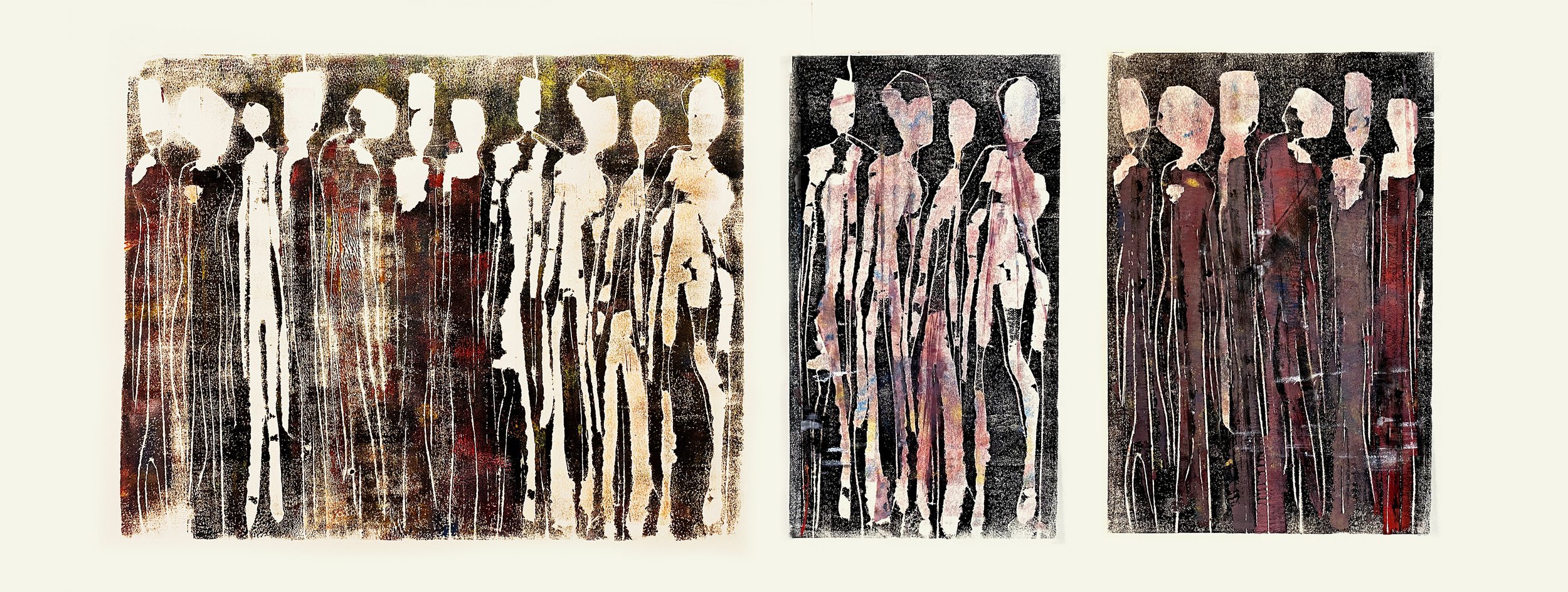
Recently, Gokul has been carrying out a collective art project. They ask others to complete drawings with them in various  settings, whether it be at a party or just a laid-back hang-out. “Art is inherently collaborative,” Gokul says, “even if it's ultimately a drawing on a page. Despite the isolated concept of me or the self, any individual’s artworks are still contingent on the various relationships that they have with the people around them. Artists are always part of a wave or a scene. Being transparent and conscious of the fact that there's a bigger thing outside of you that's responsible for your ability to produce art is very important to me.” Last semester, Gokul had other people complete a self-portrait that they had started on their own. “I wanted to really reflect the people in my life that I see myself tethered and grounded to. Because I do feel like my sense of self is dislocated, sometimes disembodied, but more importantly, spread out amongst the people that I interact with. I can't really conceive of myself in any other way. So even when I'm alone, the voices and feelings of others are always with me. I think that's reflected in my art.”

What Gokul said at the end of our conversation in reflection about art—not only drawings, but music, poetry and all forms of art—is particularly moving. “Art is a reflection or a translation, leading me to split my sense of reality. Maybe a lot of my involvement in the  practice of art is just trying to resolve the chasm that I feel between how my thoughts, the feelings are in my head and in my body, and how it is like in the external world. Resolving that internal and external chasm has always been something that I've wanted to do. And I think art––drawing, poetry, listening to music––has helped me feel more comfortable in my body, more comfortable speaking, and more comfortable expressing myself. Sometimes there are just a lot of things that I can’t express through language that visual art allows me to do so. As a person who experiences a lot of very rich and nonverbal forms of thought—non-representational forms of thought—It's my goal as an artist to show why that kind of thought matters.”

Gokul’s work can be found at @surfaces.depths

Em Sieler

Feature by Alex Avgust

Photos by Gabi Levy

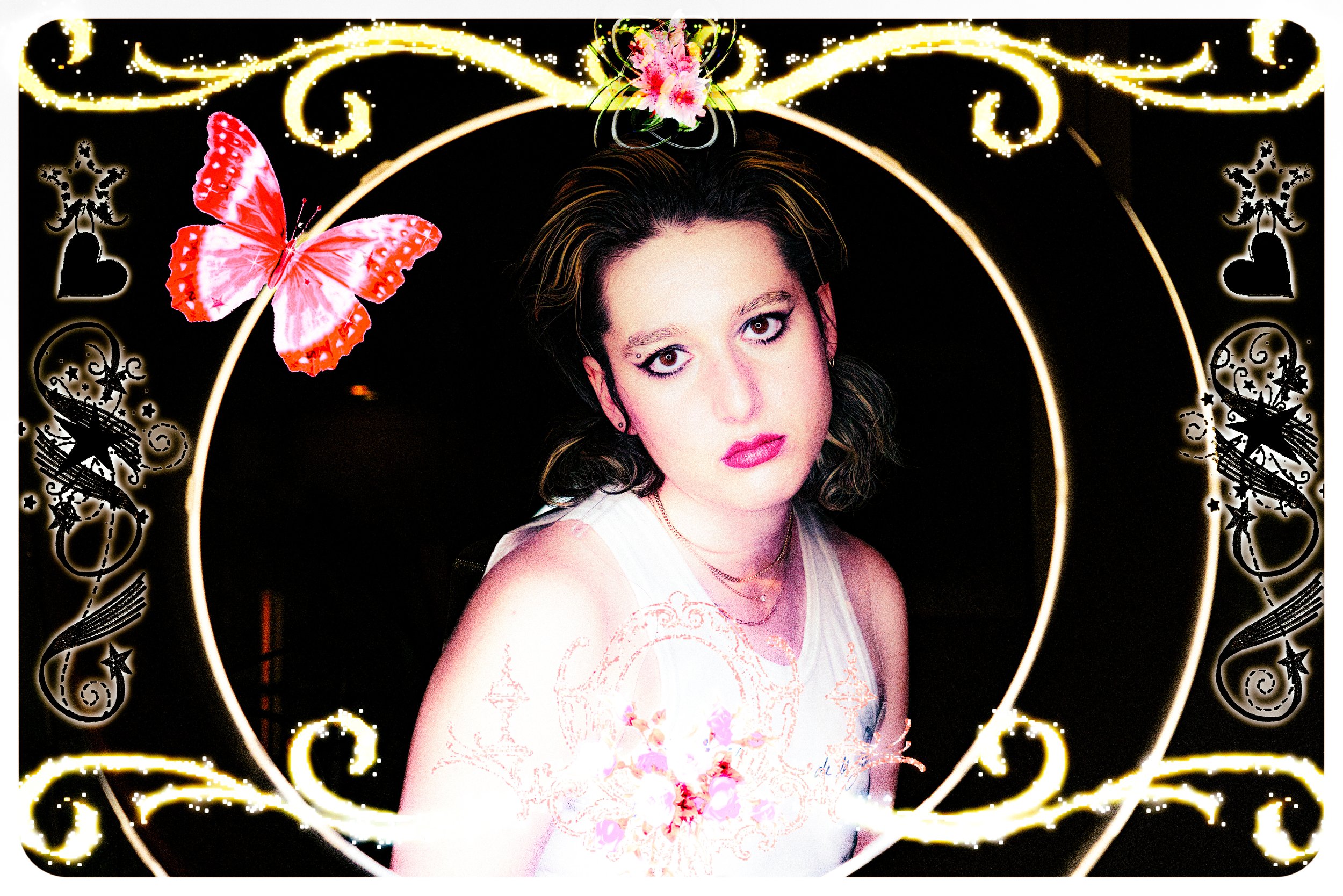
“Queer, feminist, post-internet, new media, lens based, collage, social media, attention economy, mental health. All the buzzwords.” Em Sieler tells me these are the terms they used to describe their work during a class exercise. I met Em in their cozy apartment one late evening, and after commiserating about the hectic nature of being an art student at Columbia, we started talking about the central tensions in their work. Their photography inquires into online spaces and social media, exploring the interactions between the individual and their digital presence. Their work is particularly concerned with the role they themself play in the attention economy as an artist and an image maker. 

Em creates with the awareness that most images are made for advertising purposes. “Ever since the pandemic, I’ve spent all this time on social media being bombarded with ads,” they say, describing the way they noticed commercial images selling and conflating products with identity. As consumers, we are continuously prompted to reexamine what we are wearing and what sort of people we are in the same breath, something not even counter-culture is free from: “Nozw there is the idea of being a queer Brooklyn raver person, there is influencers for that and there is brands trying to align themselves with you and be like ‘wear this brand of underwear because you’re a cool Brooklyn person.’ ” In this whirlpool of visual commodification, they base their image-making practice on the notion that “Images are not just objective, they are not just there. They are selling something to us, so I want to be conscious of what I am producing.” 

Much of Em’s work utilizes themself as a subject, tapping into the themes of self-image, self-portraiture and self-reproduction. “I would like to control the way my image is shown and consumed,” Em tells me, opening up about the way they have experienced their images being circulated and sexualized without their consent. “My body and sexuality sometimes feel out of my control, especially when I am in public. It’s something that people feel free to comment on,” Em pauses, “for some god-damn reason.”

Their work is about “controlling how my image is put out…  and not letting somebody else take me and make something of me. I’ll sexualize myself before someone else can do it, and I’ll do it in a way I wanna do it!” 

Love

Em is also interested in helping others reclaim their image in a way that feels comfortable and affirming. “I’m happy to be the queer, female-whatever photographer, cause there are a lot of creepy ass male photographers out there” they explain. Em expresses a tension between their own vision and commercial projects in this regard, balancing between the way things are “supposed to look” and what they wish to portray and evoke. 

When they are not taking self portraits, they mostly collaborate with friends: “Before COVID, I was mostly going out with friends, dressing up, and taking pictures of them just doing whatever crazy stuff that we did. And you know, just being young and depressed.” Em describes. They want their work to portray a sense of intimacy, rather than appear staged or manufactured as they are also thinking about photography as a means to construct one’s identity on social media. “The whole thing of ‘this is my image on social media, I’m doing great’: I didn’t want it to be like that, I wanted it to be real—whatever that meant. A lot of me and my friends were dealing with mental illness at the time. As we still are; as many people are.”​​ Authenticity is integral both to Em’s self-portraiture as well as their collaborative projects, their work connecting to its audience through the quotidian intimacy it evokes. It’s easy to image one’s self as simply another one of their friends, tagging along just outside the frame. 

When preparing for shoots, Em focuses on grounding themself in the emotions the work is capturing. “Getting into the body and out of the brain, as an anxious, mentally ill person, is important to me. That’s the place where I can get into my art the most and not think about it. It’s a release, that’s when it feels the most real.” They center both their art and themselves in the moment, prioritizing active––as well as physical––participation, stepping away from compulsive forethought. “I’m participating in the moment, not really thinking about what I’m going to do, what I’m going to say, what this is going to say but I’m just being in the moment with the person that I have a relationship with.” Em’s work heavily emphasizes the proximity between photographer and subject, giving the product an incredibly intimate tone. They describe their process as very intuitive, as they largely work on short term projects and rarely revisit them: “I feel anxious to just go back and be like ‘Is it done yet? Is it done yet?’ So I’ll just kind of make something in one sitting.” 

One of their important influences is Araki Nobuyoshi, a contemporary Japanese photographer, known for his juxtaposition of eroticism and bondage within a fine art context. “It’s just naked pictures, a lot of naked pictures,” they chuckle as they show me a book of his works. They were drawn to the quotidian nature of nudity depicted, in contrast with the religious and mythic nudity usually occupying museum spaces. Araki’s work made them ask questions such as “Why do we consider certain stuff porn and other stuff beautiful and art?” They are looking to embody the same stylistic features, while sparing the exploitative and voyeuristic aspects of Nobuyoshi’s work which come with the gendered dynamic of a man making images of nude women. They are also drawn to the work of John Yuyi, especially her depiction of the relationship between the self and technology, as well as her satirization of the idea of an online personal brand. Nan Goldin is another one of their favorites, especially the authentic feel with which she approaches themes of sex and gender. “I like how she shows people who are real people, who are struggling and who are not perfect, who are not the Dalai Lama or whatever. They are just her friends.” Other influences include A. L. Steiner, an eco-feminist lesbian artist, as well as Dido Moriama, whose repertoire has a quotidian, documentary aesthetic present in much of Em’s work as well. 

Lolo

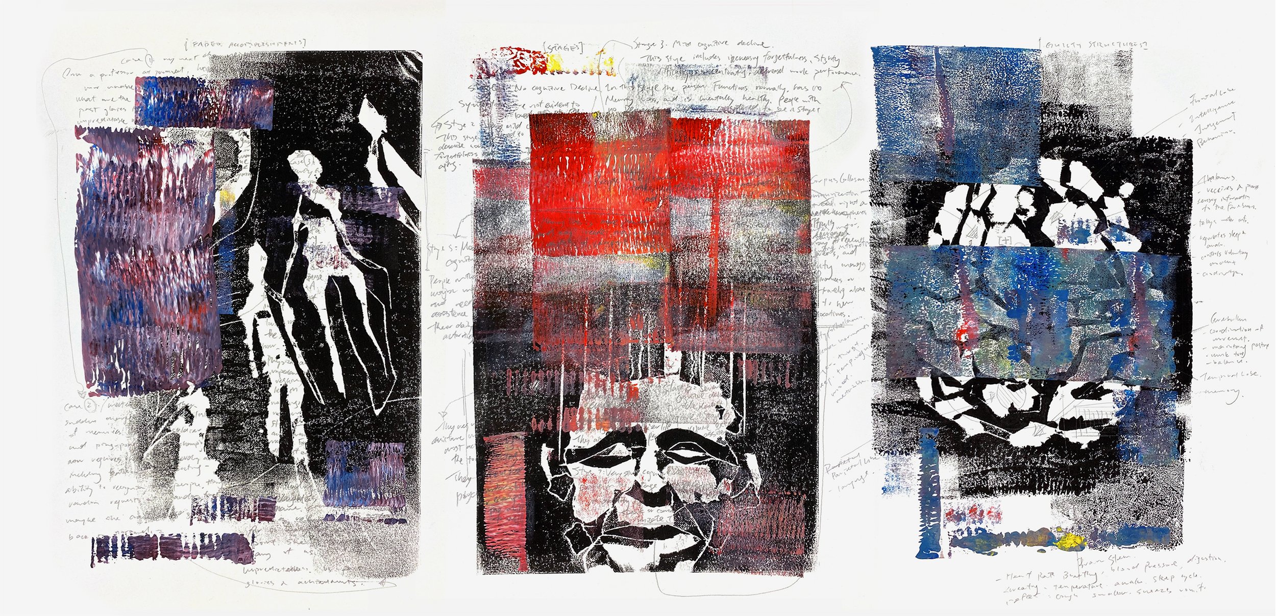
They see their work as deeply personal. “Feelings are very important, because they take up a lot of my headspace,” they tell me as I leaf through a book they constructed during the pandemic. The book is a portmanteau of charcoal writing, self portraits, candid images of environments, and fingerprints. There is a deeply intimate, almost confidential, feel in the book. It’s oddly physical, for a work that is entirely limited to the two dimensionality of its surface.

For Em, art requires a careful balance between interpretation and self-expression. They tell me about reading a quote from a studio conversation, claiming “If you need to be understood, you should go see a therapist.” Ultimately, they feel like “Art needs to say something, it says whatever is important to the person and that can be closer to home or further away. Mental health is a thing that happens to be close to home and Instagram is a thing that happens to be relatable to a lot of people.” 

Their own relationship to social media has been a complicated one. In high school, they had aspirations of becoming a social media influencer as a way of connecting with others through shared interests. Growing up in a conservative college town, they felt lonely and isolated, seeing social media as a way of celebrating self-expression. As this was how they first gained interest in photography, they consider this experience an ultimately beneficial one. It allowed them to connect with people, share their work and get inspired. Yet it was also a source of anxiety. “I took a year off from school to care for my mental health, and people from home, even people from here too, would look at my Instagram and they’d be like ‘Oh my God, you must be having so much fun, you must be so happy, you look so amazing!’ And I was like literally I am miserable right now, I hate my life. It just kind of hit me that this shit is so fake.” 

Despite its potential for authenticity and agency, social media also ended up being a place of fracture and misconstruction. Torn between being honest about their experience and leaning into the facade, they ultimately decided to tell the truth: “It made me mad that people would tell me not to say it, that it was embarrassing or shameful or that people would judge me or something. And I was like I’m working on my mental health and if people don’t like that I don’t really care about them, so. I will tell the truth.” Now, they see social media mostly as a business venture, maintaining it for networking and promotional purposes. They are grappling with the performativity of an artist’s online presence—the need to put forth an image of oneself as an artist while also remaining authentic to one’s own practice. “I am definitely aware of using social media to create some sort of cool artist image or whatever. I had a professor tell me I should keep up my social media presence, that’s how editors and galleries will find me. But I don’t like it, it still gives me a lot of stress and anxiety.” 

Despite this increasing sense of commodification, their work expresses a belief in youth and the individual creator’s ability to construct a counter-narrative. They see the role of the artist as one of reclamation, as well as open communication. “I would like my art to be the thing that starts conversations. I feel like that’s so cliche, but if I could have anything, that’s what I would want. When I get messages saying ‘Your art made me have a conversation about mental health’ or ‘It really hit home’, that stuff is why I keep doing this,” they said. “Don’t we all hope that what we’re doing has a meaningful impact on people?” 

While they may sometimes feel hopeless about the future and the increasing disconnection it holds, they also hold onto the hope that their art has meaning and resonance, making people reconsider their own engagement with social media and digital spaces, giving them a route towards imagining new possibilities of connection. 

Currently they are drinking iced matcha lattes with almond milk, wearing partially transparent colorful outfits, and learning to screen print on mirrors. You can find more of Em’s work at: https://emsieler.com
Lindsay Kornguth

Feature by Jane Loughman

Photos by Maria Shaughnessy

On the Lerner ramps, I chatted with multimedia artist Lindsay Kornguth about her visual art and music, beginning by looking at her early portraits of celebrities. From YUNGBLUD in color pencil to Brendon Urie on graphite on paper, Lindsay used to share these portraits on her Instagram in high school, hashtagging and tagging the names behind the famous faces. However, Lindsay believes these portraits are not simply a way for her to garner attention from these A-listers. She doesn’t see them as tributes to the artists, but rather as her own work. Actors, singers, bands, and fictional characters are important for Lindsay’s inspiration, not just for her visual art but also for her own career as a musician. 

(Left) Colored Portrait Study (YUNGBLUD), (Right) Black and White Portrait Study (Brendon Urie)

Since developing her skills in portraiture, Lindsay has branched out into animation and graphic design, and now majors in computer science with a concentration in visual art. However, Lindsay’s lowest grade in high school was in visual arts. Despite her parents spotting hints of a creative gene in young Lindsay’s doodles and sketches and later enrolling her in art classes, her high school art teacher did not respect her work. The teacher wanted Lindsay to make “real art,” not “cute” portraits of famous people and characters. Lindsay contests that point of view, and rather, views her work as a practice in perception; she says this herself on her website, which notes, “whatever I end up doing in life, I must somehow express my unique perception of the world.”

Black Panther

“I'm making something original. I'm seeing things the way that I see them. When I make portraits, it starts more with a fascination for the art itself, and drawing faces [...] is something that I always found extremely difficult,” she says.

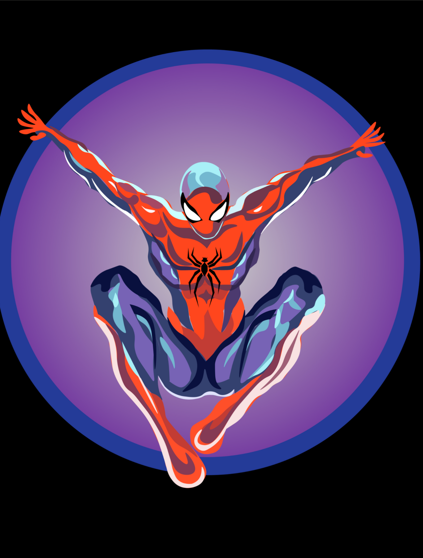
Lindsay is often eager to take on new art forms, but she can be hesitant if it does not come naturally. She used to have a grudge against digital art, but now she is a big fan of her drawing tablet, with which she recently created a Spider-Man graphic. Lindsay tells me working on a tablet feels like sketching on paper, so she didn’t feel too out of her comfort zone. Since starting college and taking classes, she has also developed an interest for animation. She created a stop motion flipbook animation of Octopus, in which you can see her combine her skills in drawing with her love for visual storytelling. 

Spidey

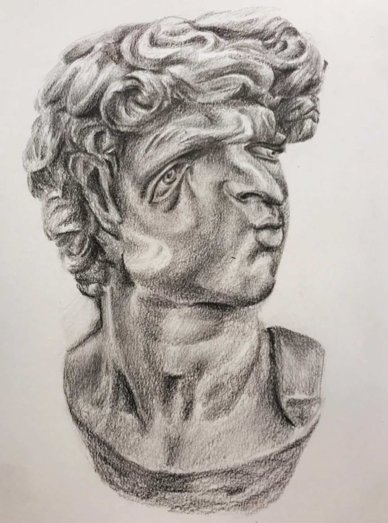
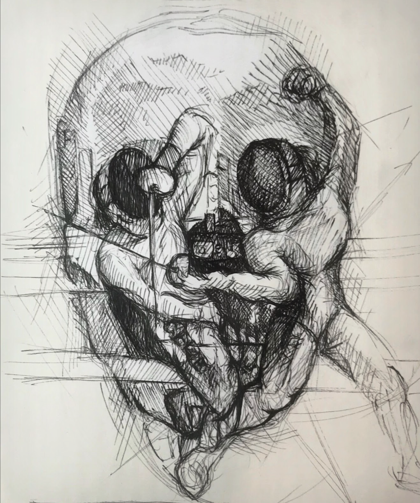
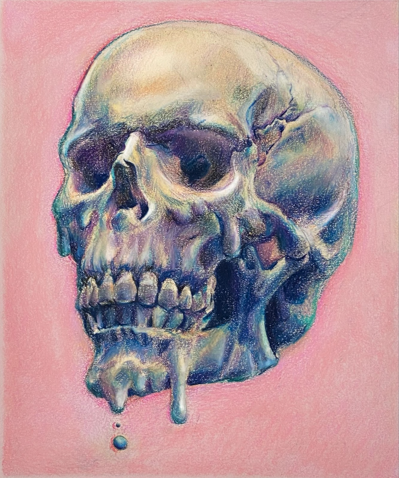
Visual storytelling is still evident in her earlier works, as Lindsay enjoys playing with traditional subjects in art. 2 Cool 4 Skuul, an anatomical study of the skull drawn with prismacolors, introduces color to a classical art training exercise. Dance Macabre features another skull, but within it is an optical illusion of two fencers. In Portrait Distortion, Lindsay distorts a marble statue using graphite. 

Lindsay values her years of art training, but she has a love-hate relationship with studio art classes. In these classes, the subjects couldn’t include the likes of celebrity portraits, much to her dismay. Younger Lindsay would find class teachings, like routinely drawing hands to perfect the bodily form, frustrating. Now, she has reconciled with her adversity to classical drawing techniques, realizing that it's part of a learning process: "You're not going to get better unless you do the kind of boring things."

The classes have paid off as Lindsay has mastered drawing the hand. Her piece Submerged, a technically complex piece involving differing textures of water, foam, and bubbles features a man with cuts on his face and hand. The mark on his hand is small and subtle, but one can feel the wound. In Detailed Texture Study, as its title suggests, Lindsay again experiments with texture, this time with the texture of dripping blood instead of scratches. “I wanted to capture the feeling of blood coming down the wrist,” she tells me, and she does create that sensation viscerally with thick lines. For this piece, she was inspired by Panic! at the Disco’s album Pray for the Wicked, the “devil’s key,” and gore featured in Brendon Urie’s music videos. Though she takes inspiration from outside sources, Lindsay has found personal meaning in her drawing’s symbolism: “The fist feels triumphant, and it's covered in blood, which is kind of gory. It was more this idea of getting out of something painful. To me, the key represents new opportunities, new paths, and moving forward.”

(Left) Submerged, (Right) Detailed Texture Study

Music, particularly album art or music video aesthetics, forms crucial inspiration for Lindsay. Inverted Recreation is, as the title suggests, a recreation of Missio’s cover art for their song 'Everybody Gets High,' drawn as a photo negative and inverted. For a recent graphite drawing, Living Vicariously, Lindsay uses visuals from Muse’s music video for ‘Won’t Stand Down.’ She plays with the idea of control and technology: “the hand is not like the one that's playing. [The machine] is playing the hand that's playing the piano, which I thought was kind of trippy.”

Living Vicariously

Inverted Recreation

Lindsay finds her relationship to music and her connection to art very similar. She describes the two practices as being “locked-in”,  both with “rhythmic” and “repetitive” qualities After playing piano for thirteen years, she moved over to the guitar, picking it up very quickly with her musical background. She started a punk rock band—The Blowouts—at Columbia in her first year, but since the pandemic began, Lindsay has been focusing on her own music, uploading covers to YouTube. She was discovered by the record label 11:11 Music Group after her cover of Glass Animals’s ‘Heat Waves’ garnered tens of thousands of views. Together, they mixed the cover for Spotify, and it now has over 180,000 plays.

“So that's how that happened—it was just exciting. But other than that, I haven't been dropping a ton of music, so it's funny because I've got like one song on my Spotify.”

Lindsay does have original music on her Soundcloud, both songs having her own cover art designs. During quarantine, when Lindsay was cooped up in her music studio, she reflected on how life had changed drastically at the beginning of her formative college years. So, with MUSE as an inspiration, she created the alternative rock piece ‘THUNDR.’ Making the song allowed Lindsay to develop her range as a vocalist. When she sang for The Blowouts in a more punk manner, her vocals in her ‘Heat Waves’ cover are soft and dreamy, while in her original songs ‘GHOST’, it’s energetic, and in ‘THUNDR’ it’s moody. 

Music was an escape for Lindsay during quarantine, and she felt that the isolation was essential for her creativity and flow. Moving back to New York and experiencing the city opening up again complicated her ability to make music in the same way. “Going insane in my room is the main inspiration for a lot of the art that I made. I didn't have as much of that type of setting [when I moved back here], which I thought I needed to make art. I thought I could only create things if I was locked up somewhere.” Lindsay is currently working on adjusting this attitude, as she realizes that that kind of isolated lifestyle was no longer sustainable. Now, she believes that by giving herself space and time to reflect, “things will come naturally.”

As an artist, Lindsay sees no limits to her creativity. She is often questioned about how she has many artistic endeavors, that it sometimes comes across to others that she has “no idea what the hell [she] want[s] to do” with herself. But Lindsay does have an idea: she hopes to employ her drawing skills as an animator, all while keeping up with her many other artistic practices. To Lindsay, artists shouldn’t feel limited to one area or medium. Inspiration comes in many forms, and ideas need to have the freedom to be executed in a variety of ways. Making art is like an addiction, she tells me, that surpasses any one medium.

You can keep up with Lindsay Kornguth’s work on her website and reach out to her for commissions or collaborations through her Instagram, @lindsaykornguth.

Lauren Zhou

Feature by William Lyman

Photos by Dennis Franklin

Lauren Zhou is a sophomore at Barnard College. Her photography revolves around personal photojournalism projects with the aim of storytelling. 

In the far corner of Hex and Co.––where the walls are covered in different iterations of Scattergories, Codenames, and Catan––I talk with Lauren Zhou about her camera. It’s a Canon 5D Mark II, covered in scratches and missing the top button. It’s the same one she’s had since 2016. Despite its imperfections, Lauren talks affectionately about her long history with the camera. “It's literally been with me throughout this very long journey of me navigating my relationship with photography,” she explains. While she likes to constantly redefine her relationship with the art, one thing has remained the same: making the camera so much more than a missing button, but an object of her own personal mythology.

Currently a sophomore at Barnard, Lauren began experimenting with photography in middle school. She describes photographing landscapes she found pretty, or taking portraits of friends. Eventually, however, she found more meaning for the practice, focusing her efforts on personal photography projects with the aim of storytelling. However, the road to this conclusion wasn’t easy. Lauren describes a series of collections that changed her, along with the ebbs and flows of inspiration, finally leading her to now––where she feels more in command of her craft than ever.

Born in the U.S, she moved to the Philippines when she was seven which shaped her artistic journey. “My photography would be completely different if I wasn't raised in the Philippines.” Towards the end of her high school years, the stress of college applications and leaving the Philippines loomed. “I was really anxious all the time. I was waiting on college applications to come back. I needed an outlet for all of my anxiety.” Lauren explained, “so what I decided to do was to just walk around Manila and take photos of strangers I talked to.” This became her first major photojournalism project––interviewing and photographing people she encountered in Manila.

The series made her feel a lot more connected to the Philippines: “the photosare a way for me to look back on and remember my home for so many years.” The Philippines - 2019 series was Lauren’s introduction to the world of photojournalism, a practice which helped her better understand her city and her relationship to photography. “When I'm in a city, I look for its character and the things that distinguish it from other cities. [In Manila] the people are so bubbly, kind, and welcoming. And I saw that when I would interview people and they would talk about their family.” She remembers thinking: “I'm gonna miss this country so much.”

Following the Manila series, Lauren adapted this interview model for future projects. After coming to New York, she finds opportunities to interview and photograph any characters that stand out to her. “There's this one photo on my New York series of this man who would sit near the window in Starbucks every single day and he always had a different book. He was just the nicest person ever, and now, he’s not a stranger.”

Yet, commissioned portraits during graduation season posed a challenge to her enjoyment of photography. “During grad season last year, I really lost inspiration. I was doing it more for the money than I was for the actual artistic expression. I was asking: does this really have meaning for me?” Many artists struggle with the idea of monetizing their work, and for Lauren, this meant the creative outlet she has always returned to during hard times became alienating.

“After grad season, I stopped doing photography in the summer.” Lauren explains. Only after her grandma’s passing did photography re-enter her life as a source of comfort and a way of processing her loss. From there she sought to use photography to make a celebration of her paternal grandparents, who work and live in Flushing, Queens. “It's like my second home in New York,” she says of the neighborhood, where she visits a couple times a month. Her Flushing photojournalism project, Model Minority - 2019, explores the American Dream as it relates to Asian Americans in New York. Growing up as a first-generation Chinese American, Lauren felt “so much pressure to exceed academically.” She explains: “A lot of people think of Asian Americans as a monolith. They excel academically. We live out the American dream. But that's not necessarily true. Especially for what I've seen in Flushing.”

The series is “a celebration of Flushing and all of its service workers,” as well as a celebration of her family. The process “was closure for me,” following the death of her grandma, reaffirming photography as a creative, healing presence in her life. 

When asked how she plans to continue her photography in the future, Lauren seems to have found the balance she was always searching for. “Doing commissions and commodifying your art is just draining. I don’t want to feel forced to take photos.” During last year’s grad season, where she was taking commissions for portraits, her art became her source of disposable income. There was “a lot of pressure to do shoots for money. But because of that, I got so tired of something that used to bring me so much joy. I wondered: is this really worth the trade off?”

Nowadays, Lauren is looking to challenge herself with editing and storytelling. “Now that I know that I'm doing photo projects for myself,” she begins, “I want to go out of my comfort zone.” Her new approach is perhaps best exemplified by her return to portrait photography, taking something that used to feel uninspiring and curating an environment to communicate an artistic intention. “When I look back at them, my grad portraits lacked character.” In her Vivian - 2019 portrait series, she was determined to challenge herself. “I let her do whatever she felt right about. And then, I took artistic control with the location and editing. I enjoyed the shoot so much more.” 

You can find Lauren on Instagram @laurenzhou_ and her portfolio online: https://laurenzhou.myportfolio.com/.

Tejasri Vijayakumar

Feature by Isabella Rafky

Photos by JP Schuchter

Tell me a little bit about yourself!

My name is Teji, I use she/her pronouns. I grew up in Yonkers and went to school in the Bronx.

In school, I was mostly focused on STEM; I was the only girl in all my classes for the most part. Outside of school, I did Indian dance and interned at a lot of museums in the city, which got me interested in the importance of art. I also took this class where I read The Picture of Dorian Gray, Orlando, and Giovanni's Room. I became immersed in all these  texts and spaces surrounding art. When I was applying to college, I was interested in both computer science and art, and I’m now studying both.

You dance, paint, draw, code, the list goes on – do you use a similar artistic approach for each of these facets of your creativity?

There’s a lot of overlap between dance and art. I started both in a rigid way. Art started with trying to draw super realistically. Especially when I was younger, it was mostly, Oh, can I draw a really realistic apple? Eventually, I started to loosen things up and make things more my own style, adding my own brushstrokes here and there.

It's the same with dance, where I started with very concrete lines and steps. As I got older, I started to deviate from that formality. In dance it’s being more expressive, especially with my face. I used to never move my face; I looked angry most of the time. It took until junior year to be able to use my face in dance. Indian dance is very narrative, so facial expressiveness makes it easier tell stories and put yourself into the character.

Kolam, 2021

With computer science, it feels the opposite. A project intuitively makes sense in your head, but then you have to make it so that a computer understands your thoughts. It’s going from this abstract idea and making it rigid enough for a machine to be able to compute it. I have this idea of a Cartesian plane, where art is one of the axes and computer science is the other. Between the two, you're going from super rigid to super expressive, intuitive to hard coded. I think becoming expressive but in a weird, digitally confined space could be a fun challenge.

Did where you grew up influence your artistic practice? 

Definitely. I went to a private school my whole life where mostly everyone was white. That was a huge factor growing up. I always felt like my culture was super valuable, but not something that I could talk about all the time. We would be reading like, Emerson and Thoreau, and I’d be like guys, this is just like the Bhagavad Gita. Everyone would be like, Cool, that means nothing to me, because I don't know anything about your culture. Now, I have so many friends who are brown, and friends who aren’t weird about my culture and whatnot. I talk about it all the time.

I also had a ton of access to public art and museums, growing up in the city. I’ve been taking art classes since elementary school. I have this core memory from third grade: in my art class, we were learning Chinese ink brush paintings. I had a white teacher, so it didn’t really make any sense. We were looking at these ink brush paintings and then trying to copy them, and she would walk around and be like, “Oh, your brushwork feels too Western.” I mean, why wouldn’t they be? We were third graders and no one was Chinese. Who was going to have the visual context? Something about her comment just made me think about this question––what does it mean for a brushstroke to be “Eastern”?

Oftentimes, when you see something visually, you can identify it with a place. That’s something I've always searched for with my art, because my identity’s been so convoluted and mixed up with everything else. It's hard for me to distinguish what is visually South Asian or South Indian, and what came from elsewhere. That's a lot of what I'm trying to look for in my art.

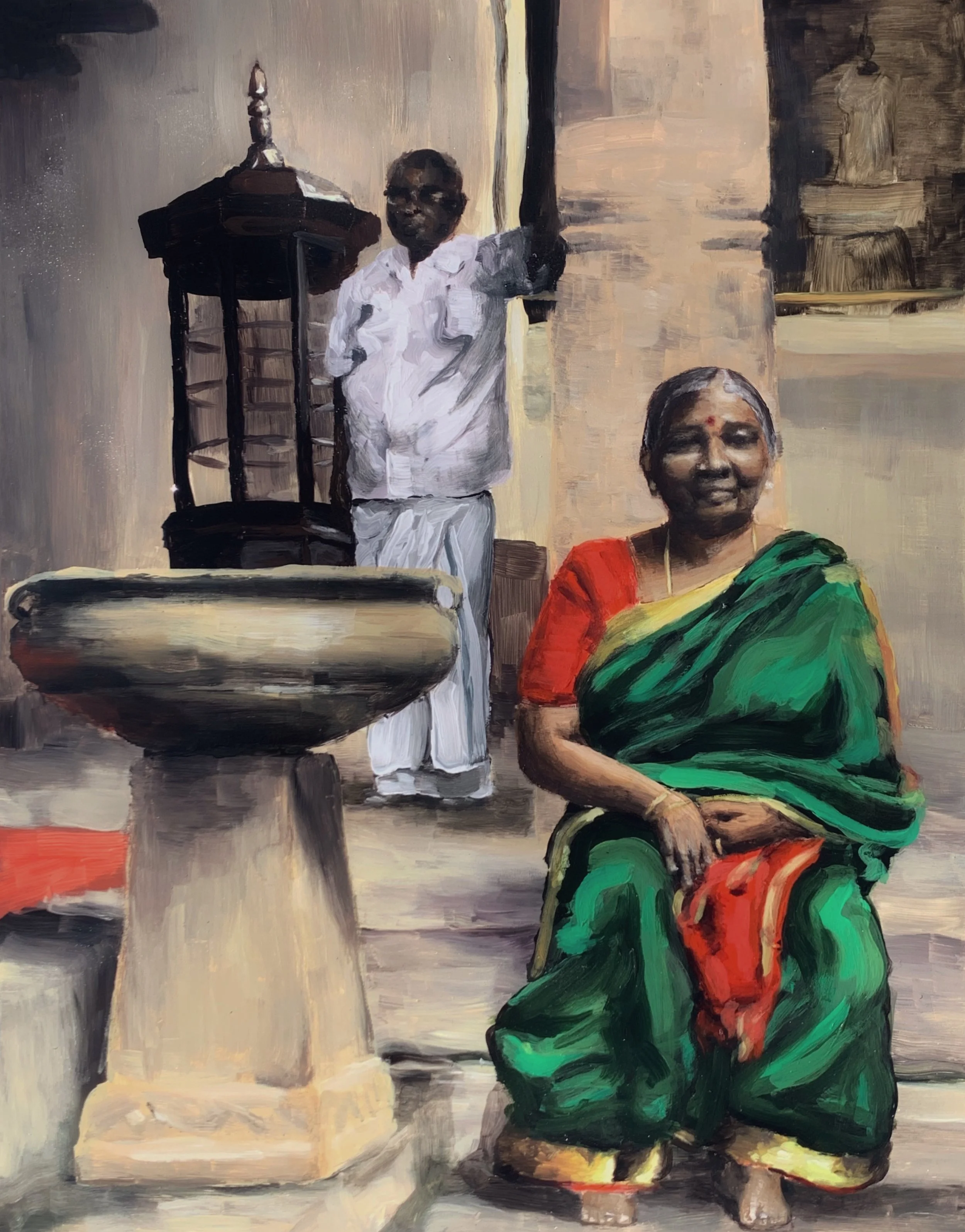
Paati and Tatta, 2020

What intrigues you about making art; why do you do it? 

I am usually bad at putting things into words. I’m not the most verbally competent person, especially considering my mother tongue. There are a lot of things that I want to write about or read, at the intersection of so many different languages. At the end of the day, I think art is about expressing yourself or expressing something. The preface of The Picture of Dorian Gray has a whole thing about this. If I had an argument to make, I would write an essay, and that would be fine. But, usually I don't really know where I'm going with things; there’s a level of nuance or uncertainty that art allows for, where I can express myself without offering anything concrete. 

What’s your artistic process like? 

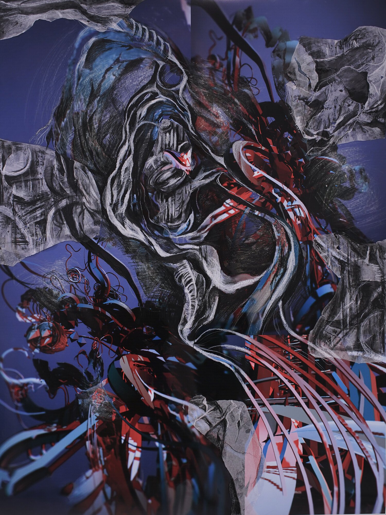
Usually, I work from a picture and I'll try to make it weird. For example, I have a piece called Ardanareeshwaran [(Millat and Magid)] that’s split into quadrants. It’s based on a picture of a temple in India that was blown up by the British. The God that it's depicting is bifurcated, because it's half male, half female. I took the picture, cropped it, and messed with the colors a lot. Then I split it in half twice, and collaged it back together. Most of the time, if I'm working from an image that I already have, I'm not trying to make it super natural. I'm trying to mess with it and ask myself, what information do I have to keep to get the essence of this, what can I do without? 

Ardanareeshwaran (Millat and Magid), 2021

How do you want your work to be shown or experienced? 

This one's tricky because, especially with paintings like Ardanareeshwaran [(Millat and Magid)], I can't tell if I want to preface it with context beforehand, or if I want people to see it first as abstract shapes. I don't know which one is better. But if I had a gallery, I would not want it to be a white box. I’d want it to be a kind of performance space. There a lot of senses that are specifically Indian that would bring my work to life. To get the full experience that I feel, you need something other than visuals… you need to smell coconut oil, or hear a tabla in the background, or to take your shoes off before entering the space. If I could have complete control, I would make viewers do little things like that; participate in these rituals that would situate you better in my work. 

Speaking of divinity, how has Hindu mythology, spirituality, and its culture affected you and your material work?

It's hard for me to separate the things I grew up with and the way I currently think. It was exciting to incorporate Hindusim into my art, because it felt like everything in my life was connected. That feeling made me really happy. It’s frustrating, because I always wanted to explain these connections to people, how beautifully these things all fit together, but I struggled to do it with words. It’s spiritual to connect art to Hinduism and the way that I understand the soul and energy and stuff like that. That's mostly what I'm trying to do with my art, express that weird moment of clarity, the Whoa, it feels like everything in my life happens for a reason and it all is clicking right here and now.

You were saying how Indian dance is narrative. Have you ever taken ideas from a dance to then represent in your art?

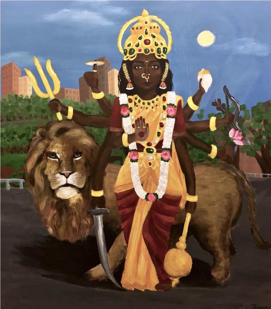
Simha Vahini, 2019

Yes! In the beginning of junior year, I had what's called an Arrangetram, which is a graduation ceremony of sorts for this type of dance. It requires so much practice; I was practicing six hours a day at a point, it was crazy. My whole performance was three hours, and the longest dance I did was 30 minutes. Each one tells a story. There's one, the one that I told you about, called Simha Vahini (2019) where I painted myself as that goddess. The backdrop is Van Cortlandt Park, because that's near where I went to high school. That was fun. I was interested in transplanting this goddess that you see in an Indian context into the context of my own life. Also, a huge part of Hinduism is recognizing that God isn't actually separate, that it's within yourself. With this painting, I was looking internally for something rather than externally. 

Bhakti, 2018

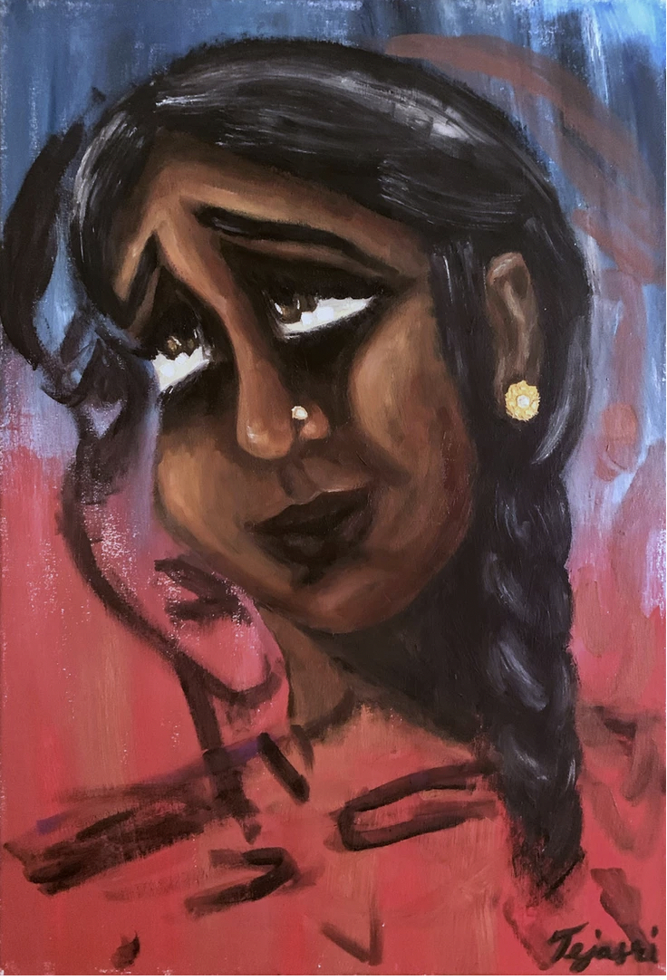
There was another one called Bhakti (2018) that I really liked. I made that when I started learning how to use my face in dance, because Bhakti means devotion and that's a very hard emotion to convey on your face. It's really in the eyebrows; I was focusing on the feeling of making your eyes look kind of sad, but your mouth happy. In the dance I had to do this for, I was playing the mother of the god Krishna. It wasn't really supposed to be my face. It was about the feeling of making that face. Something about keeping your eyebrows pursed; it's interesting. That's how it started, and then it kind of morphed into whatever.

The Metrocards Series blew my mind– what do you like most about painting on unconventional surfaces?

The Metrocard Series

The reason I prefer paint over anything else is because you have a little bit less control over it. Changing the medium becomes an easy way to bring yourself out of your comfort zone again, snap yourself out of it. Once you get a little too comfortable with the routine of something, the practice gets worse. You have to always be a little bit on your toes. Metro Cards are shiny, a little glossy. When I was using acrylic paint, it kept slipping off. It took a really long time. I usually paint in layers, but I couldn’t because every time I painted on top of something, whatever was underneath it would go away.

Euterpe

That was fun, because I had to kind of retrain myself by working with new mediums. I did this too with a violin, where I poured acrylic paint on it first. The back is really textured with yellow paint, and it drips in a fun way. When I painted over that, it crackled a little bit with the wood. I also did one on lace. I just sewed the lace a little bit so that the paint wouldn’t slip through. I was still using acrylic paint, but it almost felt like watercolor because it would seep through everything. Those are definitely fun ways to reset.

Do you see yourself as an artist or do you imagine working professionally as an artist?

Every time I talk to my T.A.s about their MFA program, it’s super interesting. I really want to do something like that. But I also can't imagine the weird business side of it, being represented by a gallery, selling your art to collectors, selling my art in general. I should be better because I would love money, but I am very bad at it. Also, this is kind of self deprecating, but I feel there are people who have a more clear understanding of what they're trying to say with their art. My creativity goes through waves, where sometimes I'll be super creatively rich, and other times, I can’t even look at paint.

Millat and Magid, 2021

That being said, creativity is the only thing that can't really be outsourced. There are a lot of careers that are going to become nonexistent, especially in computer science. I think in 40 years, maybe less, every computer science job will be replaced by a robot. The only thing that you can't really do that to is creativity and art. I put myself in a good position here where I can't really be outsourced. It would be cool to do something at the intersection of computer science and art. During my internship at the Jewish Museum, curator JiaJia Fei spoke to us and said, “paintings exist because there are walls.” Now that we're moving into a digital space, we need to create something new for that. I'm not talking about NFTs, but I think there is a huge potential for art to be changed and democratized; it would be cool to be involved in that.

Thank you for speaking with us! Where else can we keep up with your work?

My website is https://tejasrivijayakumar.wixsite.com/artportfolio and my Instagram is @tejasriii.

Samia Menon

Feature by Mel Wang

Photos by Caitlin Buckley

Samia Menon is a junior majoring in Computer Science and minoring in Anthropology at Columbia University’s School of Engineering and Applied Science (SEAS). Hailing from the beautiful Cleveland, Ohio (“a shimmering jewel of the Midwest,” as she so aptly describes it), Samia creates art that focuses on the intersection of technology and humanity. Her work includes graphic illustrations, data visualizations, and interactive pieces.

“This isn’t an interview—it’s actually a commercial for Chef Mike’s Sub Shop,” says Samia Menon as I hit the record button. She says this matter-of-factly, with a face so deadpan that I question whether I should even bring out my interview questions. “Yeah, this is a hype scheme,” she explains. “I’m actually an undercover agent for Chef Mike, posing as a young artist at SEAS and trying to promote the Sub Shop by sitting for magazine interviews.” 

It is this tongue-in-cheek sense of humor that characterizes all of Samia’s artwork. From her playful illustrations for The Blue & White magazine to her quirky coding projects (which include apps that can read your tarot cards and match you with the perfect plant), Samia is truly an artistic jack of all trades.

Samia, what led you to your major combination? (Computer Science major, Anthropology minor)

In a strange way, I’ve found myself becoming like Barbie in the sense that I enjoy experimenting with different fields. You know how there’s a Barbie doctor, a Barbie astronaut, a Barbie baker, a Barbie artist, blah? That’s who I want to be.

I also like tweaking technology to fit the needs of people. In a world that’s continuously improving its technology, I believe it’s important to have people in tech who care about the people they’re making the technology for. In the world of tech, it’s really easy to forget the human side of things, but I think you can tell amazing stories from data - yield migration, gentrification, redlining, it’s all data that represents the human story. I figured that if I could use my computer science skills to do good by people, then that’s a life well spent.

Created in Processing, COVID-19 "Painting" is a program that uses the death rates of different ethnic groups to produce a ‘painting’ that visually depicts the data, creating an engaging story solely through data

The tagline on your website is “tech w/ humanity.” What does that mean to you?

It’s my motto when I’m coding, really. The tech world is a manipulative one—even in my computer science classes, we’re learning about ways to use tech to manipulate people and turn a profit on them. I find that very strange. I know that we’re living in a late stage, capitalist era, but we shouldn’t lose sight of why we work in tech, which is to make people’s lives better.

Does this focus on humanity also apply to your non-coding projects, like your illustrations for The Blue and White?

Yes it does! I was illustration editor last year for The Blue and White,  and it was such an honor to work with so many talented illustrators. When working on editorial illustrations, I was trying to visually depict the human side of our articles. With any illustration, I start by wondering how I want a viewer to feel when they see my work. I usually want to grab their attention with colors, which is where a lot of my influences (old Cartoon Network shows, Studio Ghibli movies) come in, because I’m obsessed with using color and movement in my work. 

Could you talk more about your influences?

Well, they’re not high brow, art museum influences, but sure! I grew up on a steady diet of Cartoon Network, pop culture—basically anything that was made for kids, I fell in love with and used in my own work. I really liked the art style of the TinTin comics growing up, along with Asterix, oh, and a really good Cleveland-based graphic novel called Paper Girls. And video games!  I was a big Pokemon fan - gotta catch ‘em all! And Street Fighter, and Undertale, and—god, I could go on, but I just think there’s something really miraculous in a clump of colorful pixels telling a story.

Did you fall in love with video games for their stories?

100% yes. Even with simpler games like Pokemon and Street Fighter, the player still has a main goal. And that’s the computer science part of it - you’re making these characters, making these worlds, out of pixels and code, and they all come together to tell a pretty awesome story.

What’s more important in your work - story or aesthetics?

So you know how you’ve just finished watching a movie, but you haven’t processed it yet? Or you finished a video game, and then you see the end credits play? I don’t know about you, but I get this sense of numbness, like I’m still working through what I’ve achieved. It’s that little gap between going through an awesome story and understanding it, and that gap is just a jumble of visuals and narrative. I want to make art that exists in that gap. Art that smorgasbords aesthetics and storytelling into one big, impressive piece that you can’t stop thinking about.

Do you prefer small or big projects?

So right now, I’m only capable of really tiny things. The goal is to make projects that belong in the MIT Media Lab - just big room-sized interactive projects that rope the viewer into a story they can’t get out of. For example, with my Koi coding project, where it’s a bunch of koi fish swimming on your screen - I want to expand that to have an entire room of koi swimming in a sine wave pattern, and I want people to come into the room and feel like they’re sitting at the bottom of a koi pond.

Koi by Samia Menon

So existing in that little gap - is that something you want to pursue after you graduate?

Yeah, definitely. The plan is to work for a nice software engineering company that’s ethical - emphasis on ethical! Eventually, I’d like to start my own fully ethical company and hopefully put out projects and products that combine technology and anthropology. And then maybe grad school, combined with making more art that combines computer science and humanity. Big dreams.

I think you’re already doing so much in terms of combining product and ethics - especially with your current project, Rayn Naturals!

Oh wow, you found that! That project’s on a roller coaster  right now, but you’re right in that it’s a product that focuses on the human side of things. Rayn Naturals is an eco-friendly invention of mine that I started working on when I was a freshman. It stemmed from the cockroaches populating my residence hall  — they just kept coming back to our shower. So I thought, this is silly, let’s fix this. My friends and I read a bunch of papers online and found out that essential oils are really effective in shooing away cockroaches without hurting them, so we designed a drain cover that you can use in your shower or in your kitchen sink to ward them off ethically. I don’t normally work on product design, and I have more experience working on coding projects or illustrations—but I learned a lot from working on Rayn Naturals, and I’m proud that we made a product that’s humane and ethical.

Rayn Naturals, 2021

So we’re winding down our interview here - what’s next for you, Samia?

I’m not sure, really—it feels like there’s so much to do! I think I’ll be working on existing in that little gap like we talked about and working on my skills from there.

Where can people find your work?

My website portfolio is bysamiam.com, a lot of my work can be found on The Blue and White website, and my instagram is @samia_mnn.

Venice Ohleyer

Feature by Aditi Kapoor

Photos by Jane Mok

Sometimes electric blue hair balayaged with blonde highlights, a byproduct of a past that needs no recounting, is not about philosophical substance––it’s simply silly. Not to mention it looks cute. So believes Venice Ohleyer: part time student, full time comedian. A gift to Columbia from a substandard college we don’t speak of [Dartmouth], Venice has made several headlines in her time here. This includes being featured by the capital-O-fficial Instagram of Columbia University in the City of New York (or as Venice calls it, the greatest college in the greatest university in the greatest city in the world). In that light, one can often refer to her as an inhouse celebrity. 

I met Venice in an off-campus cafe on 103rd street, purposely distanced from the maddening crowd that occupies the halls of Butler. Spotting her from afar in her fluorescent jacket, I couldn’t help but concur that she has the most colorful aura. Completed by her eclectic selection of eyeshadows, and even more eclectic comedy sketches, one can usually find her florally dressed, or in a fashion she describes as “space alien-y,” in John Jay, sipping on her new favorite obsession: broccoli cheddar soup—newly distinguished by her as a culinary phenomenon, and not just another soup. 

Engendering phenomenons is part and parcel of being a creative writing major. For Venice, writing doesn’t always have to be scholarly; it could also be fun! When asked why she chose to pursue comedy––of all things––Venice claimed her love for the art form simmered intrinsically and was propounded at LaGuardia, local-celebrity-churning-haven, where the value of performing arts was never questioned. She recalled the head of the department, “a somewhat devil figure, synonymous to Terence Fletcher from Whiplash, saying: ‘people who are always observing, end up being writers.’” Yet, Venice “didn’t want to be a writer,” she explains, “I wanted to perform!” Today, she’s found a way to do both. 

Comedians have an edge over their audience and perhaps it’s because comedians “are people who notice things that other people don't notice.” More than doing things for shits and gigs, there’s an innate psychological analysis behind the art of stand-up comedy, which Venice argues, is in fact art. Stringing together a hilarious narrative doesn't begin to cover stand up, there is a lot more that one’s personality needs to bring to the table, including an overarching sense of self awareness, which Venice believes is of imminent importance, almost to a crippling degree. 

All the prerequisites that come before being a successful performing artist, however, do not restrict one from performing in multitudinous ways. Venice is the epitome of a multimedia artist. Not only has her work been published in longform in Columbia Spectator, it has also found its way to Twitter’s banned accounts list. The infamous story of Joe Biden’s parody account both precedes and haunts Venice’s being in equal measure. “Someone’s gotta do it, you know,” she said about impersonating Joe Biden, “it was to underline the almost blase, blanket-like statements from the people in power that made me think, what the hell are we doing?” The tweets were her attempt to acknowledge the hypocrisy of performance activism on the internet. One would be hard pressed not to mention that Venice’s tweets, eerily, did indeed resemble real tweets from the actual President of the United States. 

Fuelled by the uneasiness brought along by American statesmanship, Venice also curated CDC’s guidelines for fully vaccinated people, which hysterically laid down a listicle of things one could partake in, once fully vaccinated. Her list, in true comedic fashion, proved to be more conscious of the pandemic than CDC’s, which can be deemed as yet another play at governing institutions that often flounder in the face of crisis.

CDC Guidelines by Venice

Some comedians hesitate intermingling politics with comedy, but Venice’s work makes one ponder the discrepancies and shortcomings within our systems. It’s a way to perhaps wield comedy as a tool to overturn the dynamic between the masses and the government. Although, this dynamic is often challenged by diplomacy, hence, the sad demise of Venice’s eight-year-old twitter account, now resting in remembrance. The Twitter debacle, however, didn’t deter her quips. As of August 2021, to bite all impersonator-claimers, Venice’s alter ego has resurfaced on the internet as her unflinchingly true self— @venicesvagina.

 Comedy is certainly not black and white, if anything, for Venice, it's an expansive palette that allows her to express herself in prolific ways. “It's like when something crazy happens to you, there's potentially a way to turn it into something better or something fun, like ‘oh, I just noticed this person do this batshit crazy thing’ and maybe I can make a sketch out of it.” The best skits, she agrees, are grounded in reality. They are an extension of one’s experience in the world. In the same vein as being a creative writing major, Venice looks at curating stories based on the subjects she encounters, or the instances that befall her: “that's why people respond to comedy, because they're like, oh, yeah, the same thing happened to me, I recognize that behavior.” On a certain plane, comedy arouses a shared human connection by demystifying life experiences and celebrating commonality.

One of the many reasons for her deep rooted commitment to comedy is its unpredictability. What one may find funny can often land abysmally in front of an audience. Ergo, one can’t only be a master of words— they also have to be a master of people. Venice is on a journey to be just that; figuring out trends while being comfortably distanced from the world of TikTok, she wants to be real, with the people, for the people. Her online performances, that mostly avail the hands-free video feature of the Instagram app, are working to unite the masses, even if it may be in the name of broccoli cheddar soup. Secretly embodying her suppressed main character syndrome, she’s patiently awaiting the day Columbia Dining finally notices her. 

Short by Venice

Venice’s work can be found on https://www.veniceohleyer.com/, and her favorite medium of distribution, Instagram, at @effervenice. Her twitter fame is amassed on @veniceohleyer1 and @venicesvagina. She can also be found performing with Columbia's oldest improv group, Fruit Paunch. 

JULIE KIM

Feature by Sabrina Bohn

Photos by Em Sieler

I met Julie Kim on a cool Saturday evening just as the sun had set, leaving the blue glow of night in its place. Julie had just come from a long day at work as a studio assistant for another artist. She was carrying a portfolio bag, had splatters of paint on her fingers, and possessed a quiet passion that permeated our whole discussion. 

After attempting to go to a closed Joe’s Coffee, we ended up in the piano lounge in Lerner. It started off quiet, with only a couple of other people working around us, but as the evening progressed, people’s conversations around us grew louder, and someone started playing the piano. As Julie and I talked about her art, the ambiance–an aspect integral to many of her paintings–came through as she discussed her inspirations and the emotions behind her pieces. 

Julie first encountered art at a young age, attending classes with a painter in her neighborhood. However, she became serious about art when she began attending Ashcan, a studio in New York, that was just a train ride away from her home in New Jersey. Every day after school, she would spend hours making art. “That was my first experience knowing that art is what I want to do,” Julie says. 

She mostly drew and painted with acrylics as a child, but creating art at the studio drew her to oil painting, her main medium now. “When I have a paintbrush there's more room to let go and be free. I love building things up with color,” Julie expresses. “I also appreciate the waiting process as the paint dries. That's helped me to be more deliberate about what colors I want to put down and where.” 

People Watch (2019)

Kate in Chicago (2020)

Julie not only built up her knowledge skills at this studio but also created lasting and memorable relationships. She met her best friend and now roommate, Kate, at the studio, who is featured in People Watch (2019) and Kate in Chicago (2020). Although Kate explores different realms of the human experience in her filmmaking, “People Watch was the first painting that embodied my creative motivations today and truly appealed to me as subject matter. That sparked the initial vision and ideas for a lot of my paintings now. The colorful lighting was all improvisation and gave me the courage to paint in make-believe things in the future based on my instinct and vision,” Julie says.

Working at Ashcan also gave Julie a feeling of independence and a sense of belonging in New York. In many of her pieces, including Remembering or holding onto disappearing moments in blue (2019), New York serves as an inspiration. “I really associate New York with the feeling of liberation,” Julie says. “There are so many unexpected things that happen every day in New York. Whenever you're walking, you don’t know if you'll see the people you pass ever again. I just think the crowd is a really interesting concept for me–being amongst so many different people yet not knowing who they are.” 

Remembering or holding onto disappearing moments in blue (2019)

Remembering or holding onto disappearing moments in blue (2019) was also a piece that allowed Julie to elevate her creative process. In the piece, Julie and her dad sit in the restaurant The Butcher’s Daughter in West Village. Julie and her dad were never in this restaurant together, but Julie recalled that she imagined this scenario in her head and placed different photo references of her dad, herself, and the restaurant together. She feels that if she’s “just trying to replicate a picture, it becomes hard to be intuitive and fluid with brushstrokes and colors. Having different references and being the one to put it all together into one canvas makes it more natural.”

What these two pieces, along with much of Julie’s work, have in common is the centering of relationships, especially between two people in her life who she loves. When I asked about this theme, she simply stated, “I don't think it's intuitive for me to do anything else in terms of subject matter. The things that I really want to paint are the people I value and experiences I've had.” 

Despite her love for New York, she also wanted to express the loneliness that comes with living in a big city. Julie wants to communicate “how lonely watching a world full of people can be.” Pieces that capture this feeling of immense solitude include Cold Shower (2020), which is a painting of a Furnald bathroom, where she lived her sophomore year. “I think that captures the loneliness I was talking about, but also feeling comfortable in solitude. That's an example of using colors to embody a mood because I would associate blue with cold, but it's also a color I really love.” 

Cold Shower (2020)

However, during the first half of the pandemic, Julie faced a different kind of isolation in her home in suburban New Jersey. Although she felt detached and alienated from creating art, she began contemplating what she felt drawn towards making and consuming media that inspired her. She specifically mentioned the book The Lonely City by Olivia Lange. “It sent me on a trajectory of figuring out what it means to find your identity in a place,” Julie explained. “It really inspired me to think about the city as a character itself.” 

In general, Julie feels very inspired by books, movies, music, and other artists. She describes how she deeply empathizes with characters in books and movies, getting completely looped up in the fictional person’s feelings and narratives. As for her artmaking process, Julie says this ability makes it really easy for her to imagine things that haven't even happened or imagine feelings that she’s never felt before.” 

Another artist Julie feels inspired by is Julie Mehretu, a contemporary American artist, who she saw at an exhibition at the Whitney Museum last spring. Mehretu’s works are large-scale, abstract, and multi-layer landscape pieces. “Her art was life-changing,” Julie enthuses. “It's the opposite of what my paintings look like, but it was still such an immersive experience. Mehretu’s art pulls you in and makes you feel a part of something.” 

Passionate about Mehretu’s work, Julie went on to explain how she wants to make her pieces just as immersive, even if they take a different form. “I want to create not just a scene but an entire environment that penetrates through the edges of the canvas,” Julie describes. “I want people to breathe the same air as the people inside my canvas.”

Julie also cited the film La La Land as an inspiration to her when it came out, causing her art to be influenced by a variety of films. “I just remember thinking, ‘oh my god, this is a love story where things don't end well but it's still so impactful at communicating what love is and can be. That's when I realized relationships can come in all different shapes and sizes and forms.” 

Julie also writes for Copy Magazine, an arts publication she got involved with last summer, where she goes in-depth about her influences and creative process. “I really appreciate the space I have to write about my art because I had never written about my art like that before. Doing that helps me understand what my goals are, how I want to approach certain paintings, and what kind of an artist I want to be,” Julie said. “It also helped tremendously with talking about my art; now, I have words for what I want to convey in my paintings.” 

Along with writing for the magazine, Julie also started writing poetry to go along with some of her pieces, exploring how language and painting interact. When I asked if she would ever share her poetry, she laughed nervously and explained how her writing felt more private. “My words are so much more personal. I'm writing to immediately communicate the thoughts or feelings that are in my head,” she says. “In contrast with paintings, I'm thinking about how I want people to feel when they see it.”

In her paintings, Julie hopes to transcend the physical spaces she depicts, using bright colors and specific color palettes to incite a certain mood. In order to describe what she’s feeling through her art to her viewers, Julie says: “I try to put myself into the zone of the feeling I'm trying to emulate. Sometimes I'll make Spotify playlists to go along with the narrative of the day. It makes a huge difference having the feeling actively in my chest. This way, I can absorb the feeling of the relationship or the person, and I splash it onto the canvas.”

Although many of her pieces include close friends or family, Julie uses her own experience to convey deeper emotions that anyone can relate to. “It would be easy for people to relate and connect more if we were stripped of everything on the outside and just focused on the emotions we feel at our core,” Julie explains. “I think when people are at their most vulnerable state, we're all so similar; most feelings are super universal. I love tying people together through emotions and tapping into that place you don't really share with people on the surface.” 

When asked about her future, Julie has a clear vision for what she wants. “The biggest thing is that I just really want to paint more,” she expresses. Along with considering paths like art education or programming at museums, Julie hopes to produce an expansive collection of pieces and eventually be part of permanent collections in galleries and museums. However, now, she continues to be inspired by young artists she sees online. “Finding artists in their early to mid-career doing well gives me a lot of hope.”

In the past year, Julie feels that she’s made significant progress towards her goals. Along with writing for Copy Magazine, she did an internship for Art on the Ave, a non-profit that places art by underrepresented New York City artists in vacant storefronts. Through the internship, her art was placed in an exhibition in the Financial District, which was her first public show. She was also able to exhibit her art made in class at the Columbia Undergraduate Art Show, which happens at the end of each semester. “I was like, ‘wow, I have made so many things this year,’ and a lot of my friends came out to see it. I think that was a taste of what it would be like to show art at a national gallery or museum in the future,” Julie said. “That felt so great, so that's motivation for how I'll approach my future.”

Art piece that was in the Art on the Ave exhibition - Mom (2019)

Seasick, Homesick (2018)

However, as she exhibits her art more publically, Julie increasingly considers how audiences view her artwork, shifting her creative process. “It’s tough because I know my art still exists without people looking at it but also having an audience is super important. I want people to feel the way that I feel when I watch a movie or when I read a really incredible book.” 

Recently, someone messaged Julie and told her how much her artwork meant to them. “That reinforced for me why I want to paint. It's not that everyone who looks at my pieces has to, but even one person feeling understood or heard or seen feels important to me.” 

You can keep up with Julie Kim’s work on her website and through her Studio Diaries in Copy Magazine. She also sells prints of her work on her Instagram

Beatrix Villiers

Feature by Taylor Bhaiji

Photos by Jasmine Wang

Bea Villers is a digital and animation artist. Using photoshop as her canvas, Bea creates a fantastical world with saturated and contrasting tones that rival the colors we see in our reality. Inspired by the runway that is the city, Bea displays fashion through a whole new window that dresses her imaginative characters.

Go ahead and introduce yourself!

I am Bea Villiers and I am a freshman at Columbia College. I’m also from London.

When was your first encounter with art?

I’ve been basically drawing since I was born. It’s always been something that I didn’t really have to think about, sort of like a safe space. At the end of the day, I can go and relax and get into my art. It’s always been therapeutic for me. 

I also grew up in a very artistic household. My mother is also into art and we went to galleries in London where we lived. It’s a great place to get inspired.


Tell me about the different media you use.

I mainly use digital art, animation, sculpture and oil painting. Digital art and animation kind of intersect because I use Photoshop for both. I do 2D animation, so I can create a single drawing and from there I can create animation. In terms of sculpting, I tend to do figure sculpting with polymer clay. I made a ring collection of necklaces. I also sculpt a lot of faces, like alien faces and fantastical creatures. Oil painting is something I want to explore more. It’s very different from my other styles. 

What prompted your movement into the digital realm of art?

It was actually my neighbor. My neighbor works in animation and concept art. He worked on the film Paddington. For my eleventh birthday he gifted me a Wacom tablet and gave me a free Photoshop download, which allowed me to experiment. It took a long time for me to create art I was proud of. 
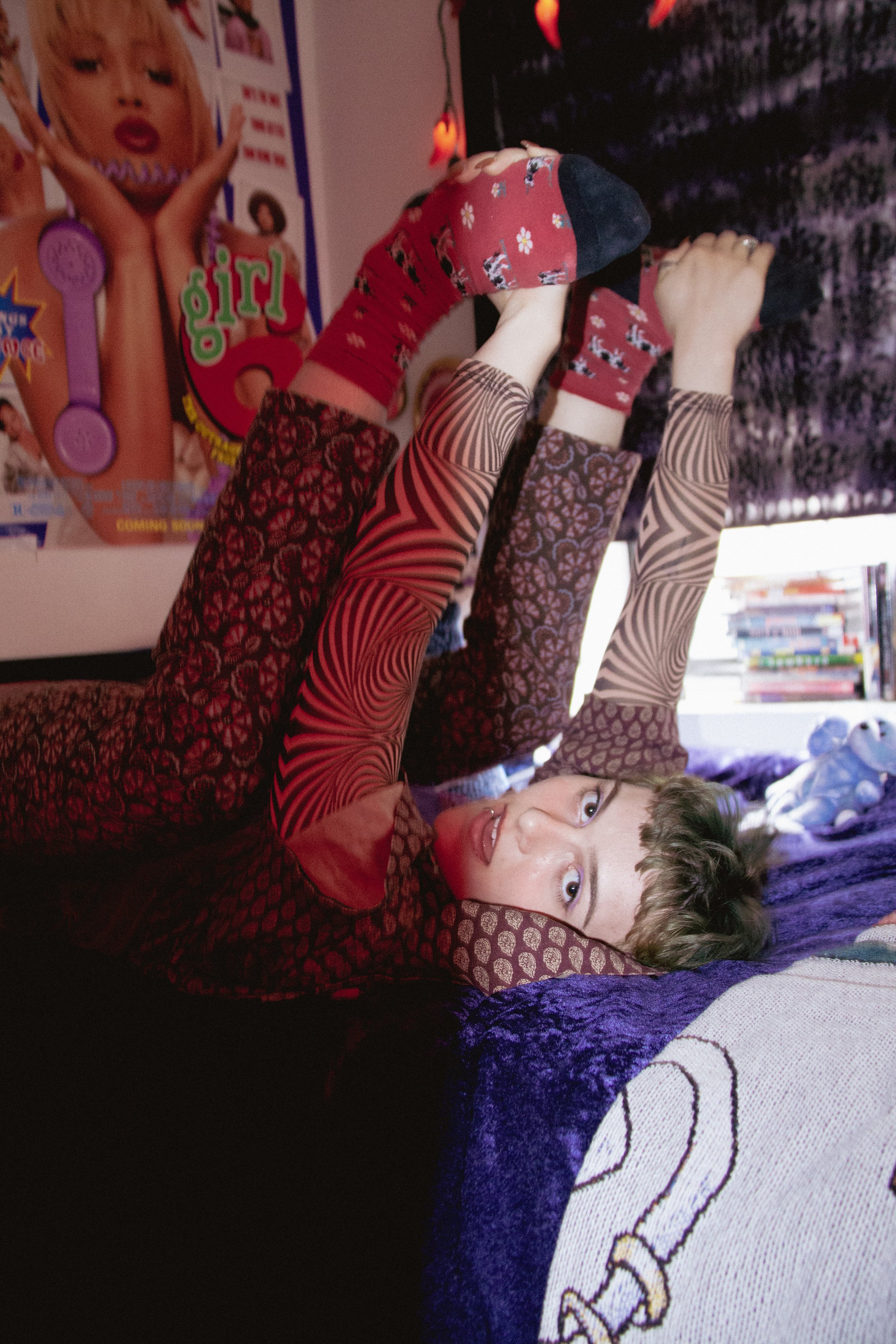

Can you talk about how your art has evolved?

My art has gone through a major evolution this summer. Before I was doing a lot of fashion drawings and I was mainly focusing on the clothes. Then, I started experimenting with big scale paintings and using a loose brush stroke style. I started to incorporate my painting style into my digital art, so that it would seem more fluid but still have a digital element. I also moved towards more fantastical themes in my work.

How do you discover your subjects or find your muse?

My characters come from my mind, and I get fashion inspiration from Pinterest. I also get inspiration from my friends, and the way they dress in real life. I like to represent them in my artwork. 
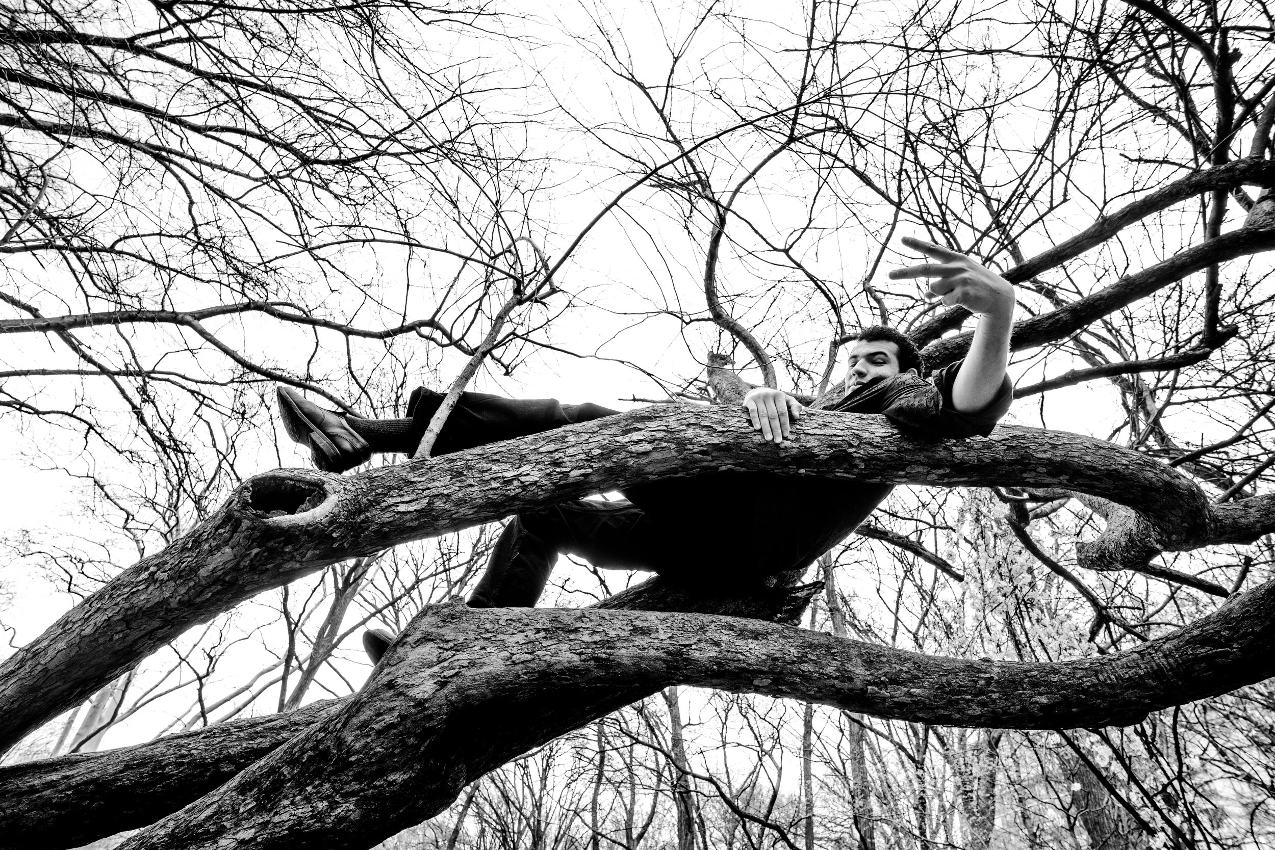
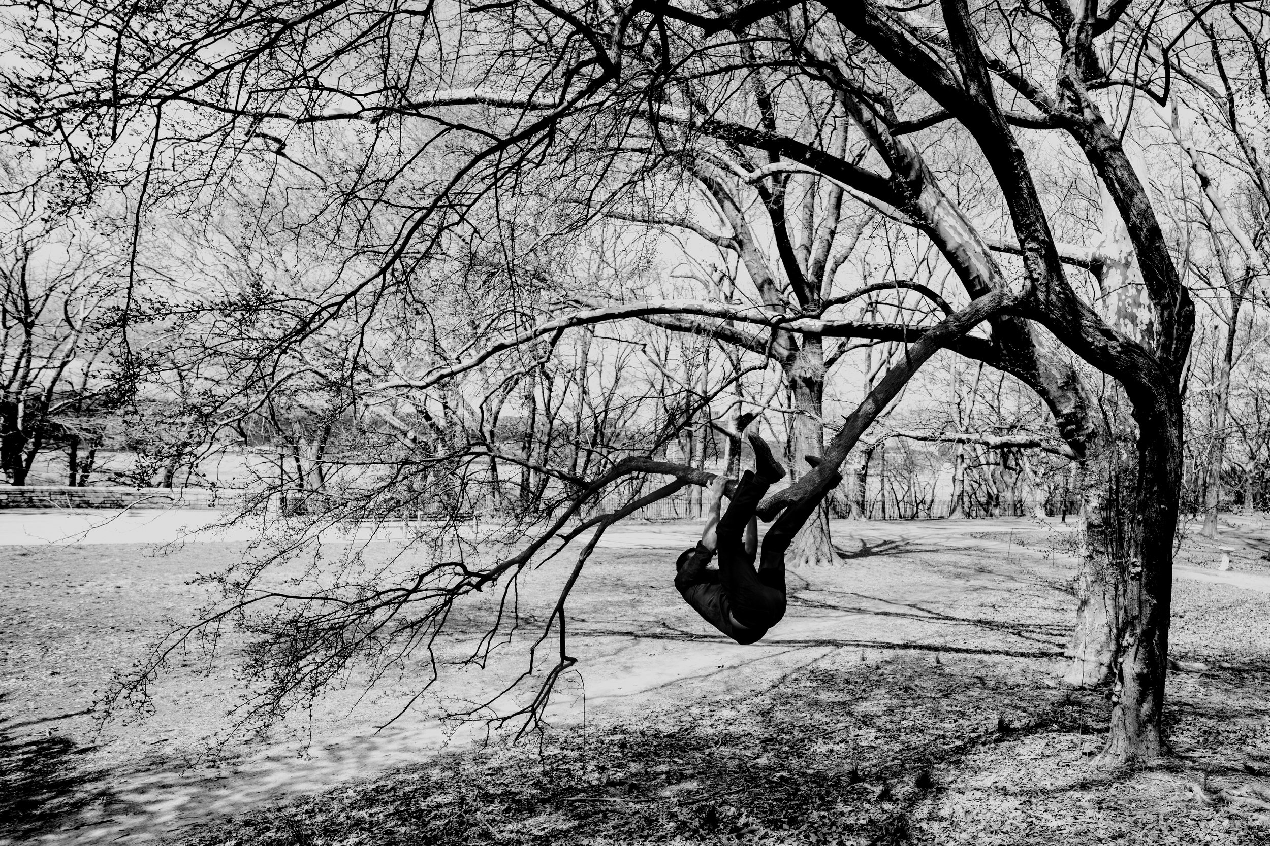
Who or what are your artistic influences?

I am very inspired by Japanese art. Studio Ghibli films are a big inspiration for me with the fantastical elements. I really like the work of Jenny Saville and the way she depicts women, skin, and the female form. 

I am also very interested in Mary Katayama’s art. She’s a disabled artist and she has these very cool photographs where she incorporates fabric appendages. Her color palettes are amazing. 

Have you considered branching out into different mediums of art?

Yes! I really want to get more involved with sewing and clothing design, though I'm really bad at technical things. But, I want to try it out for sure. I’ve also been thinking of branching out into graffiti lately. 


Can you talk about your choice of using bright, neon colors?

When I moved towards creating art that was more fantastical, I wanted to use more interesting and contrasting colors and go outside of the traditional color palette of the human skin. I wanted to incorporate more blues and greens because I started noticing the tones of our skins. On my phone I would turn up the saturation of pictures of myself and my friends, and you can see that there are so many different colors within our skin tone, and I wanted to emphasize that in my work. 

Eye are such a powerful element in your work. Why do you draw them the way you do?

I feel like that’s also definitely inspired by Japanese art. Eyes are so powerful, and I want to exaggerate that because I feel like they are the coolest feature of the human body. I don’t even know if I’m capable of drawing people with normal-sized eyes. I’ve been drawing big eyes since I was little. I guess it’s just a part of my style 

How long does it usually take you to finish a piece?

Sometimes in my mind, I’ll have a vision and I will just do it, and I’ll be done thinking that my art is perfect. Other times, there is a little thing wrong and I am experimenting for hours. Sometimes my art is done fast, but sometimes it can take months.


Fashion seems to play an important role in your artwork. How does living in New York, a fashion capital, play into your work?

Definitely. Having grown up in a big city and moving to another big city, you are exposed to lots of cool people and cool styles that have influenced my outlook. New York fashion and London fashion are interesting, and I love to see the differences. I noticed I’ve been more free with my artwork and more explorative since I’ve gotten here.

If you could describe your art in one word, what would it be?

Maybe “saturated” just because my work is so bright and I use such contrasting tones. I feel like the saturation within my art is such a central part of my work.  

Is Instagram your main mode of sharing your art?

Instagram and TikTok, but I haven’t been active as much lately. I was gaining popularity on Instagram, so I was sticking with the art that was getting a lot of likes, but in a way it felt like posting for my audience was hindering my artistic development. I’ve done that style since I was fifteen and now I’m eighteen, so it’s time to change it up. I don’t feel like the art I post now gets as much support, but I still like it a lot more. Lately, I’ve been trying to focus on creating art for myself rather than for other people.

What are you working on right now? What's next?

I am working on a piece that takes place at a nickel factory in Norilsk that I watched a documentary about. It has Artic climate and is very polluted and isolated. There are these tower blocks there because it used to be a Soviet labor camp. I’m doing a drawing of two characters in a Norilsk cityscape. I feel like it’s different from my usual drawings because it has a very depressing mood and the colors are very gray and unsaturated.

Where else can we find your work?

My TikTok is @beafcakez  and my Instagram is @murpll.

Emma Owens

Feature by Hanna Andrews

Photos by Jane Mok

I met Emma Owens in the Alpha Delta Phi Society, which has been housing crash mats, juggling balls, a steel wire and more circus paraphernalia since last semester in anticipation of the Columbia Circus Collective’s Fall Cabaret show. The show, highlighted on Barnard’s TikTok and Instagram accounts, included multiple aerial acts, burlesque, contortion and wire routines. Co-founder and President of the Collective, the only recognized circus arts club at Columbia, Emma has practiced circus arts as a performer and organizer, and is even writing her thesis on circus arts. Emma also has a background in visual arts, and Columbia Circus Collective Co-Founder and confidant Sam Landa (GS ‘22) describes her as having “a special way of making anyone feel like their friend, whether as a person or performer.”

Introduce yourself! 

I am a senior at Barnard studying Art History and concentrating in Visual Arts. I grew up in San Francisco, and in high school, my family moved to Minneapolis.

How would you define circus arts for those who are unfamiliar with the discipline?

It's kind of an infinite amount of things, which is part of what makes it so special, and there are some clear aspects of it that people recognize; if you think of a traditional circus, and you think of a circus tent, there are acrobats, there are aerial artists (like people you see on trapeze or silks), and there are many types of aerial apparatuses, such as lyra, which is a metal hoop. Then there is juggling, hula-hooping, wire-walking, there are clowns and comedians; many circus performers fall into those categories but there are many other categories, such as equestrian circus performing, I mean, that’s a much more traditional thing… people also do sword-swallowing, or sideshow acts.

Wire Performance, Xelias Aerial Arts, Split

So when you say ‘traditional circus,’ what does that mean?

I mean circus that has roots in the “Golden Age of Circus,” starting in the mid 19th century. I would say stuff like Barnum & Bailey, and the Ringling Brothers and all the big circus businessmen from the early 20th century and then it kind of died, but now there’s many types of circuses… people are familiar with Cirque du Soleil, which is a Canadian-based contemporary circus company that has taken over nightlife and is a much more, I think people would say, “artful” kind of circus, but traditional circus is much more family-oriented; I would say there’s the family-oriented circus and then nightlife circus, and those are kind of two different things.

How did you get into circus arts and what are your areas of expertise?

So I was a competitive gymnast growing up in San Francisco and I trained at a place called AcroSports, which is connected to the circus school Circus Center, and I would always go to gymnastics lessons and practice and see the circus happening right next-door. People would be on silks and I would always tell my mom that I wanted to do it…so then, when we moved to Minneapolis, there was a circus arts studio called Xelias Aerial Arts right near my house, and I decided to start taking classes there and try it out.

So then I was told about this circus summer program, Circus Smirkus, and was told to apply by a coach, and I applied to their advanced summer camp program and went to Greensboro, VT, and then went back for two more summers and worked there for three summers. I also continued to train and do showcases at Xelias Aerial Arts in high school. I started off doing aerial arts, like trapeze, silks and lyra when I first started, then I decided I wanted to try out wire-walking, and I quickly decided that was my favorite thing to do, so my main disciplines became aerial arts and wire-walking and I continued to train in both. 

Then, I came to college and wanted to do circus arts, and there’s only two places to train: one is in Brooklyn and is pretty far away, one is in Midtown and still far away, and classes can be expensive. I was trying to look and see if there were gymnastics or circus on campus but there was neither. So that all kind of led me into eventually realizing that I needed to get something started on campus for circus.

Wire Performance, Xelias Aerial Arts, Middle Split

Wire Training, Circus Smirkus

So that was the genesis of Columbia Circus Collective in a way; how did it actually come about?

There is a wonderful person named Sam Landa, who I met through Circus Smirkus is in high school, and we were in contact freshman year about circus arts and I feel like we texted a few times and were talking about how we both wish there were circus arts on campus… and then nothing happened with it. In sophomore year we started texting about it again and we met up. In the spring we got really serious about saying, we need to start this. The two of us would meet in Milstein and try to write up a club constitution to become a school-recognized club, but we really had no idea what we were doing at that point.  In March 2020, we had just gotten news that we were approved, and our final meeting was during the first week of the pandemic and I remember it being on zoom, which is pretty crazy. 

So we were founded in spring 2020, not the best timing, but Sam and I did Zoom events through our junior year, and then this past summer Sam and I got everything ready for in-person school.

And that led to the Cabaret.

Yes, that led to the Fall Cabaret. We were able to host the first student-organized circus performance on Columbia‘s campus, I'm pretty sure the first ever. 

Columbia Circus Collective, Fall Cabaret, 2021. Photo by Pedro Damasceno.

So how many people are in the Columbia Circus Collective and how did you source people out for the cabaret show and for the club in general?

It feels like so long ago now, but I remember in sophomore year we had to get a certain amount of signatures to officially continue as a club, and I remember through social media or some other means, we got the word out and got people to sign up. We did the Barnard and Columbia club fairs and found a lot of people that way, and people would come up and be like, there’s a circus club at Columbia?, and we’d be like, yeah. I forced all my friends to join!

One of the amazing people we recruited for the club is Maia Castro-Santos (CC ‘25), who is our Vice President and a freshman in CC; Sam and I knew her through Smirkus before and we told her about the Collective, and she joined as a board member during her first week of school! She gained publicity hula hooping on the lawns, and she recruited other freshmen she knew. 

I feel like something that continues to surprise people is the sheer amount of folks at Columbia that have a background in circus arts! 

People just came out of the woodwork! It was shocking, I don’t know how to explain it! There are a lot of people who do circus arts recreationally, like I did, and a smaller group professionally, like Sam Landa, there were people coming up to us at the club saying they had taken a silks class as a workout; there’s so many different levels to circus exposure. I think a lot of people who did it in high school were assuming that there was absolutely no way to do it in college unless they wanted to commute and pay a lot of money and that’s something we are trying to resolve. 

Trapeze Performance, Xelias Aerial Arts

How do you create the material prerequisites possible to host circus arts at Columbia, since equitable training opportunities may not exist en masse? 

We would not be able to make circus arts starts accessible at Columbia and Barnard if it was not for Allie Emmerich, who is our club advisor, she was incredibly helpful with space. When Sam and I started the club, our biggest problem was trying to find space where we could have rigging for aerial equipment, everyone told us that it wasn’t possible, that we couldn’t have any rigging, too big of a liability… and Allie, who runs the Glicker-Milstein Theatre at Barnard helped make it possible. She contracted our rigger, and figured out the legality for us to have aerials in the show.

But in terms of equipment, a lot of it is sourced from the people on the board, brought from home and stored in ADP or our apartments, and we share them. This is honestly the biggest thing about all of it, is that the circus community is extremely strong and Sam and I were able to reach out to Smirkus and ask if we could borrow equipment, and they said yes, and we were able to borrow aerial equipment that we were looking for, and juggling balls and hula hoops. It was an act of care. 

Something about circus people in general, people who are involved in circus arts, is that they know how hard it is to get it going and they know how hard it is to make space for circus. Sam and I have been super lucky in that a lot of different circus groups have wanted to help us out, just complete strangers who are running large circus organizations like Circus Vazquez and Big Apple Circus. We have reached out completely cold as a new circus performance group and they have given us free tickets to shows.

Your practice includes performing circus arts, of course, but also extends to director and producer roles, which have included you counseling and piecing together acts for the previous Fall 2021 Cabaret and now an upcoming project; where does this inclination come from and how do you see yourself in the director/producer role vs. the performer role?

Performing circus arts is really special to me, but this past semester was the first time that I’ve been able to produce something and it’s just super rewarding to be able to bring together circus people to make a whole entire show. The point of circus is that all these different acts are included in one show and it’s very special to organize that instead of just being one piece as a performer. 

You’ve talked a little bit about the different levels or registers of circus performance, for example, with the contemporary circus stuff like Cirque du Soleil versus the family-friendly appeal of traditional touring circuses that are often run by families or even the nightlife stuff. How do you see the future of circus arts and what do you look for or like to see?

You know, this is my crisis right now! I think circus arts, post-pandemic, are becoming very popular, in a series of ways and I can’t fully explain why that is… I think there’s an aesthetic quality people are really interested in, an element of being “low-brow'' and not traditionally thought of as an art form that’s also interesting and attracts people.

Wire Performance, Columbia Circus Collective, Fall 2021. Photo by Pedro Damasceno

There are still family-run circuses that are touring, and then there are more adult-themed shows or shows aligned more with high art, like Cirque du Soleil, which is still mass-marketed, and there are smaller more “artful” shows that are performing for shorter periods of time and under tighter budgets, there are people performing in clubs, but I’m not sure what it’s going to look like in the future. 

So you gave a little brief circus history in the beginning of our chat, and I know that your thesis work revolves around circus arts in the Art History department at Barnard. How does this translate as an academic interest to you, or at least one that is interested in history and what that means for you?

My thesis is investigating The Ringling museum which is located in Sarasota, Florida and was founded by John Ringling, one of the Ringling brothers. The thesis is ultimately a comparison of two competing institutions within the museum, the Circus Museum and the Museum of Art. I think the reason why my thesis is about circus arts is because I truly believe that circus is an art form…it’s this thing that has been a part of many significant moments in American history and American culture, you can trace the industrial revolution and development of trains through the Golden Age of Circus when it became big, and all of these things that circus has gone along and adapted and evolved throughout huge events in American history and American culture. In my thesis, I am looking forward to exploring this memorabilia museum and also this collection of insane, beautiful paintings that were bought with circus money in the adjacent museum, and examining an art museum that includes circus to see how it is represented.

How do you ground your style as a performer?

I do really miss doing aerial arts, which I can no longer do because of a shoulder injury, but I really love wire for the same reason because of the fluidity that you can incorporate, and I like trying to balance performing tricks with quality of movement. I think there’s also a playful element and a need for accessibility in content that should be involved in circus performance.

I think there’s something there in that there’s an entertaining and interactive quality that you are looking to preserve that maybe is a balance between the hyper-accessible family environment and the high art stuff, in that it’s beautiful and super athletic, in the way that Cirque du Soleil for example is interested in impressing people and the costuming and characters are over the top, but you’re still encouraged to participate. For example, at the cabaret show, I remember you had to remind people to clap throughout the entire show whenever they saw something they liked, and had to alert them to the fact that they were supposed to interact.

We wanted people to interact because without the audience, there is no performance. That may be a large part of why circus is coming back after the pandemic, because you are supposed to cheer and are supposed to interact and are often encouraged to take photos and videos of the show, and you’re supposed to feel a part of it.

Wire Performance, Xelias Aerial Arts

Do you have a kind of preferred set of aesthetics when it comes to circus arts, or choices you like to make as an individual performer or when putting together an act?

With Smirkus, for example, the style is playful and light, the costumes are super classic because it’s a youth circus. Xelias influenced me to find a balance between performative and entertaining while also being athletic and visually appealing. At the same time, I love the traditional circus color palette of red, black, white and stripes, and having colorful lights. Makeup is a key piece to this, and at Xelias it was always very elaborate with facepainting and more.

With Columbia Circus Collective’s upcoming production Hamlet, for example, I’m hoping to balance the slowness and stillness of tragedy with big, colorful, performative moments of circus.

I would love to hear more about some of the aesthetic stuff; I am really interested in the idea of circus as a fringe, sexy art form. 

There’s this history of circus artists as “freaks” existing on the outside of society and ostracized for having a non-traditional lifestyle. They couldn’t get work anywhere else, or wanted to travel, and there was this association with illicit or odd activity. 

I think there is this idea of circus as a place of refuge—it’s a very particular kind of person who is able to live this way, because people are often not paid very well and circus arts are not well funded. I think this also ties into the sexy factor, because there’s a huge crossover historically with circus performers being sex workers. The circus was a large place of information-sharing, in that audiences could see animals they had ever seen before, and sexuality was allowed in a way that was unfamiliar outside of that context. I was just reading this book about the Ringling brothers where they performed in Chicago and had this semi-nude Greek statue act, in which everyone was wearing tights and revealing clothing in a very conservative period for fashion, and there was kind of this spectacle of danger and promiscuity.

Also, there is a huge queer community in circus. Circus was the first place I found queer role models, and adults celebrated for their queerness. I made a zine about queerness and the circus and talked about freak theory as a final project for the course Queer Contemporary Art, and I interviewed queer circus people I knew. I looked at the history of circus performers and found often these people were already outcasted from society and the circus was where they could find a place. But personally, Circus Smirkus was the first place I could see queer people and queer adults I could look up to. It was not associated with shame, which was cool for me in 9th grade living in the midwest. 

Queerness and the Circus, a Zine by Emma Owens, 2020

The sexy circus thing is also so commercialized. In order for circus people to make a living, queerness is often conflated with promiscuity and raunchiness to drive nightlife. I feel like the Columbia Circus Collective is so interesting because it is outside of these categories, neither traditional nor nightlife, and three of the group’s leaders met in this very child-friendly environment, and now we’re college students and adults making our own choices about how we perform.

For the fall cabaret, we said, send us your music, what do you want to do, so it was in the performer's hands, guided by the audience’s requests and it came together beautifully. The beauty of circus is that you can have people doing Thriller and Frank Sinatra in the same show and it works.

What’s next for the Columbia Circus Collective and for you?

This upcoming semester, the Collective is collaborating with King's Crown Shakespeare Troupe (KCST) to put on an interdisciplinary production of Hamlet which will include actors, dancers, and circus artists, and this will be performed at the end of March or beginning of April. Hamlet is a production we’re having people audition for and it’s a large-scale project that we’re taking on that is unlike what we did last semester, and we will be doing a spring Cabaret again this semester which is what we did in the fall, in which no experience is necessary. We just want people who want to learn and perform circus to be involved.

Where else can we stay up to date with your work?

The Circus Collective’s Instagram can be found at @columbiacircuscollective.

Isai Soto

Feature by Beatrice Agbi

Photos by Rommel Nunez

Isai Soto is a junior at Columbia College majoring in Anthropology. They consider their pieces to be literal expressions of themself, incorporating humor and fun into all aspects of their art. They work in graphic design and printmaking, using their skills to make zines, fonts, and posters.


Introduce yourself!

I’m Isai Soto. I'm from San Diego, California, and I am a graphic designer and zine maker.

How would you describe your style of art? 

I do a lot of poster work. I love making flyers, and I've recently gotten into making zines and type fonts. I would say my style leans more towards maximalism and a little bit of the punk aesthetic that was used in the London rave scene in the ‘90s. I call on motifs that are used now in modern poster work, like smiley faces and stars and flowers, for example. Overall, I think a lot of my style is just fun.

Do Not Disturb, digital

When did you start creating art?

I took a graphic design course at Georgetown University before I transferred here, in my second semester as a freshman. Famously, the COVID-19 pandemic happened, and I went home. During that time, all I did was wake up and get on my computer. I would recreate album covers and spent most of my summer in quarantine getting better at design. I kept doing it for fun after quarantine.

Why did you take the graphic design course in the first place?

I actually took the course from the recommendation of my friend. Even though I was really bad at the course, I still stuck with it. My lowest grade that year was in that class, because the teacher did not like my art. I thought it was bringing it to the table, too! 

Did you have any experience with art before you started doing graphic design?

I was never an arts kid. In high school, I was a farmer – that was my big thing. I was part of the Future Farmers of America organization. I ran a goat herd, and I would go to farm conferences in places like Indiana. I wasn’t really doing any of the work I do now. If I was making flyers, it was for a barbecue we were doing or something like that. I never thought that poster-making would be a trade that I would want to pursue seriously.

Paloma La Mona, screenprint

What influences your work? Could you name some of your favorite artists?

I love screen printing. From there, I would say old flyers by Riot Grrrl and Sex Pistols also influence me, because they incorporate a lot of collage. Their posters have this weird texture to them because they would print and xerox them over and over again. They always work with one color, mostly because it’s cheap. Similarly, I started off by working in just black and making designs from there. I still have a lot of trouble with color.

Some of your pieces seem to have a direct message. For example, I Have Cavities directly talks about how expensive dental care can be in this country. When you're making these art pieces, what is the level of intentionality?

Most of the time, I'm just having fun. If you do this practice for leisure, or if you make art to alleviate any of the stress of your life, the focus should be to enjoy yourself. Graphic design should be fun! Paula Scher says that you should be in a state of play when you're designing and I sincerely believe that. So I go the comedic route.  

I Have Cavities TEETH! Ed., screenprint

I’m straightforward in what I have to say. Like, I have cavities. I have real cavities. It’s not that dental hygiene hasn’t been a struggle for me. Having a dentist does cost a lot of money, and I haven’t always had the money to have a family dentist or any of that. Even then, when I make art, I try to keep it light. This mindset is really important because I think the art world is very pretentious and elitist about who gets to create stuff. A lot of printmaking is derived from people who democratize art.

How does humor play a role in your art?

Whatever medium you use, it needs to be fun for you. If you take all the joy out of your work, then this practice that was supposed to be great for you and enriching for your life becomes a detriment. While I think that there are ways to express negative emotions through art, ultimately, by denying yourself the playfulness that everyone innately has, you block yourself off from the dimensionality that you as a person can create. All this is not to say that you can’t be sad and playful at the same time––I've been playfully sad a lot of times. I think that kind of nuance is able to be recreated through art. When I use humor, I do it just because I want to laugh. Sometimes the jokes don't even make sense to anyone else, but I’ll still put them in my work.

For example, I put my face on a lot of my art. My face and humor are my signatures. People often get nervous to share what they make, and they don't want to attach themselves to their work. Initially, I thought that using the Germprint brand would be a way of distancing myself from my work. But my face is pasted all over it, so it’s impossible to hide from it.

Germazine P. 9-10 Spread, screenprint


When you put your face in your art, do you consider it to be like a self-portrait?

I’ve never thought of it as a self-portrait before, to be honest. Usually, when my face is in my work, there's a lot of manipulation that goes into it. Since I do a lot of editing, there reaches a point in my work where the face is almost unrecognizable. I know that it’s me, but the editing creates a detachment from a regular picture of myself. So no, I wouldn't consider putting my face in my work as a self-portrait. That’s why I consider my face a signature. 

I do want to talk about Germprint now. What was the process of creating that brand? 

I had the idea either this year or last year. I was at home by myself, making a bunch of little designs, and then I slapped on this logo. It was originally gonna be like a skate brand. The logo is actually the rough sketches of a dirt particle combined with one of those like little Covid bacterias. Because words like germs and bacteria were such hot words at the time, I would go back and forth between brand names like bacteria print and bacteria design. Germprint stuck the most; I feel as though it’s almost a personification of me and my raunchy personality types.

Germprint screenprints

How much of your work is already found material?

A lot of my photos come from my own gallery, or they’re stock images, or they come from my own personal collection. Royalty-Free baby; I am not paying a dime and I love it! I’m a huge magazine collector. I recently got a 1934 and 1944 National Geographic. I also love vintage Playboys. Old magazines are really interesting because some of the ads exhibit the time they were made in. For example, I love cigarette ads. Usually, an image of the box is slammed on there, and then underneath it, the text reads: Have a beautiful evening. I like that juxtaposition. To be honest, reading magazines like those are a part of why I make Germazines. To me, these zines represent tiny subsets of my life, like how vintage magazines capture such a specific period in time.

I read on your website that you went to a MoMA Exhibit and you were inspired to make a Germazine. What did you see? 

 The exhibit had a bunch of letters that people had submitted to the MoMA. Inside of them were drawings or these little zines about whatever was going on in their life. The exhibit made me realize that our generation has definitely lost the art of sending letters to each other. I decided that we needed to bring that culture back.

Just imagine one day, you check your mailbox and someone has sent you a little piece of art. Doesn’t that sound nice? It costs nothing for me to make these zines and it can make other people feel better. I love it. Especially with zines; while a lot of magazines feel corporate and impersonal, the emotions that go into zines are especially authentic. Zines really can be anything. 

I've read zines about people exploring their trans identity and whether they require prosthesis to be a trans individual. You won't find that in the New York Times. And even if you do, it might cost you 10 bucks. Isn’t that crazy? With zines, someone can get this free little piece of art and do whatever they want with it. I don’t mind that my work may not get immortalized with this little zine, because it’s supposed to be for friends anyway.

Hunter @ Met, screeprint

What do you think about text and how it relates to your art?

Type fonts are way underrated. It is such a huge part of everyday life, but we never talk about it. I once saw this documentary about how the font Helvetica is used everywhere. It's in the subway system, it's on street signs, it’s even on your phone. When you take a moment to think about how much we use Helvetica, you realize how weird it is that society loves to use this one specific font. 

I think where it gets fun is when you start comparing fonts. You can look at other fonts, and notice that this e is a little shorter than some other one. I remember when I first started getting into text, I would watch videos about it, and people would look at the text and say, “This is a really playful font.” It wasn’t until I started making my own fonts that I began to understand what they were talking about. I would look at these letters for hours and as I edited them, I would think, “That is so playful!” I would make a letter just a tiny bit wider and think, “I'm getting silly. I'm getting really silly in here.”

What was it like for you to make your own font? How did you make it? What did you use?

The star font was made for the Star Stainless Steel Company. Since they’re an old company and they wanted something that reflected their reputation I thought, “What better than a serif font?”

Star Font All Glyphs, font

I started by sketching possible designs. I made little drawings of important letters, like an s or a lowercase e. A’s are important and L’s too. Also, a lowercase a and a lowercase f – whoa. You learn a lot about a font just by those two letters. They’re all weird. I started with those, and I built this font on Adobe Illustrator. From there, there are ways you can turn all these vectors into shapes that are readable as a downloadable OTF File.

How long did it take for you to make the font?

I would say it took me most of the summer and into the middle of fall. The first thing I made with the font was the company’s name. After that, I built all the other letters. Making a font is really nitpicky work, which is what I mean when I say that it’s an underrated practice. One of the most important parts is ensuring that the bottom of the base of a glyph is flat. Because if it isn't, the letters are going to look weird when you zoom in or if they get blown up. If something is even a little bit off, you can recognize it easily.

Currency, digital

Infinite Me’s!, digital

What are you currently working on?

Good question. I’m trying to make my Germazines easily accessible so that anyone can download them. When I get home I’m going to work on Germazine 4. I also made a design for a skateboard this summer and I can’t wait to showcase the process. I’m working on this small project that’s based on the year 1998. It’s supposed to be a flyer for the Limelight, which was this really cool hip club that was in New York. 

Also, at the present time of this interview, it's my last week in New York. I'm leaving for home early because all my finals are virtual. I’m going to be in Berlin next semester. Isn’t that silly? One of the things that I’ll be doing there is collecting rave posters. I’m hoping to build an archive of rave posters, out of an emerging pandemic in Berlin.

Where do you see yourself in five years? What do you hope to do with your art?

I'll be 26, and I hope to be living either in New York or San Francisco. I hope I'm still doing this. I don't think it's crazy to think that by then, something I make will be mass-produced, whether it be an album cover or poster work. I also hope to have published something that gives more repertoire to the art of poster making, for sure. 

Last question. This one is for your fans. Where else can we find your work and stay up to date? 

Someone recently said I should call my fans the Germophiles. It’s kind of a terrible name but we’ll go with it. The Germophiles can get me on @germprint on Instagram. My website is isaisoto.myportfolio.com.

Isabelle D'Amico

Feature by Alex Avgust

Photos by Madalyn Hay

After relentlessly hunting for a coffee shop open at 9 am on a Sunday, I met Isabelle in the Dodge tents— both of us hoping the enclosed space furbished with outdoor heaters would provide some much-needed relief from the persistent chill. Yet, such hopes were entirely fruitless and we soon decided to relocate to Low Steps, preferring the meager sunshine to the deceptive promises of warmth that lured us to the tents in the first place. 

We started discussing the trajectory of her work, as she moved from more traditional mediums, such as painting and drawing, to incorporating multimedia elements, including quotidian items like household objects. This led to reaching her current predominant interest of pushing the boundaries between physical and digital spaces with creative coding projects, soundscapes, and video work. 

Isabelle explains that the beginning of her painterly journey started in the early Tumblr days. She was drawn to the indie-pop, rock and grunge aesthetics, which she still sees as formative of her visual preferences.“It was a lot of American Apparel and skinny girls,” she explains. “There were a lot of idealized and romantic images of couples and beautiful flowers and impressionist paintings. But it was also darker stuff. Lots of self-mutilation and political anger and depression-related content…” Looking back at her early work, she remembers a really painful sense of self-criticism that went into the process of creating, seeing it as both cruel yet ultimately profound and possibly over-romanticized. 

David and His Brother, 2022

As Isabelle’s work developed, she stepped away from strictly adhering to prescribed stylistic choices already circulating in online spaces and started to explore the medium of paint itself. Experimenting with the physical medium led her to start experimenting with subject matter, finding inspiration in the works of Lucian Freud and Jenny Saville.

The questions she asked herself about her work also changed, progressing from “What makes an image good?” to “What makes a painting a painting?” as opposed to, for instance, an illustration. She explains she made a conscious effort to step away from derivative and overused images, rather leaning into the intuitive nature of the physical process. 

Mother in June, 2020

She continued to engage with the physicality of the medium, especially interested in texture, while also starting to explore multimedia approaches. Her piece Mother in June incorporates twine in the foreground and a bathmat in the background. 

She kept engaging with other painterly qualities such as movement, especially in her piece Whitney — a disorienting figure painting that challenges the boundaries between representation and abstraction. Her most recent painterly work has been influenced by Richard Diebenkorn and Alice Neel’s aesthetics. “In the future I want to maybe calm down a bit with color. I think there is a lot of maturing to do in my work, in every aspect. But I’m not sure I’ll ever get somewhere comfortable. Maybe that’s the process,” she concludes. [4]

Whitney, 2019

As an anthropology and visual art concentrator, Isabelle expressed that she views the two disciplines as deeply interconnected. Her paintings focus on individuals: their bodies, their relationships to them as well as the manner in which their bodies interact with their respective environments— environments which include other bodies as well. Likewise, she finds her own relationships and environment to play a large role in her creative process. She describes struggling to find motivation due to the isolation of the past year, finding an environment with other creatives to be much more conductive than trying to create in isolation. 

Another prominent component to her work includes the exploration of domestic spaces: kitchens, bedrooms and bathrooms, all of which have an intimate connection with the bodies that occupy them. As places of both comfort and conflict, these domestic spheres provide a ripe ground for exploring the relationships between community, individuals and art. She describes these spaces as both private and universal, taking special interest in them now that most of us spend the majority of our time in our homes. 

She recalls a carefree childhood memory of eating pomegranates in the bathtub. “My mom used to get us pomegranates— but they stain everything! So one of my favorite childhood memories is my mom would slice the pomegranate, put me and my sister in the bathtub and we would just sit there and gnaw on the pomegranate—It didn’t matter how messy it was because we were in the bathtub.” 

Into The Space and Night, 2022

Yet not all spaces she is interested in exploring are physical ones. She sees digital environments as equally rich in culture and interpersonal connections. While her interest in online culture is evident in her early work, she says this curiosity was reinvigorated during the pandemic: “I got super disenchanted with politics and kind of everything else. Covid, post-George Floyd protests, I was just really pessimistic about everything. It made me think of the internet and technology in a new way.” 

She started to see digital spaces as sources of solace and connection. Her view of our increasingly digital social landscape is far more optimistic than that of most. She sees social media and technology as a tool to overcome conventional bounds of identity and transcend corporal restrictions: “I have hope about the internet and technology but I also don’t wanna make it seem all puppies and rainbows.” Like all spaces Isabelle deals with in her work, the internet is a contested, complex, and often contradictory site of culture. She sees it as both a root cause of a lot of issues our generation has internalized due to early exposure and a source of hope for a more inclusive and egalitarian future.


Still from Weird Core Bedroom Snowflake. Processing. 2021

Her digital work continues to engage with the idea of spaces and their relationality. Her piece Weird Core Bedroom Snowflake. Processing. simulates a liminal space through the intersection of found images, creative writing, and creative coding. Isabelle discovered her interest in art through writing; the first time she practiced art around other creatives was at the California State Summer School for the Arts Summer Program for creative writing her sophomore year of high school. The creative community aspect of the program inspired her to pursue visual arts. Even though her practice has become far more visual since she still finds solace in writing. This piece in particular shines a light on the fact that even though there seems to be a clear trajectory in Isabelle’s work––going from traditional mediums to digital formats––her past and future work are deeply interconnected. She describes the piece as evocative of early Tumblr culture, rooted in the liminality of the internet as a social space, a call back to her earlier styles.

Her soundscapes explore the cultural shift from heavily visual media such as TV to sound-based forms like podcasts. Her work explores the reason for this technological shift in our ability to separate ourselves from external stimuli, or rather the lack thereof. As Isabelle says: “You can close your eyes, but you can never close your ears.” Much of her audio work is uncanny and unsettling, resting in the liminal space her visual digital work has carved out. In the future, she is interested in incorporating narrative components into her audio work, both working with and subverting the nature of the medium. One example of challenging the prescribed format addresses the fact that there is a clear beginning and a clear end to each piece. In her digital work, Isabelle finds inspiration in the works of Joshua Citarella. She is especially fascinated by his research concerning online political spaces and how his anthropological and journalistic approach intersects with his visual artistic practice. 

Lucy, 2019

Currently, Isabelle is producing a student film, taking digital music classes, and curating memes. The student film, written by Jane Summer Walsh, tells the story of a low-income student leaving her hometown for college. The day she is meant to depart, however, someone steals her pet turtle. The story follows her as she attempts to find her missing pet and give it a good home before leaving. “It’s so sweet and it’s so smart and it’s so funny and I have so much respect for Jane as a creative writer,” Isabelle exclaims. “I also run a really small meme account,” she goes on to say, “I think that might be art? It’s mostly curation. I don’t make most of them. It’s pretty edgy though…I made it private.” (@wat.rcup) 

More of Isabelle’s work can be found at: https://isabelledamico.com
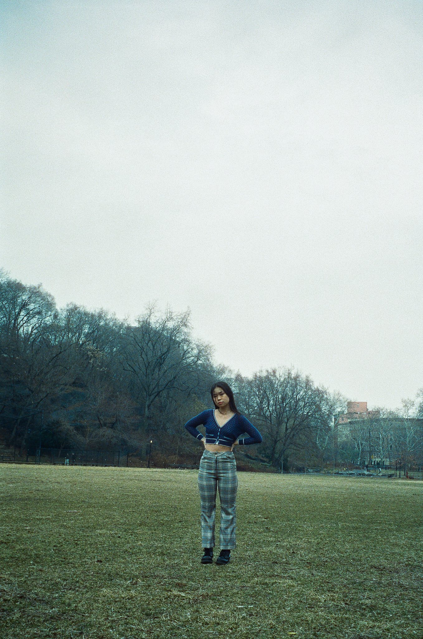
Benny Yang

Feature by Lexi Phelan

Photos by Jane Mok

I met Benny Yang on a brisk Sunday morning in the tent between Milstein Library and the Diana Center. The sun fought its way through a blanket of clouds just enough to offset the mid-October chill settling over the campus’s changing leaves. Benny joined me for a casual conversation, a break amid the stress of midterms, as students made their way to the library.

Benny described to me a childhood that brought him to multiple locations across the globe. Born in Shanghai, he later moved to Beijing, San Jose, and Wellesley, Massachusetts, before going to boarding school in the Northeast. He described to me how his work has changed less due to his physical location in the world and more according to the time in his life. In recalling his artistic training, Benny recalls his numerous mentors who each introduced to him a new medium, ranging from pastels to traditional Chinese painting. “After high school,” Benny recounts, “I started doing some of my own creative work. I chose a medium that best fits the theme or idea I was trying to explore.

Melting Flatland

His Instagram account features an archive of work in a number of different styles and mediums, though his three favorites are charcoal, printmaking, and sculpture. Intricate charcoal drawings hang side by side with oil paintings, photoshopped images, and pastel pieces make up a digital gallery where each post’s caption speaks about the process Benny took to make the work. 

When asked about his artistic influences, he cites the work of surrealist Salvador Dali. Another influence is Alberto Giacometti, as he described an appreciation for “the looseness in all of his sketches.” Dalí’s Le Sommeil (Sleep) is one of his favorite pieces because of the “uncanny uneasiness” of the work. 

When the COVID-19 pandemic swept the globe, Yang reacted with the various ways he creates art. With the influx of free time, he “started creating these series of works that would explore one theme using a bunch of different media and have these offshoots of ideas diverting from this one big idea. He describes one example: “During the pandemic, I started a series on the relationship between humans and their living environment. My work explores how the self inhabits the body and the body inhabits society, and different things we run into by exploring through life.”

Many of Yang’s pieces appear to be reflections on this topic. An untitled mixed media piece from last December shows a number of white humanoid silhouettes against a background that is at once black and colorful, thanks to a combination of charcoal, pastel, and watercolor. Each figure is positioned close to another, sometimes overlapping, but each figure has a space still between them, deepened by the black charcoal. Posted near the peak of the pandemic and while Yang was still a high school senior, the piece appears as a rumination on the physical space created by the pandemic and the various attempts made to fill those voids.

By reflecting through his art, Benny describes: “I’ve become more observant of the spaces I’m in. During this pandemic especially, I looked into different living environments and living spaces. I became more sensitive to how a building is created, for example.” New York is the perfect place to observe this phenomenon, being filled with spaces inhabited by a diverse set of backgrounds. The move from Western Massachusetts to New York presented a lot of changes in that regard––a shift from spread-out buildings to New York’s busy, compact spaces.”

The physical move also initiated a change in Yang’s preferred medium. “Right now, I’m taking two printmaking classes,” he told me, “so that’s everything I’m doing in terms of art.” Benny was familiar with some printmaking from some high school classes, but Columbia’s classes allow him to explore new mechanisms and techniques. “I did a lot of prints before, but those are mostly CA, which is where you lay different things you find, for example, cardboard, on top of each other, and roll ink on it and print,” he explained. This type of printmaking gave him the ability to explore with a multitude of different colors, and no two prints looked alike. Under the guidance of Columbia professors, Yang has been able to take a more methodological approach: “I’m doing more prints where you have to make five that are exactly the same… It’s really fun and wonderful taking classes in Intaglio, which is copper plate etching, which I had never done before.”

For the moment, Yang is focused on the transition as a first-year and learning as much as possible from this new environment. Columbia is just one moment in Benny’s journey, both as an artist and as a person, so he is naturally already looking towards what’s next. When I asked him where he sees himself in five years, he paused for a moment to think before answering. “Honestly, I have no idea.” He continued, “I think if I wanted to pursue art, it wouldn’t be as a ‘pure’ artist. I think I would find something else too… Maybe in a museum, but that has a lot to do with the opportunities you run into… That’s why I decided to attend Columbia; I think New York gives you a lot of those opportunities where a lot of other cities wouldn’t be able to provide.”

Watchdogs in the World of Kitsch

Unenthused by Benny’s more practical answer, I asked the question again, but with the condition that everything were to go perfectly right, luck and money out of the picture. His answer was much more definitive this time: “Be famous. Yeah.” 

We both laughed at his change of answer, and he continued, first noting that while some artists today are criticized for being “too commercial,” they also have the ability to bring in new artists and observers who might otherwise feel that seemingly exclusive art spaces are not meant for them. It’s important to Yang to be able to hold down a ladder to the artists to come after him. However, his work retains an incredibly personal meaning; an extension of his work exploring the relationality between the self and the environment, Benny is offering his own meditation on his subjective position in time. The relationship between self and society, now and the future, is displayed in his ultimate aspirations: “I do really want my name to go down in history. 100 years from now, if you search my name, to be able to see what I’ve done, see a picture of my face.”

You can keep up with Benny’s work on his website and Instagram @yangyart.

Christina Su

Feature by Justin Liang

Photos by Georgia Dillane

The first thing Christina Su will tell you about herself is that she is Canadian. “I don't shut up about it,” she says. “Vancouver, where I’m from, has the best Chinese food outside of China.” At first, this bit of boosterism does not strike me as significant: mere banter at the start of our two-hour conversation about her art and career as an artist. 

Yet only as our conversation continues does it become clear how important identity and place are in her oeuvre. Take, for example, one of the first works of hers she shows me: a striking piece called In Perspective (spray paint and gouache on paper), which depicts a narrow alleyway whose proportions and signage recall the backstreet lanes of a Chinese metropolis. Yet, the scene is clearly not of this world. Textureless and depopulated; monochromatic save for the vivid pop of a few red lanterns: this is a strange parallel reality that is at once both spectral and lonely.

In Perspective

 Then a projector flickers on, and suddenly a riot of ghostly, mythical figures are superimposed upon this urban dreamscape: a giant cat looms mysteriously in the distance, while witchlike wraiths wander the alleyway. It is an immersive, haunting work, revealing influences as diverse as Blade Runner and Studio Ghibli while displaying originality of its own. 

The immersion in an environment and a strong sense of place that characterize In Perspective is a consistent theme in Christina’s oeuvre. She points to her experience of Gaudi’s buildings in Barcelona as a key influence: “if I were an architect I wish the world would let me be Gaudi… how he creates space in a way that collects light, seeing what someone could do in the relatively rigid medium [of architecture] was really inspiring”.

Immersion in a compelling environment is not just a visual experience: it is also, she says, a meditative one. Exterior space can inspire interior states of mind. Though Christina says In Perspective has been called dreamlike, it remains rooted in a recognizable urban space that obeys the laws of perspective. She shows me another piece, however, that leans more heavily away from realism into the realm of psychological abstraction.

Iceberg of Consciousness

This piece, entitled Iceberg of Consciousness, has its inspiration in the psychoanalytic theory of Sigmund Freud, says Christina. The tip of the iceberg shows a jumble of more recognizable objects and figures, though their sense of scale is heavily distorted: two girls, for instance, sit atop a boba drink and soda can. This figurative world, she says, is the conscious mind. Further down, the work devolves into ever higher levels of abstraction, with disembodied hands floating along torrents of pure color, representing a push “deeper into the subconscious.”

The mapping of psychological states onto physical space is taken into three dimensions with Grasp, a Chinese lantern made of bristol board and painted with gouache. On the outside, billowing clouds swirl around a face looking out towards the viewer. Christina interprets this figure as falling into the lantern, away from the viewer, but the hand outstretched suggests an opposing directionality. Various cutaways reveal the illumination within, which changes color thanks to an electronically programmed light bulb. The effect is ethereal, almost mystical.

Grasp invites immersion in physical space: the interiority of the lantern, viewable only from close quarters and at particular angles, draws the curious viewer nearer. Up close, what comes into view is a profusion of Chinese characters. Christina explains that these are fragments of song, poetry, and literature that she was inspired by in her childhood. This one, for example, is the opening line in the Romance of the Three Kingdoms, a classic 14th-century historical novel of which Christina read a children’s version in her youth.

Chinese culture and heritage play an important role in Christina’s oeuvre, attesting to her unique upbringing in Vancouver’s Chinese diaspora community. She recalls spending countless hours in front of the television set with her grandmother, watching Chinese medieval dramas. “I would pretty much just sit at home with [her] and watch whatever she was watching.” As her grandmother explained the myths and legends behind them, she began to read more deeply into Chinese history and literature, whose rich material was fuel for her budding imagination. “I started picking up drawing as a means of visualizing what was going on in my head… I would just sketch whatever character was in my bedtime stories,” she explains. Her visual panache caught the attention of her parents, who empowered her to dive more deeply into the arts.  

In a crucial sense, then, culture and heritage form the bedrock of her creative career. The rich realm of Chinese myth and legend gave her the imaginative license to envision other worlds, parallel universes that are both familiar and strange to us, disturbing our rooted, taken-for-granted sense of reality. In the martial arts canon, for instance, heroes float and villains fly because the laws of physics are suspended. A different kind of suspension applies in the realm of metaphysics, where utopian visions and codes of conduct in Chinese literature provide new material for pondering questions of ethics and morality.

 This push to imagine new worlds, and to immerse us in them, drives Christina’s creative output. Whether it’s the urban spirit realm of In Perspective or the psychedelic, culturally inflected dreamscape of Grasp, Christina invites us into the parallel universes of her imagination. It is no coincidence, then, that she has extended her practice into the realm of virtual reality (it is for this same reason that she has eschewed sculpture, with its greater number of physical constraints). Her virtual reality portfolio, created using Google Tilt Brush, steers away from the cultural referents of her two-dimensional work into pure, abstracted feeling; it retains, however, the same mysticism, sense of disorientation, and psychologically probing, dreamlike quality of her earlier oeuvre. 

Virtual Reality: Explorations in Google Tilt Brush

These features of her art are all enhanced when donning a virtual reality headset and feeling surrounded on all sides by the world that Christina has envisioned. The power of technology to facilitate new forms of immersion has motivated Christina to add a computer science major in addition to visual arts. She is inspired, for instance, by such generative art practices as training artificial intelligence to mimic one’s own drawing patterns, which enable collaborative pieces between humans and robots. “Everyone has a grounded idea of what reality is, but to re-explore this reality through something a lot further out there is interesting.” 

The demands of technology, however, can also impinge on creative practice. As a time-pressed Columbia creative, Christina strives to carve out the time to simply stop and think: “shower thoughts,” she says, are a crucial part of her creative practice, because only with time and leisure can her imagination unfold and inspiration strike. Her artistic process begins with capturing the contents of her imagination in a “word vomit” on the page: the ideation process is the most time-intensive stage of her creative journey, she says, whereas the actual execution goes relatively quickly.

Urban Utopia (2020)

Aside from exploring the world of virtual reality, Christina has also indicated an interest in combining sound with visuals. She “can’t walk into a cathedral without instinctively hearing organ music”, and has gestured to the possibility of collaborating with a composer on a soundtrack for her virtual worlds: all in the interest of even greater immersion. Game design, with its emphasis on creating immersive, engaging game worlds, is another area of possibility. The culture at Columbia has, she says wistfully, also pushed her thinking in more corporate directions: she has spent time applying her artistic sensibilities to user interface and user experience design for smartphone applications, though even these she hopes to imbue with her own creative sensibilities. “If you take creativity and visuals away from me it just wouldn’t work out,” she says of her future.

Christina, for all of her prolificity, is just getting started, and there is much to look forward to. Whether continuing to mine the rich seams of her culture and heritage or to build worlds of purer psychological abstraction, her work is certain to remain rooted in the immersive environments and strong sense of place with which she grew up. In some senses, she’s come far from her childhood in Vancouver, but in the best of ways, she hasn’t strayed far at all. 

The entirety of Christina’s work can be found on her website, https://www.christinasu.com/ and Instagram @artchrissu.

Bill Liu

Feature by Aditi Kapoor

Photos by Caitlin Buckley

Bill Liu is an analog photographer from Australia, and a lover of symmetry. In 2021, he moved to New York City as a student at Columbia and has since taken to embrace the compositions offered by the metropolitan, in contrast with some of his earlier works that feature visceral stills of the Australian landscape.  

What got you into film photography? 

I began in high school, just as a fun way to remember the final days right before graduation. I would usually bring a disposable camera to most occasions, primarily to take photos of my friends––especially because I knew I'd miss them once we all went in different directions. It felt like a time I’d want to remember. As for the medium of film, there’s something about not being able to see your photographs until you get them developed and scanned that makes the experience more rewarding. There was way more nostalgia that echoed from those film photos than from photos I just haphazardly took on my phone. After that period, I kind of just stuck with it. Having a limited number of shots per roll also meant that I was a lot more careful with what I was capturing. Now I bring my clunky vintage camera everywhere. 

Because film is such a precarious medium, have you ever felt more conscious about what you’re trying to capture? 

I used to have a digital camera that I used quite often, and the main difference I found was that on film, you can't see the exact photo you're taking. It’s still possible to compose it in the exact way you wanted, but doing it on film is more of an interesting challenge. All of my photos became about capturing the symmetry I would have been able to get with a digital camera. I started capturing sceneries and cool geometric shapes that evoke symmetry, instead of going after specific subjects. That made carrying my camera with me a lot more fun because I wasn't necessarily looking for things to photograph, I just embraced whatever came my way. 

While perspective differs from photographer to photographer, what do you think makes for a good perspective that can be visually channeled into a photograph? 

I'm sure there's a technical answer for that, but for me, it's mainly about being able to find specific lines and shapes that look good in 35mm. It could be mountain ranges, or simply a flower, but as long as it’s captured in-depth and with every layer complementing the others, it’s a good perspective. 

Your photographs are especially evocative because of their colors. Have you ever wondered what photography would be like without color? Would you ever want to capture the world in black and white?

I haven't experimented much with black and white just yet, but it's certainly something I would want to get into. Black and white film accentuates the composition of a photograph a lot more than color film does, I suppose. Eliminating color makes you focus more on the subject of the photo, regardless of whether that is a shadow or something material. While it has its pros, black and white photography still seems restricting to me, especially since all my photos have amounted to these colorful experiences that I’d like to capture with full impetus. 

That makes me wonder if being from Australia, especially with the country’s terrain, has had an impact on how you perceive color? 

Absolutely. It makes me realize that that's precisely why I've been keeping to color photography––the landscapes and the scenery of Australia are so vibrant that one would be remiss not to capture it in color. The flora and fauna in Australia have so many different contrasting colors and shades––for instance, the arid and dry landscape complements the green plants. Plus, Australia's always got really beautiful weather. The blue skies always create a great contrast between the landscape, especially if you’re around beaches.


Despite having transitioned to New York fairly recently, do you think the city’s atmosphere can be fully be captured in black and white?

Yeah, I think so. I mean, whenever I think about black and white, my brain immediately points to noir films set in rainy Paris or rainy New York. Similarly, old black and white silent era films feel so reminiscent of what I see in New York now.

Being a photographer myself, I’m really fascinated by how photographers perceive the world. Do you think you look at the world as a spectator first and then a photographer, or vice versa, if at all? 

I can't say I've ever thought about it in that way before. I suppose the vast majority of my photos are taken when I'm traveling, whether on a road trip or camping with my friends in Australia. I guess I go to those locations first as a spectator, just to travel, but I always keep in mind my camera. I don't typically intend to take photos when I go out, but I like having the option to. I never go to a place just to take photos; that way, it’s especially serendipitous when I come across a scene that’s worth capturing. 

Do you ever find photographs deficient in that it captures a mere split of a second? Do you find yourself craving more from a medium that is perhaps less still? 

I certainly think photography and videography both have their own distinct positions in the world. While I may not be a professional photographer, I believe really impressive artists are individuals who are able to work within the limitations of their medium, all the while communicating their message. From that lens, even if photography is an instant in time rather than a moment, it is a limitation that photographers have to contend with, and the good ones are able to grasp that.

Having begun in high school, I wonder if you think photography has changed you over the course of time? Have your photographs changed with it?

I think so. In the beginning, I would take my cameras mainly on nights-out to photograph my friends, but over time it became more about travel and landscapes. It became more focused on the aesthetics of the photo, rather than the subject. Gradually, I have moved more and more away from people to symmetry found in nature. In terms of the way it has changed me, film itself has made me a lot more careful about composition. I'd like to think I've become more sensitive to aesthetics. Now, a lot more goes into evaluating a scene and finding new ways to approach the same subject. 

Nostalgia seems to be a very big facet of your photography. Do you think photographs generally possess an emotional charge? Do you think that charge lapses over time, or are photographs immortal? 

This relates back to when we talked about the medium of the photograph being limiting. Photographs are unlike writing but they’re still “worth a thousand words,” right? If historic writing is still relevant today, photographs should be warranted the same immortal status. I think a lot of the emotional charge that a photograph envelops comes from what it captures and how it makes you feel, regardless of how distant you may be to its subject. If a photograph fulfills those conditions for an individual, its charge is likely to remain intact. 

I feel as though one of the biggest dilemmas a photographer faces is feeling conscious before pressing the shutter. Have you ever felt that way?

I certainly feel a level of self-consciousness whenever I whip out a camera in some places, especially when there are a lot of people around. However, both my parents are Chinese; they’ve spent a lifetime taking photos on their digital cameras. As a child, I remember being grouped for family photographs behind every scenery, time and time again. I used to get embarrassed by my dad because he wanted to take so many pictures. No matter what kind of gathering it was, as long as there was a group of people, he’d always want a group photo. Plus, he’d additionally make every combination of a photo possible. Him and her...and now this guy and this guy…  it was so funny. Having grown up with that happening in the foreground, I have grown to embrace my presence in a specific place, if only to rid myself of the consciousness that prevents me from capturing it permanently. 

It’s so fascinating how generations before us perceived photography so differently. Do you think your parents had different intentions towards photography, as compared to you? 

My parents certainly didn't do photography for the art of it. They wanted to capture people and share memories. That's certainly how I first got into it. In year 11, I made a conscious effort to take a one-second long video every day of the year and made it into a collage at the end, which was really cool. I wanted to do something similar the year after, and it just so happened to be through photography. Regardless of the generation, photography is rooted in preservation— of people, places, and the photographer’s reality and its subsequent experience. 

Is there an artist whose work you look up to, someone who has inspired the way you photograph? 

Ansel Adams. His landscape photography looks like it belongs in some epic fantasy like Lord of the Rings or something. 

Where else can we find your work?

My Instagram is @license_to_chill.

Zachary Ginsberg

Feature by Raunak Lally

Photos by Rommel Nunez

Go ahead and introduce yourself!

Ginger and Elsa Rose

I'm Zach, I'm a painter. I study History at Columbia. My main schtick is that I paint and that's what I'm hoping to make my life's project. I like to paint people in my life, I like to paint my friends and my family and people who I run into in the streets. I try to capture their interiority and anxieties and what gives them pleasure and excitement.

Where are you from? You said you paint people who you run into in the streets – is that in New York or back home?

I'm from New York, so this is home. 

Are you involved in any student organizations or clubs on campus?

I'm the Graphics editor for The Federalist, which is a satire newspaper. I'm also on the debate team.

Shifting gears a little bit onto your work now, how did you start exploring oil painting as a medium to translate what you notice about subjects into an image?

I've been painting before I could talk, or so my mom says, so it's always been a way that I've expressed myself and been able to interpret the world. When I feel really stressed or anxious, I turn to drawing to ground myself in the world, so it's very therapeutic. For me, it almost makes the world make more sense when you're able to internalize the aesthetics of it and then reproduce it onto the page. That's always been a part of me. I started oil painting in high school––I was painting with acrylics before that. In high school, I started taking classes at The Art Students League on 57th Street, which is a really great school that has a lot of seniors taking classes there, and a few young artists. It used to be a really big and vibrant institution for the arts – Jackson Pollock went there, Norman Rockwell when there, Mark Rothko, people like that. I basically moved into oil because the colors are so much more vibrant, and to up my painting tenacity. I thought it would be necessary to move into oils.

Lukas’ Room

What motivates you to work across mediums? To sketch rather than paint or paint rather than sketch?

I'm sketching all the time; if I'm in the moment and I see something and I have my sketchbook, then I'll go for it. Painting is more of a thought-through process. Ideas for my paintings surface through a percolation process through the thoughts of my mind and I always have a bunch of those circulating at any given moment. I'll make a few sketches of them to see what they look like, see if they actually could be viable paintings, and if I think it's worth putting onto a canvas, I'll start painting. 

My sketches are things that I see throughout the day and draw from life directly. My paintings are mostly from photographs, memory, or sketches. 

The main difference between sketching and painting is that when I'm sketching, I'm responding to the world as it is directly in front of me, so if I see something and then I feel movement in an arm or a leg or whatever, or a color that stands out, and then I transfer it onto the paper. With painting, I am looking at the canvas and I am responding to the canvas, so it's a very different engagement with the artwork. When one thing changes, that suddenly changes the whole composition and I have to consider if I need more weight elsewhere on the canvas. I tend not to plan or draw out my paintings precisely before I paint. 


In your oil paintings, you use color tones to capture the emotions, like the cool, chill tones of “Moving Day” or the warmer tones in “Women chatting.” How do you go about choosing what color palettes to use when setting these scenes? How do you immerse the viewer in this world that you're trying to create?

They go hand in hand, color and subject. When the idea of a subject comes, so do the colors. It's not like I want to paint a picture of moving out of the dorms during COVID and then I think "Oh, cool colors would be nice for that." I have this image in my head with cool colors already involved. It's a very intuitive process; I try not to make too many overtly rational decisions. 

Moving Day

The greatest thing about painting is the fact that it gives you a direct view into the artist’s experience with the world and you can see how they feel merely from the way they apply the paint to the canvas. If an artist tries to plan that out too much, they add a filter to that, so I try to let it come naturally, especially when it comes to the colors since they’re the most immediately emotional part of the painting. It’s important for the color palette to arise naturally. 

Normally, it starts with a few colors. For instance, I'm working on a painting right now of my roommate smoking a bowl on the fire escape and I was really drawn to the glow of the lighter on her face and the way that it made her face look whitish-yellow. In contrast, the bowl itself with the burning embers were a very piercing yellow-orange, and that combination was really great. The blue in the background created a really great contrast as well. I started with those three colors and from there, it was like, "okay, I have a blue, I have an orange, I have a yellow, I have a white. What comes next?" It builds from there into what the painting requires.

I was really intrigued by the way you omit faces in your paintings, whether it is used in the isolated figure in the back of "Women Chatting" or like the slightly obscured eyes in "Anya in the Cabin." Why do you decide to either paint a face with detailed features or make other features indistinguishable?

When it comes to the person who is in the foreground in the painting, I try to paint their face gesturally, the way figure sketches are often done. In art school, you'll have a model stand up doing a crazy pose, and then you have 30 seconds to sketch it down, so you sketch the gestures and the motion of the figure. I try to do a similar thing when it comes to faces’ gestures, capturing the way the nose juts out, or the lips cut back in, or the eyes and the curls of hair around them. It all comes together in a whirlpool of a face. 

Women Chatting

For the figures that are less visible, I prefer paintings when there's contrast in detail between one figure and another. I think it draws attention to the one you're supposed to be looking at in the foreground and then the other one adds another level of mystery, creating a good level of balance. If you made it too detailed, then it wouldn't work as well on either of them, so that's a compositional decision. The idea is that there's someone watching the scene. 

I've noticed this strange feeling in my paintings when you're looking in on this intimate scene. You can acknowledge a sort of voyeurism with another figure watching, someone who's a little bit less clearly delineated. Perhaps the viewer can connect to them more because they can put themselves in that face since it's not visible. 


Talking about intimacy in your paintings, the perspective draws a lot of attention to that intimacy and brings life to the characters like in the slightly stretched, whimsical look of the room in "My bronx roommate" or the distance that you see between the subjects in "Wyatt and Alex." How do you use perspective in your works? 

A lot of it comes from the fact that my paintings are set in rooms––in bedrooms, in living rooms. They're rarely set outside. It wouldn't be enough to simply paint a room with perfect perspective, because the relationship between the characters is sort of flat, so you can enforce a certain relationship between characters by having the room move around them and create either disorienting or a warm and inviting feel through the perspective. It's more interesting when you can feel like there's something about to happen, when you know that there's a sense of potential and movement that could come out of it. 

I try to communicate that with the room as well. The room is gestural in the same way that the face is gestural; in this moment, in this room, what's the overall twist or motion? Questions like that reinforce the relationship between the characters. 

Julian and Abhi

What drew you to painting people in the first place and making those the subjects, as opposed to, say, still life?

I like to paint things that matter to me, and, again, the way that I come up with ideas for paintings is just what percolates throughout life. The images that stand out most to me are images of people in my life. To communicate how I experience my world and how they experience the world, it makes the most sense to focus on them. 

I want to paint my life and people happen to be more prominent in my life. There's definitely an argument to be made that objects are prominent in people's life and might have a certain significance. I would like to get more into that––that's definitely something I'm thinking about going forward. There are objects in my paintings and I sometimes try to communicate a relationship between the person and the object; if you just paint the object alone or the person alone, sometimes that's not as clear. 

Another reason why I paint people is that it's not just about me, it's also about them, and so I try to paint the way that they experience the world and what's whirling within them. I want to capture their narrative, especially of those people I know well. 

When you're creating these intricate worlds, do you ever see yourself in these worlds or insert anything that relates specifically to you rather than other people?

I've put myself into a few works recently. There's one work of my friend and me that’s called "Bushwick Room.” Sometimes that happens, but I haven't really painted many other self-portraits. There is a bit of myself in all of my paintings, in the subjectivity of it. It would be disingenuous to say that when I paint someone that it's just them, that the anxieties on their face are their objective, real anxieties. If you were to go and ask that person what they felt and how they're experiencing the world, it would probably be different. My paintings are my own, subjective view of how others exist.

Anya and Abie in Brooklyn

Sometimes I can portray something about a person that strikes upon something they didn't even know was existent. Someone will look at the painting and go "Oh wow, I didn't realize I was so sad!" But they’ll confess that they did feel that way, maybe without realizing. That's just to say there's a bit of truth––I mean, I hope there's a lot of truth––to the way that I express how these people feel. That being said, it’s inescapable that some of myself are going to get into that as well.

Taking a step away from the paintings over to your photography work, it's really unique and fun to look at these eclectic settings that you've captured, like "Montana Shop" or "Montana Hat Shop.” What's your process of setting up a shot?

My photographs are impulsive; they’re rarely set up. Similar to how I paint, I really don't like there to be too much rational process. Rationality and analytics can come later. Once it's been done, you can assess, but in the process, it’s more about feeling right, and when it does, boom, take the picture. It's really just in the moment, a sort of intuitive, creative decision. I travel a lot and I always have my camera, always on the lookout for good scenes. Again, I find that I'm still focusing mostly on my friends, people who I know. 

Wyatt and Alex

Are there any overarching or intersecting themes you notice running between your photography, sketches, and paintings?

One thing that I'm working on right now is the experience of being right before adulthood and not knowing what you want to do and what's gonna come next. What's involved in that is anxiety, fear, worry, excitement, passion, confusion. That's what's most present for me in my own life. It's inescapable, but that's what I need to think about.

Due to the pandemic, have you faced any challenges or the way you interact with your subjects?

The pandemic hasn't made art more challenging for me, it's just made the context different. It's changed the sorts of aesthetics I have at my disposal. For example, it's made it easier for me to get into close contact with my subjects because I've spent the whole pandemic living with my friends. A lot of the paintings I submitted were done during the pandemic and all of them are of my roommates or someone who has lived with me at some point. I'm able to see them throughout their day, doing mundane things.

It's given me more material to work with in many ways. A lot of the time, we're all distracted by our own lives, running throughout the day, from class to class, to work, etc. The worry about the pandemic, the fear, and the claustrophobia of being stuck at home, it’s all present in my work.

Obviously, this idea of coming-of-age is not unique; a lot of artists have made work about it in the past. Something that's new now is the pandemic. There’s also our interaction with technology, which adds even more depth to all of these anxieties and all of these worries we experience as young people.

I'm so glad that I got to sit down with you and talk more about your work and your creative process, and I'm excited to see what's coming next! Is there anything you're currently working on?

I'm continuing to paint and photograph. I'm working on a painting right now with my roommate along similar lines. No big projects in particular other than my general ambition to get my artwork out there.

Where else can we find your work and stay in touch?

My Instagram is @zachary.ginsberg and my website is zacharyginsberg.com.

Ethan Green

Feature by Sophie Paquette

Photos by JP Schuchter

Ethan Green is a digital collagist and internet trash sculptor. Using free-associative search queries, Ethan scrubs the archive’s most abandoned, intimate memories––in pursuit of those low-res, ripped, totally fried impressions only accessible through an endless chain of “related images.” Layered, manipulated, and cut-out, these images serve as the exquisite-corpse-anatomy of Ethan’s collages.

Introduce yourself.

My name is Ethan Green and my pronouns are he/him. I'm a senior in Columbia College studying German and English. I make digital collages.

4-10 june 2021

Have you ever worked in material collage?

A few times. I took a creative photography class in high school, and we got to put together a little journal in class. You had the Nat Geos, the best collage material. There's always some crazy shit in those. We made these little collages on the front of our composition notebooks. It was really fun. I always liked cutting things out.

I find it interesting that we still use material words to talk about how we work in digital art. Words like "cutting" and "pasting" imply some manipulation of a physical object, even though it's all digital.

Oh absolutely. The icons themselves are reflective of the physical objects, like the "cut" icon is a little scissor. There's definitely a real physicality to the way that you work in these programs.

What in your practice feels physical to you? 

Sometimes you encounter a wacky shape and you can't remove the background easily, so you have to manually cut it out using this little path feature. You click all the way around the image, which takes a really long time. I usually zoom in a lot to get as close to the edges as possible, but this also makes it difficult to discern where one thing starts and the other thing ends, so you get caught up in pixels. You think it would make you more precise, but a lot of times it kind of fucks me up when I zoom in too much. You kind of lose track of what's going on, the boundary of one thing to the next. 

8-29 may 2021

There is a weirdness to trying to find the gestalt of shapes, like the shape of shapes, within a photo image itself. With non-posed, “real” or candid photos, the things in the image are not thinking about where they are in relation to the other things. So you really have to work with the image and determine for yourself where things start. 

It's also really interesting to do that with something that doesn't have a really determined border. For example, if you want to cut out a volcano, and there's an ash cloud coming out of it, it's up to you to decide where the ash ends. It's very nebulous. That's honestly the functional part of my work that I put the most thought into: how cutting things out works, and where to stop and begin.

11 june 2021

In a lot of your pieces, you retain the rectangular aspect ratio for many of the disparate images, and it gives it the look of blown-up pixels. When you have infinite possibilities for manipulating an image digitally, what makes you want to retain that rectangular shape?

My background is graphic design, specifically page design. I was the editor of the yearbook in high school. I'm into arranging within modular sections of a page, so I always work in rectangles, blocking things out. I think that using square images and retaining the original helps to block out a collage, so you're never gonna be able to take in the entire object at once. You can use it to do a little bit of storytelling. I do usually want to have some sort of background-foreground play. Using square images helps to form a background. 

Do you consider the reading path of these images?

I think it is something to be read. It's like reading a piece of ekphrasis versus looking at a painting.

When I did yearbook in high school, I started off interested in writing, and I would always try to write these really cool articles for the yearbook. And the editors were like, bro, do you think people read the yearbook? You're ridiculous. They just wanna see pictures. 

Some of your collages get to the point where you can consider text as image, too.

30 april 2020, 1 may 2020

In the program I use, you can convert text to path and change text into little line segments, like a mesh. You can warp it. In programs like this, there is an acceptance of text as a purely visual thing. Text is not taken more seriously than any other element in these programs. It can also be manipulated into something less easily recognizable. 

I like to go into FaceApp and then use the same filter on my face, like a hundred times until it can't recognize it as a face anymore. A lot of times in a collage, I'll find an element that I like, and I realize I don't really want to use it in the collage, but I'll just take a shape of it and then take that shape and flip it,form two shapes, duplicate that like six times, and then flip it and eventually make it into something completely strange and abstract. In one collage, I found this diagram image and I took a part of it out and then I flipped it and then rotated it then flipped it. Now it looks like a religious symbol or something.

The distorted image operates as a kind of subliminal, too, a secret message in the collage. Do you ever have an image you put down that ends up being completely obfuscated? 

30 may 2020

Very often. Or it's basically invisible. Especially in some older work, I would just put like 45 images in an 800 by 800 grid. Like just really, really small shit. Every individual image that I put on there, I'm always just like, how can I make this more visible? But at a certain point, I'm just like, I just gotta surrender to the decisions that I've made. And that's fine. When I think I've done that, it becomes a good reflection of my commitment to the process that I will actually be proud of putting out there, regardless of whether one I like gets fucked up by another one.

Sometimes, too, you just wanna preserve the wholeness of an image. Which is funny because often I will take an image and keep the same aspect ratio, but I'll just zoom into it a lot. So you're missing a big part of the original untouched image, but it's still maintaining the same guise as the original image. In reference to the essay you sent me, I'm comfortable blowing an image up, making it a little bit more distorted and grainy, in order to make it easier to understand what it is.

In my artist statement, I talked about searching the internet to uncover stuff that people just left there. I'm always trying to find images that look like somebody took rather than just an image of something. The way that file formats and image storage work on the internet necessitates that they're going to be a lower quality image. And I kind of like that, honestly, it's like a visual marker of authenticity, right?

de constructions on an instrument - album cover

That's definitely part of the visual language of our generation, that idea of deep-frying something, an image going through so many hands and channels before reaching your screen. You're getting at this kind of weird specificity, using the associative language of memory or nightmare, but also just the language of memes.

To find images generally, I go into Google Incognito mode, so it doesn't have any of my cache data. I search phrases and strings of words that I free-associate. I always try to search for really specific things because I want to get into something really strange that somebody posted. Past a certain point, Google offers you options that don't exactly match what you want. Those are always the most interesting ones. 

It's like how sometimes radio shows will jump onto the same signal on accident and just fade in and out of each other. I put out a beam and I'm looking for a specific signal, and at some point in history, these things intersect and touch my little beam.


Then it also becomes a product of chance.

Yeah, I really like process art. I don't think I could do any other kind of art. I don't trust myself to do anything besides process art.

dark ecologies 1

So, you post predominantly on Instagram?

That's the only place I post actually.


If you had complete control over a viewer's physical circumstances, how would you want them to encounter these pieces?

I like how Instagram has a zoom feature, but it's really shitty because you have to keep pinching and zooming with your fingers. If I could control how people see my pieces, you would initially have to see it on Instagram and deal with all the zooming, the way it reduces resolution, makes things hard to see and blurs stuff in the background. And then somebody would hand you a different iPad with the full resolution image. You can zoom in as you please. 

I'm not really interested in what I have to say about my own work, I'm interested in what other people think about it. So I'd also make them write their thoughts down on a flashcard before viewing it on the iPad. So you’d have to look at it on Instagram, you write down your flashcard, and tell me what you think is going on. You’d hand it to me, and then I’d hand you an iPad that allows you to look at it as close as you want. 

dark ecologies 3

Have you ever thought about working in moving image, like using GIFs?

I play a lot of video games. Like, a lot of video games. In video games, there's this thing called a fragmovie, which is like the equivalent of sports highlight reels, but for a video game. I wanted to create one of those and then like an art film and mesh them into one. 

I am very interested in moving images. Watching film, for me, image takes primacy. What's interesting about GIFs, too, is that they're super lossy. They’re really degraded. 

It's funny because these images moved but just went nowhere. It's like if you had a car and you were forced to turn right forever. They're stuck in a little closed-loop, somewhere in a forgotten part of the internet. But they're still moving. If I gave you the search queries I used to find them, you could go and find the original versions of any of these images.

Even just pulling the images of your collages up on my computer, the way the screen organizes and layers them makes a kind of natural collage.

I like looking at the geometry that buildings form between each other. If I'm looking from a certain sight line, I really like looking at that. I also like looking at a bunch of windows open at once on my computer.

These images you've created feel really similar to what it feels like to go walk outside, how you might see multiple ads pasted on top of each other and then pasted on top of a missing person poster. All of these images and words come into contact in ways you really don't expect. And when you see someone with a really graphic T-shirt walking in front of a poster, suddenly that's a collage.

Yeah, the images are a little bit mimetic. It is reflective of the way that I look at things. I'm trying to make things more busy than they are. I used to use a lot of images that I took, like, sometimes a collage would be all images that I took and then Star Trek screenshots. I really like science fiction imagery a lot. I like stuff that looks unrealistically futuristic, especially stuff from the 60's and 70’s.

Like Barbella?

Yeah. Barbella exactly. That shit is dope. Or like, not to be cliche, but like 2001, right? Or Star Trek: The Next Generation, there are a lot of really cool visual effects on that show.

dark ecologies 4

Those types of visual effects have the same feeling of something being degraded until it becomes unrecognizable.

Right, because ostensibly, there are real equivalents, like whatever they used to create the image itself. There's analog to that in sound like, you know, in Star Wars, to get the sound effect for a laser, they just hit a wire or whatever the fuck they do.

Give me a keyword search, no thinking. 

Fatimid Dynasty organ grinder daiquiri.

hand is a vector, 2021

What are you working on right now? What's next?

I'm always in the process of making like four different collages. I want to fill out like 60% of an image and print it, and then my roommate, he's going to draw on the rest of it. And we're gonna hang it in my room on my wall. I'm also working on some stuff incorporating a lot of images of my own hands. Other than that, I'm always just spinning my wheels.

Where else can we find your work?

You can find it on my Instagram @4evrdolphinluv.

Mac Jackson

Feature by Leni Sperry-Fromm

Photos by Rommel Nunez

When I met with Mac, I saw a face I had seen represented over and over in her work. With so many figurations of her already swirling in my head, I was excited to finally get to know the real person. Through talking to her, I learned that maybe, Mac is best represented through as many different iterations as you can find. It seems that, for Mac, her art is an attempt at collecting all these different pieces of who she is and who others know her to be, and putting that out there for interaction and interpretation. 

At the beginning of 2021, Mac started a self-portrait project, producing one self-portrait every month. Many were stunning acrylic paintings, one is a paper-mache mask, and another a photo of that mask being smushed by a car. While the project began as an attempt to pin down her artistic style, the process morphed into an exploration of Mac’s perspective, self, and much more. “When I was looking at the self portraits I realized that they served as a diary. While I was making it, I kept asking ‘Who am I as an artist? What’s happening in my life? How do I show that?’”

January, 2021

As Mac tries to understand her own work, she’s attempting to get past the need to be understood by everyone else around her. There’s a catharsis in putting her work out into the world and welcoming people into that, without prioritizing the need for them to understand her. It makes Mac’s work feel incredibly intimate, almost jarring, as the viewer confronts the closeness that she invites people to share in her and her image. 

“As I try to let go of caring about being understood, I have this extreme response of wanting to be completely translucent and vulnerable. To do that feels cool because I can make art about me where I'm not talking about things that I don't know about, but I'm also not being egotistical. I’m just peeling off layers of skin.”

July, 2021

March, 2021

And her work is just that, vulnerable and unashamed, challenging her audience to be a part of her world. 

Rachel’s Apartment, 2021

The interaction between Mac and her audience is what adds significance to that process of transparency. “Other people looking at my work is what makes it feel so intimate. I feel like through my art I'm putting myself out there and saying, ‘Look at me. Touch me. Interact with me. Think about me.’” Mac’s work, though infinitely introspective, belongs in a space of relation between artist and viewer. Even painting is an interaction between Mac and herself, a place where a touch can make her more real, part of a network of people. “The project feels kind of like reverse psychology where I’m trying to be less self-centered through doing all this self portraiture.”

Mac has also been exploring ways to accomplish this through other mediums, most recently through her project ‘Privacy: A Provocation.’ For the project, Mac scanned the first page of journal entries, which turned the script into loose gibberish that she then presented to her teachers and friends. The scanning process created “a dada effect of being nonsensical, but then at the same time it was so confessional.” The project comments on the difficulties of communication, presenting a work that’s paradoxically transparent and unintelligible.

February, 2021

April, 2021

Other breaks from her self-portrait project include a painting, Saint Carlos. In it, her friend Carlos sits with a halo on his head, among angels and plants. The painting means a great deal to Mac, as she says it’s “my little hope that I’ll be a humanist.” The Renaissance styles she incorporated also made Mac think about the relationship between art and religion: “If I'm bold, making art is like your own form of religion. And that painting was like one of my little art angels.”

Saint Carlos, 2020

Aesthetically, Saint Carlos fits in with much of Mac’s other vibrant portraits. She says when it comes to portraiture, she focuses on skin the most: “It’s the most fascinating combination of colors and textures. I’m interested in exploring skin’s texture because this idea of touching and closeness is so real.  Touch is the only real connection that I can’t overthink.” From the beginning, art has been rooted in a tactile, active process for Mac: “As I made art, it became more of a thing I did than a thing I made. It was an activity, more than a result.”

Ticket to Touch

Peanut Butter Jar, 2018

In this way, Mac’s process is messy and often accidental as she keeps asking herself questions. This process was integral to the creation of Mac’s recent performance art piece, where Mac made three papier-mâché masks of her face, stripping them off one by one to the tune of The House is Haunted by Russ Columbo. The result was a spooky, sexy commentary on femininity and Halloween. Mac, as someone “socialized with femininity,” relays that experience of Halloween changing from something fun and the ability to be whoever you want to changing into something sexualized as an adult: “I’m interested in that intersection of pretending to be someone else, having it be spooky and then making that sexy. Metaphorically that sticks with you as you grow up. So with the piece it was fun to have this idea of taking myself off and exposing that. And then I had to keep in mind the question of: how do I perform it? And I ended up performing femininity and my sexuality.”

Image generated with a convolutional neural network using Mac’s art style by Jay Trevino

The work is a testament to Mac’s creative process, while it might start as just beginning questions and small ideas, when she makes the work she finds a clear, direct statement. Mac celebrates the messiness of this approach: “I don't have it figured out. I don't have a lot of intention, but I do think I'm at a turning point. I do see what I'm making and what I'm experiencing, and I do like it. I don't want to take my art too seriously, but it is so connected to my feelings so there's a level of, not seriousness, but sincerity there. That's important to me. I just hope sincerity can exist alongside being a little bit stupid and figuring myself out.”

You can find Mac’s art on her instagram: @macjackart and on her website: https://macjacksonartist.wixsite.com/website. Mac will (probably) be open for commissions in her instagram DMs or her email macjacksonartist@gmail.com. Mac also welcomes people to send anonymous scans of their journal entries to her email in participation with the Privacy Project.