Feature by Beatrice Agbi
Photos by Rommel Nunez
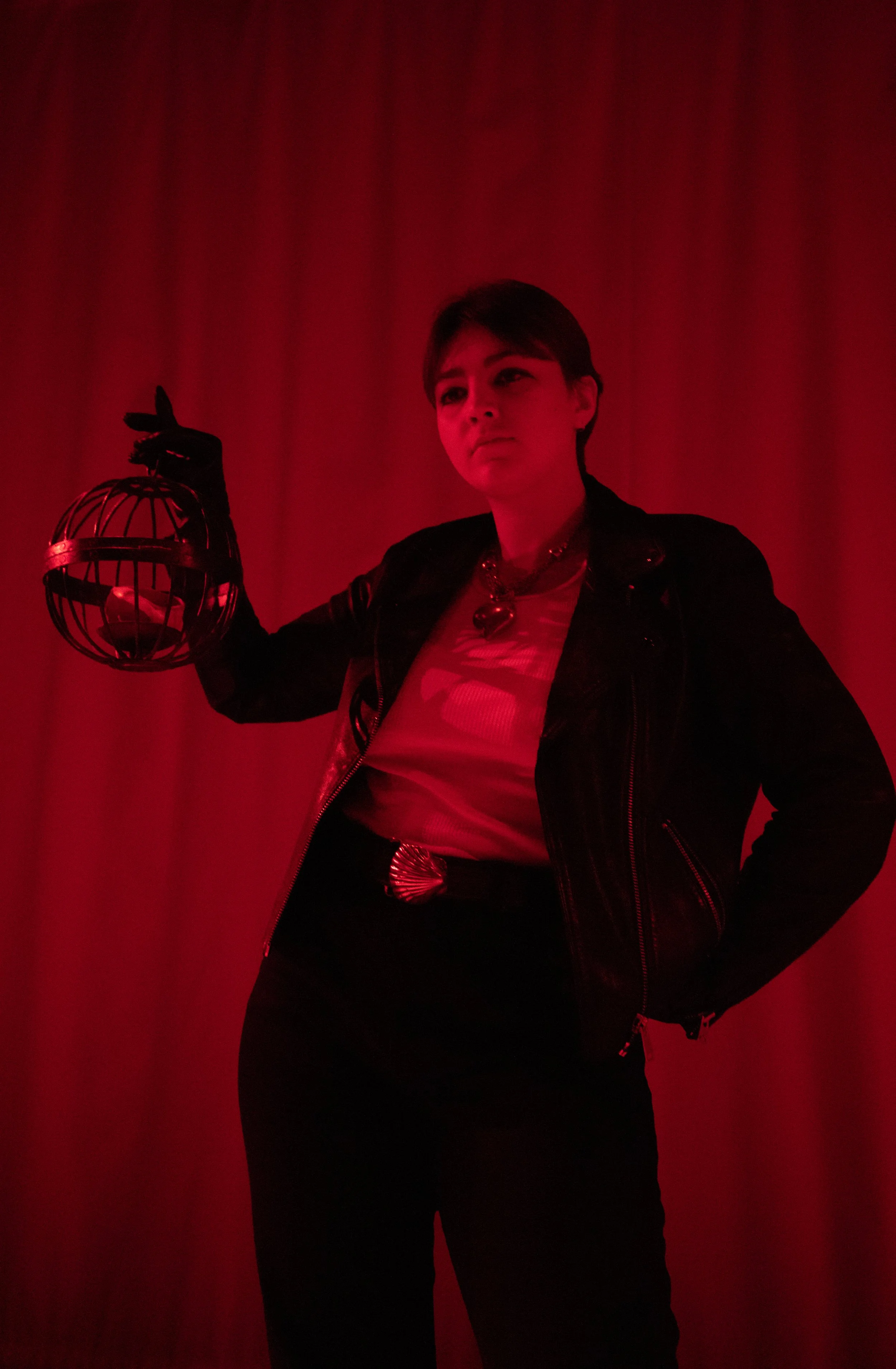
Isai Soto is a junior at Columbia College majoring in Anthropology. They consider their pieces to be literal expressions of themself, incorporating humor and fun into all aspects of their art. They work in graphic design and printmaking, using their skills to make zines, fonts, and posters.
Introduce yourself!
I’m Isai Soto. I'm from San Diego, California, and I am a graphic designer and zine maker.
How would you describe your style of art?
I do a lot of poster work. I love making flyers, and I've recently gotten into making zines and type fonts. I would say my style leans more towards maximalism and a little bit of the punk aesthetic that was used in the London rave scene in the ‘90s. I call on motifs that are used now in modern poster work, like smiley faces and stars and flowers, for example. Overall, I think a lot of my style is just fun.
Do Not Disturb, digital
When did you start creating art?
I took a graphic design course at Georgetown University before I transferred here, in my second semester as a freshman. Famously, the COVID-19 pandemic happened, and I went home. During that time, all I did was wake up and get on my computer. I would recreate album covers and spent most of my summer in quarantine getting better at design. I kept doing it for fun after quarantine.
Why did you take the graphic design course in the first place?
I actually took the course from the recommendation of my friend. Even though I was really bad at the course, I still stuck with it. My lowest grade that year was in that class, because the teacher did not like my art. I thought it was bringing it to the table, too!
Did you have any experience with art before you started doing graphic design?
I was never an arts kid. In high school, I was a farmer – that was my big thing. I was part of the Future Farmers of America organization. I ran a goat herd, and I would go to farm conferences in places like Indiana. I wasn’t really doing any of the work I do now. If I was making flyers, it was for a barbecue we were doing or something like that. I never thought that poster-making would be a trade that I would want to pursue seriously.
Paloma La Mona, screenprint
What influences your work? Could you name some of your favorite artists?
I love screen printing. From there, I would say old flyers by Riot Grrrl and Sex Pistols also influence me, because they incorporate a lot of collage. Their posters have this weird texture to them because they would print and xerox them over and over again. They always work with one color, mostly because it’s cheap. Similarly, I started off by working in just black and making designs from there. I still have a lot of trouble with color.
Some of your pieces seem to have a direct message. For example, I Have Cavities directly talks about how expensive dental care can be in this country. When you're making these art pieces, what is the level of intentionality?
Most of the time, I'm just having fun. If you do this practice for leisure, or if you make art to alleviate any of the stress of your life, the focus should be to enjoy yourself. Graphic design should be fun! Paula Scher says that you should be in a state of play when you're designing and I sincerely believe that. So I go the comedic route.
I Have Cavities TEETH! Ed., screenprint
I’m straightforward in what I have to say. Like, I have cavities. I have real cavities. It’s not that dental hygiene hasn’t been a struggle for me. Having a dentist does cost a lot of money, and I haven’t always had the money to have a family dentist or any of that. Even then, when I make art, I try to keep it light. This mindset is really important because I think the art world is very pretentious and elitist about who gets to create stuff. A lot of printmaking is derived from people who democratize art.
How does humor play a role in your art?
Whatever medium you use, it needs to be fun for you. If you take all the joy out of your work, then this practice that was supposed to be great for you and enriching for your life becomes a detriment. While I think that there are ways to express negative emotions through art, ultimately, by denying yourself the playfulness that everyone innately has, you block yourself off from the dimensionality that you as a person can create. All this is not to say that you can’t be sad and playful at the same time––I've been playfully sad a lot of times. I think that kind of nuance is able to be recreated through art. When I use humor, I do it just because I want to laugh. Sometimes the jokes don't even make sense to anyone else, but I’ll still put them in my work.
For example, I put my face on a lot of my art. My face and humor are my signatures. People often get nervous to share what they make, and they don't want to attach themselves to their work. Initially, I thought that using the Germprint brand would be a way of distancing myself from my work. But my face is pasted all over it, so it’s impossible to hide from it.
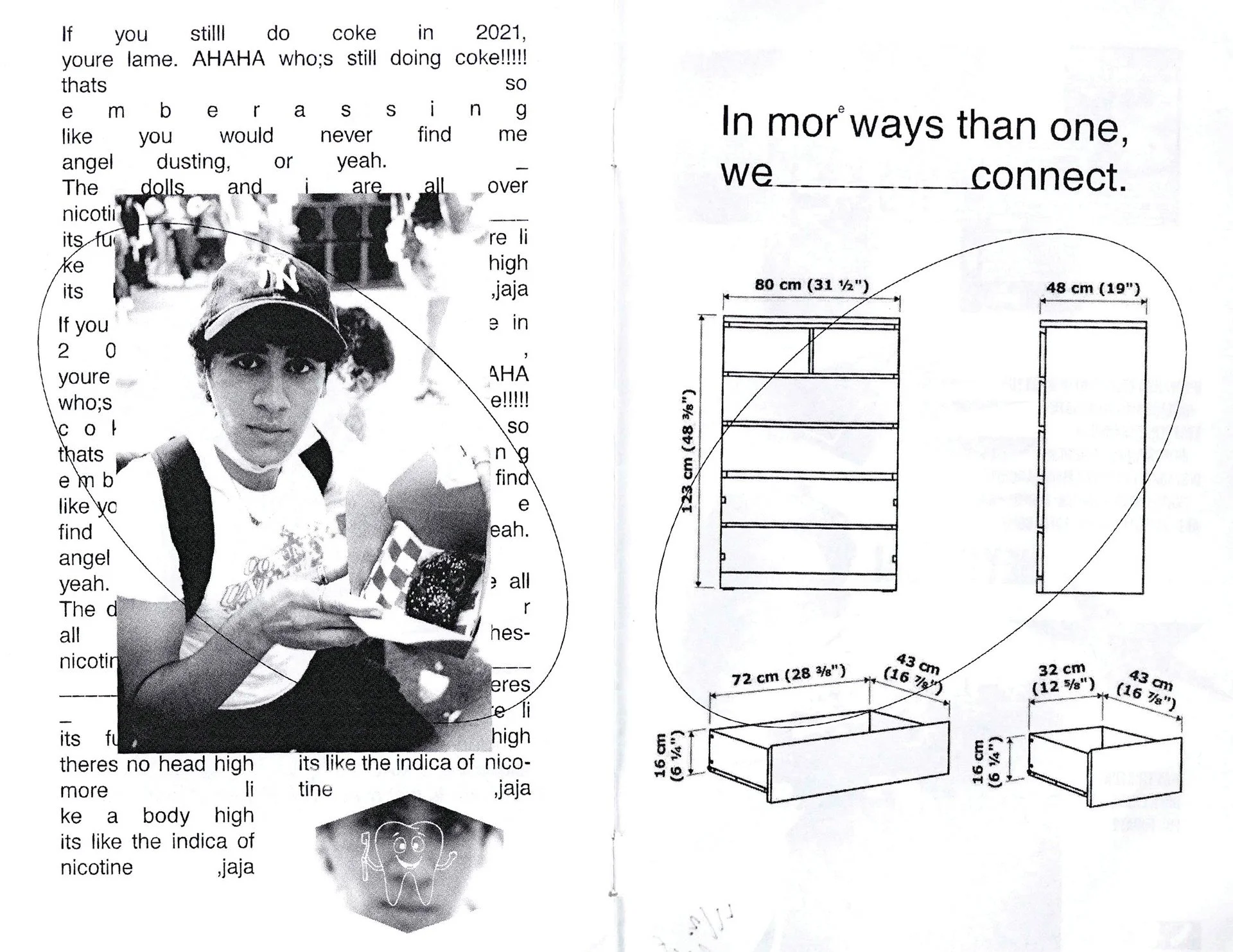
Germazine P. 9-10 Spread, screenprint
When you put your face in your art, do you consider it to be like a self-portrait?
I’ve never thought of it as a self-portrait before, to be honest. Usually, when my face is in my work, there's a lot of manipulation that goes into it. Since I do a lot of editing, there reaches a point in my work where the face is almost unrecognizable. I know that it’s me, but the editing creates a detachment from a regular picture of myself. So no, I wouldn't consider putting my face in my work as a self-portrait. That’s why I consider my face a signature.
I do want to talk about Germprint now. What was the process of creating that brand?
I had the idea either this year or last year. I was at home by myself, making a bunch of little designs, and then I slapped on this logo. It was originally gonna be like a skate brand. The logo is actually the rough sketches of a dirt particle combined with one of those like little Covid bacterias. Because words like germs and bacteria were such hot words at the time, I would go back and forth between brand names like bacteria print and bacteria design. Germprint stuck the most; I feel as though it’s almost a personification of me and my raunchy personality types.
Germprint screenprints
How much of your work is already found material?
A lot of my photos come from my own gallery, or they’re stock images, or they come from my own personal collection. Royalty-Free baby; I am not paying a dime and I love it! I’m a huge magazine collector. I recently got a 1934 and 1944 National Geographic. I also love vintage Playboys. Old magazines are really interesting because some of the ads exhibit the time they were made in. For example, I love cigarette ads. Usually, an image of the box is slammed on there, and then underneath it, the text reads: Have a beautiful evening. I like that juxtaposition. To be honest, reading magazines like those are a part of why I make Germazines. To me, these zines represent tiny subsets of my life, like how vintage magazines capture such a specific period in time.
I read on your website that you went to a MoMA Exhibit and you were inspired to make a Germazine. What did you see?
The exhibit had a bunch of letters that people had submitted to the MoMA. Inside of them were drawings or these little zines about whatever was going on in their life. The exhibit made me realize that our generation has definitely lost the art of sending letters to each other. I decided that we needed to bring that culture back.
Just imagine one day, you check your mailbox and someone has sent you a little piece of art. Doesn’t that sound nice? It costs nothing for me to make these zines and it can make other people feel better. I love it. Especially with zines; while a lot of magazines feel corporate and impersonal, the emotions that go into zines are especially authentic. Zines really can be anything.
I've read zines about people exploring their trans identity and whether they require prosthesis to be a trans individual. You won't find that in the New York Times. And even if you do, it might cost you 10 bucks. Isn’t that crazy? With zines, someone can get this free little piece of art and do whatever they want with it. I don’t mind that my work may not get immortalized with this little zine, because it’s supposed to be for friends anyway.
Hunter @ Met, screeprint
What do you think about text and how it relates to your art?
Type fonts are way underrated. It is such a huge part of everyday life, but we never talk about it. I once saw this documentary about how the font Helvetica is used everywhere. It's in the subway system, it's on street signs, it’s even on your phone. When you take a moment to think about how much we use Helvetica, you realize how weird it is that society loves to use this one specific font.
I think where it gets fun is when you start comparing fonts. You can look at other fonts, and notice that this e is a little shorter than some other one. I remember when I first started getting into text, I would watch videos about it, and people would look at the text and say, “This is a really playful font.” It wasn’t until I started making my own fonts that I began to understand what they were talking about. I would look at these letters for hours and as I edited them, I would think, “That is so playful!” I would make a letter just a tiny bit wider and think, “I'm getting silly. I'm getting really silly in here.”
What was it like for you to make your own font? How did you make it? What did you use?
The star font was made for the Star Stainless Steel Company. Since they’re an old company and they wanted something that reflected their reputation I thought, “What better than a serif font?”
Star Font All Glyphs, font
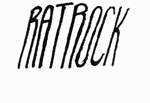
I started by sketching possible designs. I made little drawings of important letters, like an s or a lowercase e. A’s are important and L’s too. Also, a lowercase a and a lowercase f – whoa. You learn a lot about a font just by those two letters. They’re all weird. I started with those, and I built this font on Adobe Illustrator. From there, there are ways you can turn all these vectors into shapes that are readable as a downloadable OTF File.
How long did it take for you to make the font?
I would say it took me most of the summer and into the middle of fall. The first thing I made with the font was the company’s name. After that, I built all the other letters. Making a font is really nitpicky work, which is what I mean when I say that it’s an underrated practice. One of the most important parts is ensuring that the bottom of the base of a glyph is flat. Because if it isn't, the letters are going to look weird when you zoom in or if they get blown up. If something is even a little bit off, you can recognize it easily.
Currency, digital
Infinite Me’s!, digital
What are you currently working on?
Good question. I’m trying to make my Germazines easily accessible so that anyone can download them. When I get home I’m going to work on Germazine 4. I also made a design for a skateboard this summer and I can’t wait to showcase the process. I’m working on this small project that’s based on the year 1998. It’s supposed to be a flyer for the Limelight, which was this really cool hip club that was in New York.
Also, at the present time of this interview, it's my last week in New York. I'm leaving for home early because all my finals are virtual. I’m going to be in Berlin next semester. Isn’t that silly? One of the things that I’ll be doing there is collecting rave posters. I’m hoping to build an archive of rave posters, out of an emerging pandemic in Berlin.
Where do you see yourself in five years? What do you hope to do with your art?
I'll be 26, and I hope to be living either in New York or San Francisco. I hope I'm still doing this. I don't think it's crazy to think that by then, something I make will be mass-produced, whether it be an album cover or poster work. I also hope to have published something that gives more repertoire to the art of poster making, for sure.
Last question. This one is for your fans. Where else can we find your work and stay up to date?
Someone recently said I should call my fans the Germophiles. It’s kind of a terrible name but we’ll go with it. The Germophiles can get me on @germprint on Instagram. My website is isaisoto.myportfolio.com.
